Exploring the Visual Power of Sunburst Charts: A Comprehensive Guide to Enhancing Data Interpretation
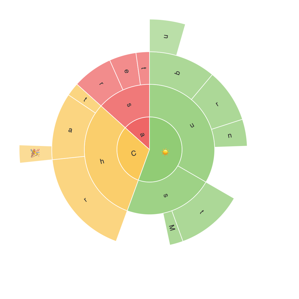
Sunburst charts, often overlooked in the world of data visualization, serve as a strategic tool for representing hierarchical data. This article aims to delve into the strengths, limitations, and applications of sunburst charts. Through this exploration, we will provide a comprehensive guide on how to effectively use and interpret sunburst charts to enhance data interpretation.
### Understanding the Structure
At the core of a sunburst chart is the radial layout, where segments emanate from a central point, resembling slices of a pie. The unique structure allows for the visual representation of multiple levels of categorization, with the outer segments representing the highest level of classification. As we move inward from the outer rings, finer details of the hierarchy are represented, creating a rich data narrative that is both detailed and accessible.
### Key Components
1. **Center**: This part of the sunburst represents the root node of the hierarchy, often indicating the top category with no further breakdown.
2. **Rings**: These are colored arcs that represent the levels of a hierarchy. The outermost ring represents the highest level of data breakdown, while moving inward, you encounter further granular divisions.
3. **Segments**: Each segment within a ring represents a group within a specific hierarchy level. The size of the segment indicates its proportion relative to the whole, typically shown through color saturation or brightness for easy visual differentiation.
### Applications
1. **Hierarchical Data Visualization**: Sunburst charts are particularly advantageous for visualizing data structures that are highly categorized, such as organizational charts, file system structures, or complex taxonomies with multiple levels of classification. This makes them ideal for industries like finance, where nested classification details are crucial, or in libraries to illustrate the breakdown of categories within books or documents.
2. **Market Analysis**: In market analysis, sunburst charts are used to illustrate the breakdown of market segments, allowing stakeholders to see the distribution of market parts across various product categories, consumer segments, or other areas of focus. This assists in identifying dominant categories and potential areas for market expansion or strategic positioning.
3. **Resource Management**: Whether tracking the allocation of resources in the budgeting of capital projects, the distribution of tasks in project management, or the division of responsibilities within an organization, sunburst charts provide a clear visual representation of how each resource is allocated, enhancing comprehension and decision-making.
### Enhancing Interpretation
To maximize the effectiveness of sunburst charts in data interpretation:
1. **Color Usage**: Employ distinct colors for each level of hierarchy and within each segment for clear differentiation. This aids in easily recognizing various groups within each category.
2. **Interactive Elements**: Incorporate interactive features such as tooltips or clickable segments that provide additional data when hovered over or selected, enhancing user engagement and accessibility.
3. **Labeling**: Place clear labels on the outermost segments for immediate identification of categories. Internal label usage should be minimal to maintain chart readability.
4. **Sizing and Arrangement**: Optimize the size of segments, keeping it proportional to their values without overcrowding. This ensures the chart remains visually appealing and the data is easily understandable.
### Conclusion
Sunburst charts offer a powerful platform for visualizing hierarchical data, providing users with a comprehensive, layered look at the breakdown of information. By understanding their structure, functionality, and potential applications, organizations can leverage these charts to enhance their data interpretation capabilities, make more informed decisions, and craft compelling visual stories that effectively communicate complex data narratives. As such, incorporating sunburst charts into your visualization toolkit can significantly improve the clarity and impact of your data presentations.
