Unveiling the Sunburst Chart: A Comprehensive Guide to Data Visualization for Decision-Makers
In the realm of data visualization, there exists a chart that presents hierarchical data uniquely, combining both depth and breadth in its presentation. This chart serves as a visual spectacle of relationships within data, offering a distinctive means of understanding complex information. Enter the Sunburst Chart, an advanced yet easily digestible method of transforming data into engaging, interactive visual representations. This comprehensive guide aims to help decision-makers harness the power of the Sunburst Chart, unlocking insights that could potentially transform their decision-making processes.
**Understanding the Sunburst Chart**
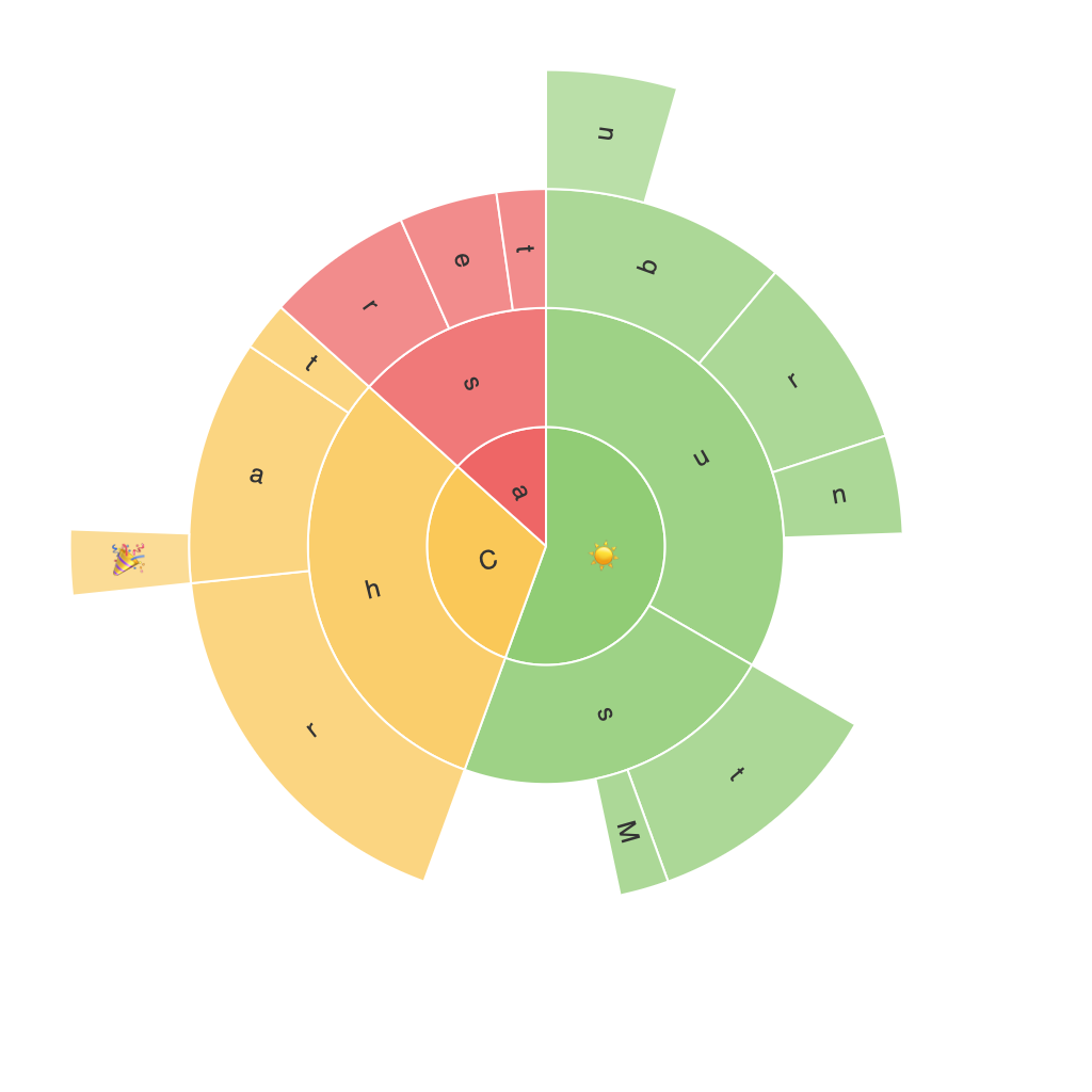
At its core, a Sunburst Chart is a type of visualization that displays hierarchical data in a radial layout. It uses nested rings to represent different levels of the hierarchy, with the central node, often referred to as the root node, at the center. This design enables viewers to easily perceive the structure of the data, breaking down complex relationships into comprehensible tiers and segments.
**Advantages of the Sunburst Chart**
1. **Hierarchical Clarity**: One of the most striking features of the Sunburst Chart is its ability to reveal information across multiple hierarchical levels simultaneously. This makes it particularly useful for data structures that consist of parent-child relationships, enabling users to understand the proportions of various segments within the broader context.
2. **Interactive Exploration**: Sunburst charts commonly offer interactive features, including pinch-to-zoom for adjusting the size of rings, and hover effects that provide additional insight into specific segments when clicked or hovered over. This interactivity enhances the user’s ability to explore and analyze data dynamically.
3. **Versatility**: This chart type is applicable across various sectors, from finance, economics, and business intelligence to web analytics, product categorization, and geographical distribution. Its adaptability makes it a go-to choice for visualizing a wide range of datasets.
4. **Aesthetically Pleasing**: Due to its appealing, radially organized display, Sunburst Charts can make data more engaging and memorable compared to traditional bar charts or pie charts. This can be particularly beneficial when presenting reports or analyses to stakeholders, executives, or the general public.
**Data Requirements and Preparation**
Before attempting to create a Sunburst Chart, it’s essential to have accurate and well-organized data. Typically, the data should be grouped in a hierarchical structure, such as a JSON format, where each object represents a node in the chart:
“`json
{
“name”: “Root Node”,
“children”: [
{
“name”: “Level 1 Segment 1”,
“children”: [
{
“name”: “Level 2 Segment 1”,
“size”: 250,
“children”: [
// Additional Level 3 segments
]
},
{
“name”: “Level 2 Segment 2”,
“size”: 750,
“children”: [
// Additional Level 3 segments
]
}
]
},
// Additional Level 1 segments
]
}
“`
Here, each “children” array represents a level in the hierarchy, and the “size” attribute indicates the proportional size of the segment within its parent node. Proper data preparation can significantly impact the clarity and effectiveness of the final chart.
**Creating the Sunburst Chart**
The process of creating a Sunburst Chart can vary depending on the tools and platforms available. Popular options include visualization libraries and tools such as D3.js, Tableau, Power BI, and Python frameworks like Plotly or Matplotlib.
1. **Import Libraries**: If using coding-based frameworks, ensure libraries required for data manipulation and visualization are imported and the data is loaded.
2. **Construct Data Model**: Utilize your prepared data structure to create a model that can be used as input for the chart. This involves mapping the data attributes (names, sizes, and children) to the corresponding chart components.
3. **Design the Chart**: Adjust settings such as colors, labels, and interactivity to match your visual preferences or organizational branding. Choose effective label strategies to avoid overcrowding or illegibility.
4. **Interactive Enhancements**: Incorporate features like tooltips, animations, and custom interactions to enrich the user experience and enhance data exploration capabilities.
5. **Test and Debug**: Conduct thorough testing to ensure all elements function as intended. Debugging any issues that arise is crucial to delivering a polished visual representation.
6. **Review and Present**: Before sharing, review the final chart for clarity, aesthetics, and effectiveness in conveying your intended message. Make adjustments as necessary and present the chart to decision-makers, providing an overview of how its unique structure aids in understanding complex data relationships.
**Conclusion**
The Sunburst Chart offers a compelling solution for visualizing hierarchical data, providing decision-makers with an accessible and engaging way to view extensive datasets. Its ability to simultaneously display breadth and depth, along with interactive features and customizable options, makes it a valuable tool for organizations across various industries. By embracing the Sunburst Chart, analysts and data users can harness a visual format that enhances comprehension and drives more informed decision-making.
