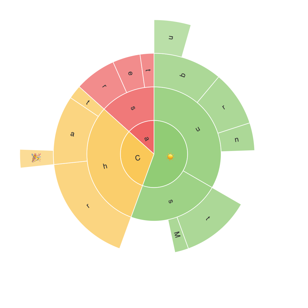
Unlocking the Visual Brilliance of Sunburst Charts: A Deep Dive into Effective Hierarchical Data Visualization
In the realm of data visualization, not all graphics possess the flair to elegantly represent the complexity of hierarchical data structures. This is where sunburst charts shine, presenting visually compelling, insightful, and dynamic views to understand multi-layered relationships between different entities. Unlike conventional bar charts, pie charts, or tree maps, a sunburst chart offers a unique way of showcasing data relationships through concentric circles and connected arcs, enhancing readability and aiding in the deciphering of nuanced data patterns.
### What Are Sunburst Charts?
Sunburst charts, innovatively crafted in the pursuit of visualizing hierarchical data, are essentially circular diagrams with multiple layers. They start with a central disc that represents the highest level of the hierarchy. Branching outward are sector segments, each further divided by arcs that connect the main circle to the central hub. These arcs represent the different sub-levels, allowing viewers to trace the ancestry from broader categories to the most specific components, revealing intricate connections and proportions with relative ease.
### Key Features and Benefits
Sunburst charts offer several advantages when it comes to displaying hierarchical data:
1. **Clear Hierarchical Representation**: The layout naturally delineates the hierarchy, making it easier to see how the data is categorized and nested within levels.
2. **Visual Clarity and Intuition**: The radial structure is intuitive for most viewers, allowing complex relationships to be easily comprehended through the visual metaphor of concentric circles.
3. **Efficient Space Usage**: Sunburst charts are highly effective in terms of space optimization, fitting more information into a compact visual without cluttering the display.
4. **Highlighting Relationships**: When combined with color coding or various effects like thickness or density of arcs, the chart highlights different levels of importance, making it easier to grasp the relative significance of different parts.
### Implementation and Best Practices
To make the most of a sunburst chart, consider the following best practices:
1. **Limit the Depth**: Keep the number of hierarchical levels manageable to avoid overcomplicating the visualization. A maximum of 5-6 levels is ideal for clarity.
2. **Use Color Wisely**: Assign distinct colors to each level and components to create a clear differentiation. Consider using sequential colors if you are attempting to indicate value ranges or importance.
3. **Optimize Information Display**: Ensure the chart isn’t overcrowded by using interactive formats (like tooltips or click-to-expand) for deeper data insights, allowing viewers to access details without compromising the initial visual presentation.
4. **Keep it Clean**: Avoid unnecessary distractions. Remove excessive labels, gridlines, and annotations unless they add value to understanding the data. This approach ensures the chart remains engaging and focuses on clearly conveying the data relationships.
### Applications
Sunburst charts find extensive use in various fields, including but not limited to:
– **Healthcare**: Illustrating the breakdown of diseases by population demographics, treatment types, or severity levels.
– **E-commerce**:展现产品种类之间的等级结构, such as categories, subcategories, or brands to help users navigate through product offerings.
– **Financial Analysis**: Displaying company structures, revenue distribution by departments or geographical regions, or investment hierarchies.
### Conclusion
In the quest to transform raw data into meaningful insights, sunburst charts stand as a powerful yet underutilized tool. They simplify the understanding of hierarchical structures, allowing audiences to grasp nuanced relationships and patterns with ease. By leveraging the visual advantages this chart type offers, data analysts and researchers can provide their findings in a format that is both engaging and enlightening to a broad audience. Whether in the boardroom, analytics dashboard, or industry reports, the true power of sunburst charts lies in their ability to illuminate the underlying complexities of data with clarity and impact.
