Sunburst Charts: A Comprehensive Guide to Creating Compelling Visualizations
In the realm of data visualization, the sunburst chart is a powerful tool for presenting hierarchical data. Born from the tradition of circular charts that include pie charts, treemaps, and radar charts, the sunburst chart offers a dynamic and engaging visualization that can easily convey the intricate details of complex structures.
## How Does the Sunburst Chart Work?
### Structure
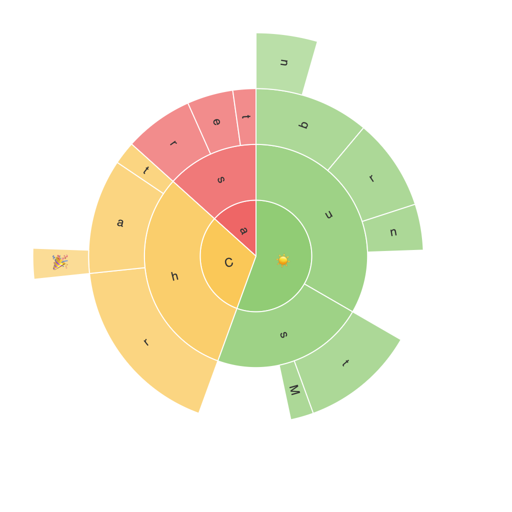
A sunburst chart resembles a sun’s rays emanating from the center, with the main segments expanding outwards and the sub-segments breaking down into smaller pieces, often with text labels or colors, following the same radial pattern. The hierarchy is typically represented from the outer parts to the sectors or central segment, with the most significant category closest to the center.
### Elements
1. **Inner Sector**: This is the main sector that represents the highest level of hierarchical data. Smaller sectors grow into the inner sectors to depict the lower levels of the hierarchy.
2. **Radial Segments**: These segments represent sub-categories or sub-segments, with each color often associated with a specific theme or data category, providing easy differentiation.
3. **Labels**: Text labels can be added, either as direct annotations on the segments or as tooltips (which appear when the user hovers on a segment), to further clarify the data represented.
4. **Colors**: Used to enhance the visual appeal and differentiate categories, colors can also carry specific meanings, aligning with your data storytelling approach.
## Benefits of Using Sunburst Charts
Sunburst charts are particularly advantageous when dealing with complex hierarchical data, providing the following key advantages:
1. **Effective Data Representation**: By visualizing data in a radial hierarchy, the sunburst chart allows viewers to quickly grasp the structure of the data and the relationships between different categories.
2. **Memory Retention**: Radial patterns are easier for the human brain to remember, making it a valuable tool for presentations and reports where information needs to be retained long-term.
3. **Space Efficiency**: Compared to other chart types, especially treemaps, the sunburst chart uses space more efficiently, allowing for a larger dataset on a single page.
4. **Engagement**: The visually striking nature of the sunburst chart catches the viewer’s eye, making the data more engaging than traditional tabular or standard bar charts.
## Tips for Creating Compelling Sunburst Charts
### 1. Start Simple
Begin with a straightforward hierarchy and gradually expand the structure as necessary. A cluttered sunburst chart can become confusing. Simplifying the data can lead to a more impactful visualization.
### 2. Highlight Key Segments
Use colors, labels, and tooltips to focus attention on the most significant segments. High-contrast colors or bold labels can help draw attention to the parts of the hierarchy that have the most impact.
### 3. Control Complexity
While the beauty of sunburst charts lies in their ability to display complex data structures, it’s crucial not to sacrifice clarity for complexity. Employ filters or interactive navigation options to help users explore data levels, especially for very large datasets.
### 4. Optimize for Readability
Ensure that all labels and segments are large enough to be read easily, especially in printed or digital documents where zooming might not be an option. Color blindness should also be considered to avoid visual impairments in accessibility.
### 5. Enhance with Storytelling
Use the hierarchical structure to tell a coherent story with your data. Consider the narrative that the chart will communicate and structure the visualization accordingly.
### 6. Test with Your Audience
Before finalizing your chart, test it with a sample of your target audience to get feedback on its clarity and effectiveness. Adjustments can be made based on user feedback to ensure the chart is as effective as possible.
## Conclusion
Incorporating sunburst charts into your data visualization toolkit is a significant step towards presenting your data in a more engaging and understandable way. By following a few key guidelines and focusing on simplicity, clarity, and effective storytelling, you can create compelling sunburst charts that not only impress but also facilitate easier comprehension of complex data sets. Whether you’re working on a business report, an academic presentation, or an information-rich web page, the sunburst chart is a versatile ally in your visualization arsenal.
