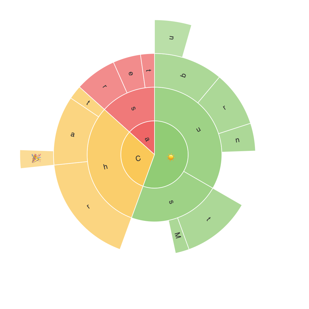
Unlocking Insights with Sunburst Charts: A Guide to Visualizing Hierarchical Data
In today’s data-driven world, understanding and interpreting hierarchical data structures has become a crucial skill for effective decision-making. Sunburst charts stand in the spotlight as a powerful tool for visualizing complex hierarchical relationships, shedding light on patterns, trends, and insights that can help businesses optimize their strategies, enhance their operational efficiency, and gain a competitive edge. This article aims to demystify the intricacies of sunburst charts and guide you through their application, offering a step-by-step walkthrough to their creation and interpretation.
### Understanding Sunburst Charts
Sunburst charts are a type of hierarchical ring chart, which display hierarchical data in a three-dimensional radial layout. They are similar to sunburst diagrams, where each level of the hierarchy is represented by a ring, creating a nested structure that resembles a solar system. The innermost ring often represents the top level of the hierarchy, while the outer rings depict subsequent levels, effectively layering data to provide a comprehensive view.
### Key Features and Benefits
#### Clarity of Hierarchical Relationships
The structured layout makes it easy to see the relationship between different parts of the hierarchy. This visual clarity is particularly beneficial when dealing with large numbers of categories or subcategories.
#### Insight into Composition
Sunburst charts enable viewers to understand the relative sizes of categories and their contribution to the overall structure. This is especially useful for identifying major contributors or outliers within the data.
#### Enhanced Data Exploration
With intuitive interactive features, users can hover over segments to view additional details, drill down into more granular data, or navigate between different levels of the hierarchy, making it an ideal tool for in-depth data exploration.
### Creating a Sunburst Chart
1. **Data Preparation**:
– **Structure**: Format your data in a hierarchical manner, ensuring each parent node has a list of child nodes.
– **Metrics**: Decide on the metric you want to represent (e.g., sales, frequency, or importance) and ensure each category has a corresponding value.
2. **Choosing a Tool**:
– Many data visualization tools support sunburst charts, including Tableau, PowerBI, Qlik, and even self-hosted options like Matplotlib in Python or D3.js for web-based solutions.
3. **Design and Customization**:
– **Color Scheme**: Use colors to differentiate between major and minor categories, aiding in the visual distinction of high versus low values.
– **Labels and Legends**: Ensure that each segment is clearly labeled with its name and value, and provide a legend if needed to help understand the color-coding system.
4. **Interactive Enhancements**:
– Implement interactive features such as tooltips, hover effects, and multi-level drill-down options to improve data exploration capabilities.
### Interpreting Sunburst Charts
– **Explore from the Center Outwards**: Start with the highest level to get an overview, then progressively drill down into subcategories for more detailed insights.
– **Analyze By Size and Color**: Categorize and prioritize categories based on the size of their segments and the color scheme to quickly identify the most significant contributors.
– **Use Annotations and Legends**: For complex charts, adding annotations can help clarify the hierarchical relationships and provide context to non-quantitative data points.
### Case Studies
– **E-commerce Websites**: Visualizing product categories by sales revenue can help identify popular segments and potential bottlenecks in the supply chain.
– **Web Analytics**: Analyzing user navigation paths on a website can assist in optimizing UX by highlighting the most direct and successful routes taken by users.
### Conclusion
Sunburst charts offer a unique perspective on hierarchical data, making them invaluable tools for businesses and data analysts looking to uncover insights, optimize strategies, and make informed decisions based on comprehensive, nested data visualizations. By mastering the creation and interpretation of these charts, professionals can unlock the full potential of hierarchical data, fostering data-driven decision-making processes and enhancing strategic planning.
