Unlocking Insights with Sunburst Charts: A Guide to Enhancing Data Visualization and Decision Making
In the vast landscape of data visualization, diverse chart types serve as the instruments through which we decipher and understand complex datasets. Among these, sunburst charts represent a powerful tool, adept at revealing hierarchical relationships and insights within multi-level datasets in an accessible, visually engaging way. This article aims to explore the intricacies and potential of sunburst charts, guiding us through their application, design considerations, and the valuable insights they offer for data-driven decision making.
### What are Sunburst Charts?
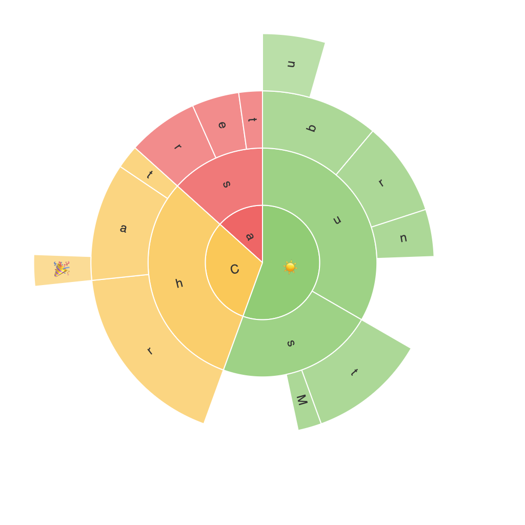
Sunburst charts, also known as many-pies or ring charts, are a hierarchical variation on the common pie chart. They display datasets with multiple levels of categories, making them especially useful for datasets that feature deep hierarchies. Each level, or ring, in the chart represents one step in the hierarchy, with the central ring typically representing the highest-level category, and subsequent rings detailing the subcategories beneath.
### Key Features of Sunburst Charts
**Hierarchical Structure**: Like its namesake, a sunburst chart’s structure is radial, with concentric rings forming a tree-like structure. This radial layout not only makes it easier to navigate through the hierarchy but also visually emphasizes the hierarchical progression.
**Color Coding**: Colors are used to distinguish between levels and categories. This color coding allows for detailed comparison and easy identification of major categories versus subcategories within a dataset.
**Space Utilization**: Sunburst charts use space efficiently, especially when dealing with large numbers of categories. Their compact nature makes them suitable for visualizing complex data in a limited space.
**Interactive Capabilities**: In digital formats, sunburst charts can be highly interactive. Hovering over sections can reveal tooltips with detailed information, and clicking can expand or collapse sections, offering a more detailed look at the specific data being represented.
### Enhancing Data Visualization
Sunburst charts can dramatically enhance data visioning by:
**Highlighting Importance through Size**: Areas of different areas in the rings can easily represent the quantity or value associated with each category, providing a quick and intuitive sense of scale and importance.
**Facilitating Comparison**: By comparing the sizes of different segments within the same level, users can understand the relative importance of different categories or subcategories within the hierarchy.
**Uncovering Trends and Correlations**: Sunburst charts reveal patterns and correlations between levels, facilitating the discovery of relationships and trends in multi-faceted data.
### Decision Making with Sunburst Charts
For decision makers, sunburst charts can be instrumental in:
**Strategic Planning**: By visualizing various levels of data, such as different revenue streams, product categories, or geographic regions, decision-makers can gain insights to inform strategic planning with a holistic view of the organization’s performance.
**Resource Allocation**: Understanding the distribution of resources across different categories can help inform effective resource allocation strategies, ensuring that more impactful or productive areas receive appropriate investment.
**Auditing and Optimization**: Reviewing the structure and distribution within sunburst charts can be crucial for auditing processes and identifying areas for optimization, whether it’s improving efficiency, reallocating resources, or enhancing services based on identified trends and performance indicators.
### Design Considerations
To maximize the effectiveness of a sunburst chart, consider the following:
**Data Relevance**: Ensure the dataset chosen for visualization aligns with the intended purpose or message. Not all hierarchical data structures will benefit from a sunburst representation.
**Simplicity**: Avoid overcrowding with too many levels or categories. Keep the chart organized and avoid clutter to maintain clarity and readability.
**Aesthetic Appeal**: Use color schemes that enhance readability and visual interest, particularly at a glance. Balance colors across different sectors and levels to maintain visual harmony.
**Interactive Features**: Incorporate interactive elements where possible. This not only increases engagement but also provides users with a more dynamic way to explore and understand the data.
### Conclusion
Incorporating sunburst charts into data visualization strategies can significantly enhance understanding and empower informed decisions. Their ability to effectively convey hierarchical relationships, promote comparisons, and facilitate pattern discovery makes them a valuable addition to the data analyst’s arsenal. Whether crafting a visually engaging dashboard or presenting in-depth findings to stakeholders, the adoption of sunburst charts can facilitate a more insightful and impactful interaction with complex datasets.
