Unlocking Insights with Sunburst Charts: A Comprehensive Guide to Visualizing Hierarchical Data
In the vast landscape of data visualization, where conveying complex relationships and hierarchies becomes a crucial task for data analysts and business leaders, a valuable yet lesser-explored method emerges: the sunburst chart. This article aims to delve into the intricacies of using sunburst charts, a non-linear radial display, to effectively visualize and interpret hierarchical data across various fields such as business intelligence, market analysis, and organizational structures.
### What are Sunburst Charts?
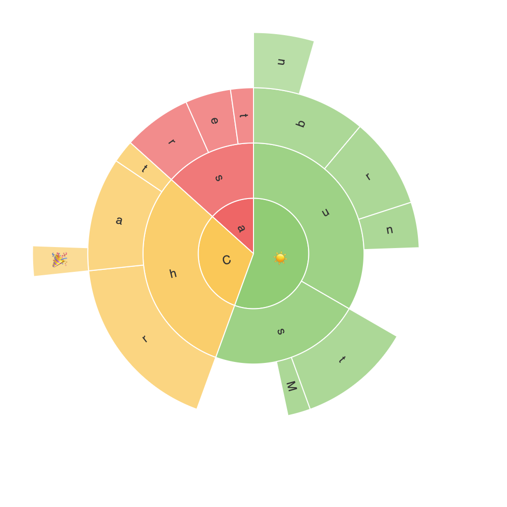
Sunburst charts are a specialized radial type of diagram that visualizes hierarchical data in concentric rings, with each ring representing a different level of the hierarchy. The pie charts within the rings represent the proportions or percentages of the corresponding category, providing an integrated view of the data at both the group and individual levels.
### Key Components of Sunburst Charts
1. **Innermost Circle**: This circle contains the topmost level of the hierarchy, typically displaying the main categories or the largest divisions.
2. **Subsequent Circles**: As you move outward from the innermost circle, each circle represents a deeper level of the hierarchy. Smaller segments within these circles represent subcategories or sub-entities, thus enabling a multi-level understanding of the data.
3. **Leafs (Segments)**: The segments in the outermost circles are the leafs, which are the smallest units of the hierarchy or the base entities where the data originates.
### Advantages of Sunburst Charts
#### 1. Hierarchical Clarity
Sunburst charts excel at displaying hierarchical data structures clearly and logically, allowing viewers to easily understand the relationships between different levels.
#### 2. Data Density and Clarity
By distributing data in concentric circles and varying the size of segments according to their value, sunburst charts can handle a moderate amount of data without becoming overly cluttered. The visual aesthetics balance data representation and readability.
#### 3. Comparative Analysis
Sunburst charts provide a natural basis for comparison between different categories at the same and different levels of the hierarchy, making it easier to identify trends, anomalies, and patterns.
#### 4. Storytelling and Insight Extraction
Sunburst charts are particularly useful in telling comprehensive stories about data, facilitating the extraction of insights beyond mere numerical analysis. They help in making complex data understandable and engaging.
### Examples and Applications
Sunburst charts find extensive applications across industries:
– **Business Intelligence**: They help in visualizing the market structure, competitor relationships, and product breakdowns within a company.
– **Market Analysis**: In financial and economic data analysis, sunburst charts can illustrate the market segments, product categories, and various stakeholder influences.
– **Organizational Chart**: For representing organizational structures, they display the organizational hierarchy, including management layers and departmental roles.
### Creating Effective Sunburst Charts
To ensure that your sunburst chart effectively communicates insights:
– **Focus on Clarity**: Avoid overcrowding the chart with too many categories. Aim for a balance where the viewer can grasp the hierarchy without difficulty.
– **Use Color Wisely**: Differentiate categories and sub-categories with color while maintaining a color palette that doesn’t overwhelm the viewer.
– **Label Appropriately**: Ensure labels are clear and readable, especially for the leafs (base entities), and consider using hover effects for detailed info.
– **Interactive Elements**: For larger datasets, consider implementing interactive capabilities like tooltips and drill-down features to allow users to explore the data in depth.
### Conclusion
Sunburst charts offer a fresh and innovative way to represent hierarchical data, providing a rich and nuanced visual narrative that enhances understanding, facilitates comparison, and supports informed decision-making. Whether you’re looking to analyze complex structures in business intelligence, illustrate market dynamics in business intelligence, or visualize intricate organizational setups, sunburst charts are a powerful tool to unlock insights from your data.
Explore the potential of sunburst charts in your data visualization toolkit, and discover how this method can empower your efforts in uncovering and presenting valuable insights in a visually compelling manner.
