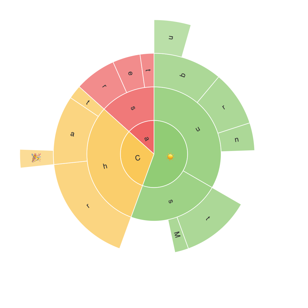
Unlocking Insights with Sunburst Charts: A Comprehensive Guide to Visualizing Hierarchical Data
In the realm of data visualization, we often struggle to make complex, structured data comprehensible and easily digestible for decision-makers, stakeholders, and other interested parties. One solution that elegantly addresses this challenge is the use of sunburst charts. A sunburst chart, also known as a radial treemap or a multilevel ring chart, is an advanced method of visualizing hierarchical data. It offers a visual representation that enables users to easily comprehend and analyze the breakdown of data elements, revealing patterns, trends, and insights that might be concealed in tabular or linear format.
### What Are Sunburst Charts?
A sunburst chart is a type of hierarchical data visualization that displays the structure of a dataset in a radial format. Each level in the hierarchy is represented by a ring, with the innermost ring depicting the most detailed level of the data, and larger rings encompassing broader categories. This visualization technique allows for an intuitive understanding of the relationships between different components of the data.
### Benefits of Sunburst Charts
#### 1. Clear visualization of hierarchy
Sunburst charts make it easy to see the hierarchical structure of the data at a glance. The radial layout and color-coded sections provide immediate insights into the relationships between different parts of the dataset.
#### 2. Improved comprehension
The radial structure of sunburst charts reduces cognitive load. By breaking down the data into simpler, concentric rings, users can understand complex relationships more quickly and with less stress.
#### 3. Effective data comparison
Sunburst charts offer multiple ways to compare quantities, including size (the length of segments), color intensity, and position. This feature makes it easier to spot trends, outliers, and patterns in the data.
#### 4. Enhanced storytelling
The visual nature of sunburst charts translates well into stories. They can highlight key contributors, trends, or anomalies in the data, making them an effective tool for presenting information in compelling and engaging ways.
### How to Create a Sunburst Chart
#### 1. Prepare your data
Ensure your data is in a hierarchical structure, typically with a parent-child relationship. You might have categories or labels at each level, and numerical values associated with each category to represent the size.
#### 2. Choose a tool
Select a data visualization tool that supports the creation of sunburst charts. Popular options include Tableau, Power BI, Google Charts, or even Python libraries like Matplotlib or Seaborn.
#### 3. Format your data
Configure your data for the visualization tool based on the selected hierarchical structure. Be sure to map fields correctly to create rings, inner rings, and segments as required.
#### 4. Customize the chart
Adjust color schemes, segment labels, and tooltips to enhance readability and provide additional context. Decide how to visually represent hierarchical levels (for example, using color variations or thickness of segments).
#### 5. Evaluate and refine
Review the chart’s effectiveness in conveying the intended insights. Adjust the visualization by tweaking the data, layout, or design elements to optimize clarity and impact.
### Conclusion
Sunburst charts are a powerful and intuitive tool for visualizing and understanding hierarchical data. By leveraging their radial structure, color-coded segments, and comprehensive comparison capabilities, users can efficiently explore complex datasets, leading to enhanced decision-making and deeper insights. With proper preparation and customization, sunburst charts become a potent asset for anyone working with structured data, allowing for the transparent and effective communication of information.
