Unlocking Insights with Sunburst Charts: A Comprehensive Guide to Visualization and Data Interpretation
Sunburst charts, a type of hierarchical data visualization, serve as a powerful tool in revealing insights from complex datasets with a high degree of clarity. Often overlooked in comparison to more conventional visual representations, these chart types provide a unique approach to showcasing information organization at multiple levels. This guide delves into the intricacies of sunburst charts, their applications, and the comprehensive steps for unlocking valuable insights through their visualization and interpretation.
**Understanding Sunburst Charts**
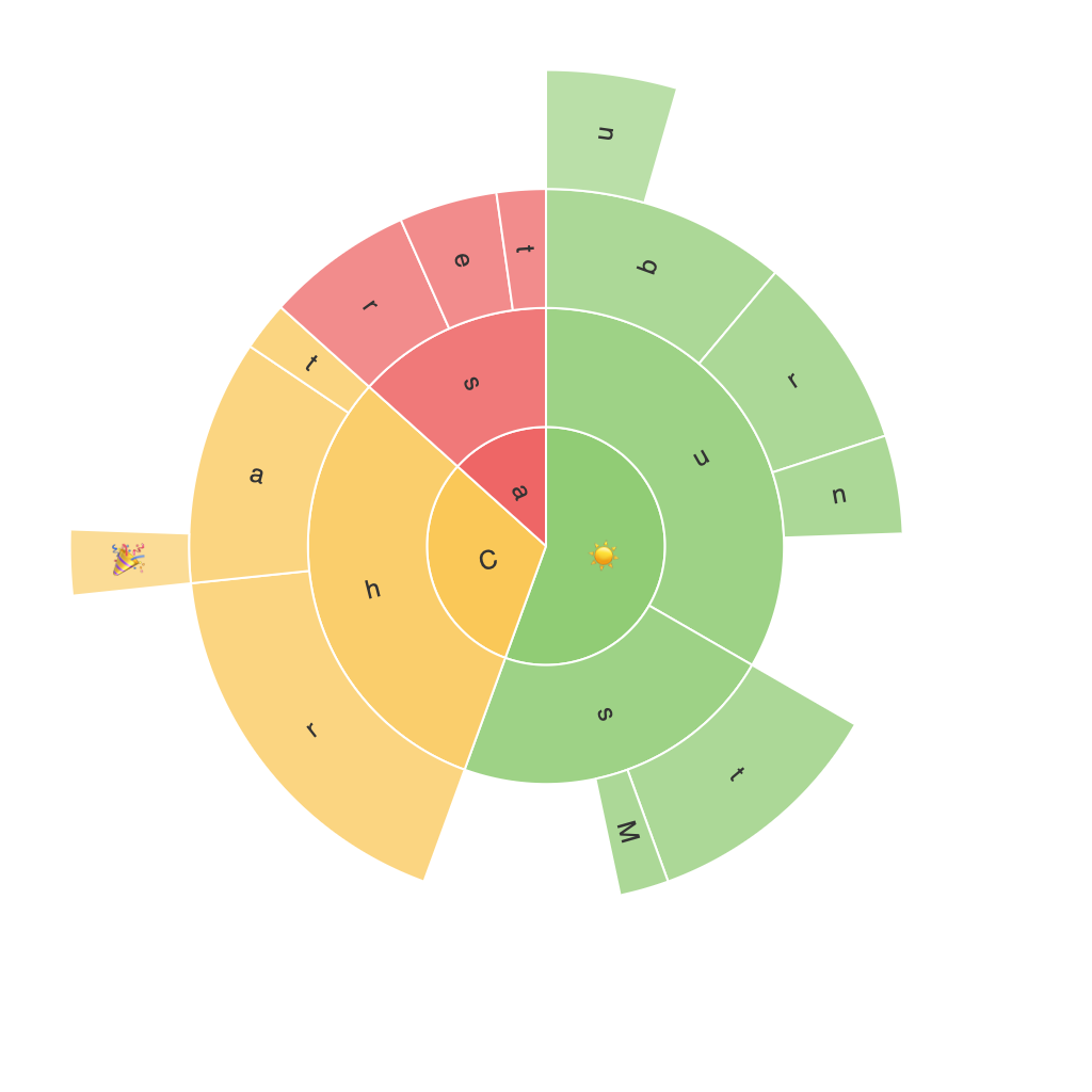
Sunburst charts are structured like radial trees, with concentric rings representing hierarchical categorizations. The outer ring holds the most general categories, descending into sub-categories in each surrounding ring. This radial layout allows for the easy visualization of a hierarchy’s complexity, with the nested rings corresponding directly to the branches of the tree. Each data slice or segment within a ring represents a specific data point, color-coded to distinguish between different categories. This allows for a clear overview of the data, facilitating both micro- and macro-analysis.
**Benefits of Using Sunburst Charts**
Sunburst charts provide several key advantages over traditional tree maps or bar charts:
1. **Hierarchical Clarity**: They offer an intuitive way to visualize hierarchical data, making it easy to identify relationships between different levels of the data structure.
2. **Multi-Level Analysis**: Due to their radial design, sunburst charts support multiple layers of data for in-depth analysis, allowing for the exploration of data at various levels of detail.
3. **Comparison and Proportionality**: The color-coding and sizes of segments enable a direct comparison between categories and subcategories, highlighting the relative sizes and proportions of data points within the hierarchy.
**Steps to Unlock Insights with Sunburst Charts**
1. **Data Preparation**:
– Ensure your data is organized hierarchically. Each level of hierarchy should be defined, with clear parent-child relationships.
– Normalize data if necessary, such as performing calculations like sum, average, or count, based on the hierarchy’s structure.
2. **Choosing the Right Tool**:
– Utilize a data visualization tool that supports sunburst charts. Popular options include Tableau, Microsoft Power BI, Google Data Studio, or Python libraries like Plotly and Matplotlib for programming environments.
3. **Building the Chart**:
– Define the root node of your hierarchy.
– Assign categories and subcategories to ring levels, ensuring consistency with your data structure.
– Use color to differentiate categories, with intensity variations indicating, for example, volume or importance.
4. **Interpretation**:
– Focus on the structure: Use the outer ring for the highest level of categories and proceed inward for substructure.
– Analyze the sizes of segments within each ring to compare proportions and understand where data is concentrated.
– Utilize tooltips or interactive features to access detailed information about each segment.
– Look for patterns and anomalies: Are there underrepresented subcategories or outliers that demand further investigation?
5. **Refinement and Storytelling**:
– Iterate on your chart by adding or removing data points or changing colors to improve readability.
– Develop a narrative around the data. Highlighting trends, explaining inconsistencies, or drawing insights related to specific segments.
6. **Evaluation and Feedback**:
– Present your sunburst chart to stakeholders for feedback.
– Use their insights to refine your visualization, making it more communicative and impactful.
**Conclusion**
Sunburst charts offer a unique lens on organizing and interpreting data across hierarchical structures, proving particularly useful in fields such as business intelligence, marketing analysis, and scientific research. Understanding how to create, analyze, and refine these models can provide powerful insights into complex datasets, fostering better decision-making and fostering more informed strategies. With a focus on data preparation, tool selection, and effective interpretation techniques, organizations can unlock new levels of insight and efficiency through the visualization provided by sunburst charts.
