Unlocking Insights with Sunburst Charts: A Comprehensive Guide to Visualization and Data Interpretation
In the realm of data analytics and visualization, innovative and efficient methods of presenting complex information are continuously being developed. One of such methods that has gained much attention in the past years is the Sunburst Chart. This type of visualization tool provides an insightful, interactive way to explore data and derive valuable conclusions. In this article, we will delve into the heart of Sunburst Charts, explore their unique features, and understand how they can assist us in unraveling intricate data sets.
#### What Are Sunburst Charts?
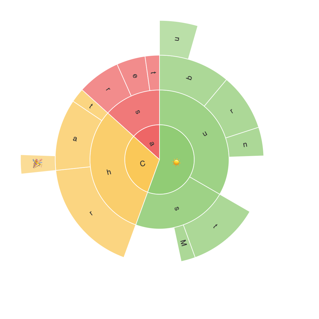
Sunburst charts are a specialized type of circular hierarchical data visualization. They represent multilevel data structures, where the most top-level categories are at the outer circle and each subsequent level spirals inward toward the center. This structure makes it particularly effective to illustrate nested data, such as categories, subcategories, and sub-subcategories, and thus is highly useful in fields with structured data sets, like organizations or businesses with a hierarchical structure.
#### Key Components and Features
– **Levels**: In a Sunburst chart, data is arranged in levels. Each level represents a different hierarchy of data. The outermost level contains the highest-level categories, while deeper levels hold the more detailed subcategories. The levels form concentric rings, with the outer ring representing the largest level and the inner rings representing more detailed levels.
– **Branches**: The lines connecting the ring levels are called branches. Each branch connects two levels and represents a transition from a higher to a lower level of hierarchy.
– **Slices**: At each branch point, there are slices representing further subcategories. The size of these slices typically represents the value or weight of the data associated with that category.
– **Interactivity**: Sunburst charts often include hover-over features that expand the chart, allowing users to inspect data in more detail. This interactivity makes it easier to discover and analyze the information represented in the chart.
#### Benefits of Using Sunburst Charts
**Comprehensive Visualization**: Sunburst charts offer a comprehensive view of hierarchical data, making it easier to understand the relationships and connections between different data points.
**Efficient Data Management**: The circular layout allows for the visualization of large amounts of data without clutter, making it easier to manage and interpret at a glance.
**Enhanced Analysis**: The hierarchical structure makes it straightforward to analyze the contribution of different categories and subcategories to the overall data set, which is particularly useful in identifying significant contributors or trends.
**User-Friendly**: Sunburst charts are intuitive and easy to read, even for those who are not data experts. This simplicity aids in ensuring that insights can be communicated effectively across various teams.
#### Conclusion
Sunburst charts are invaluable tools for data analysts and researchers looking to visualize and interpret complex hierarchical data. Their unique features allow for the clear presentation of various levels of categories, making it easier to understand intricate data sets. By leveraging the properties of Sunburst charts, one can discover meaningful insights, enhancing decision-making processes across different industries. Whether you’re dealing with organizational structures, sales data, geographical information, or any other hierarchical data, Sunburst charts are an excellent tool to visualize and analyze your data effectively.
