### Unlocking Insights with Sunburst Charts: A Comprehensive Guide to Visualization and Data Analysis
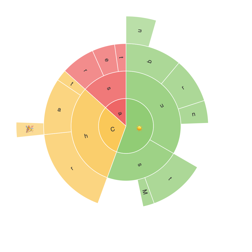
Sunburst charts, also known as sun charts or环形树图 in Chinese, are powerful tools for visualizing hierarchical data. These charts represent data in a radial layout, offering a clear and intuitive way to organize and explore complex structures. Through this article, we aim to guide you through the nuances of utilizing sunburst charts effectively, including their construction, key features, applications, and how they support data analysis in various fields.
## **Construction of Sunburst Charts**
At the core of sunburst charts, each level of the hierarchy is represented by a ring, with the outermost ring depicting the top-level categories and subsequent rings representing subcategories. The chart’s rays emanate from the center, each connecting to segments that signify different categories at each level. The area of each segment is proportional to the value it represents, making it easy to compare quantities at a glance.
### 1. **Creating Hierarchical Data**
The first step in constructing a sunburst chart involves organizing data into a hierarchical format. This typically starts from the top-level category and progressively breaks down into subcategories until the leaf nodes that hold the lowest details in the hierarchy can be identified.
### 2. **Data Input and Layout**
To build a sunburst chart, you input your data, specifying the top-level categories (`series` variable), subcategories (`categories` variable), and optionally, a value associated with each category (`value` variable). This setup allows you to define the structure of the data you’re visualizing, ensuring that the chart reflects accurate and appropriate relationships.
### 3. **Visualization and Customization**
Once the data is input, the chart is rendered based on the predefined structure and variables. Sunburst charts are highly customizable, allowing you to adjust colors, layout, and even add labels to individual segments. This customization aids in making the chart more readable and visually appealing, catering to specific needs and preferences.
## **Features and Benefits of Sunburst Charts**
### **Clear Hierarchical Representation**
The radial layout of sunburst charts visually conveys the hierarchical structure, making it easier to perceive and understand complex data relationships. This is particularly advantageous in fields dealing with taxonomies, such as product categories, family structures, or geographical territories.
### **Comparative Analysis**
The proportional size of segments allows for a straightforward comparison of different categories, highlighting what elements are more significant within a hierarchy. This feature is invaluable for businesses and organizations seeking to analyze market structures, customer segments, or resource allocations.
### **Explore Data Depth**
Sunburst charts enable users to dive deeper into data analysis by expanding nodes to explore details contained within categories. This interactivity is crucial for revealing insights that simpler charts might overlook.
## **Applications**
### **Corporate Analysis**
In business, sunburst charts can be used to analyze company structures, product assortments, or client portfolios, providing clear insights into which product categories or client groups contribute the most value.
### **Public Policy**
Government and public policy organizations can utilize them to analyze and visualize data related to budget allocations, sector comparisons, or demographic data that helps in understanding the distribution of resources.
### **Market Research**
Sunburst charts are useful in market research for categorizing consumer preferences across various products or services, allowing companies to make informed decisions about product development or targeted marketing strategies.
### **Biological and Environmental Data**
In science, they can represent hierarchical classification systems like phylogenetic trees, molecular structures, or ecological niches, providing a visual way to compare and contrast different datasets at various levels of complexity.
### **Education and Training**
In educational applications, sunburst diagrams can be used to display the breakdown of learning paths or the curriculum structure, aiding students and educators in tracking and understanding the progression through different stages or modules.
## **Conclusion**
Sunburst charts present a visually appealing and informative way to represent hierarchical data, making them indispensable for decision-makers, researchers, and data analysts alike. By fostering a deeper understanding of complex structures and relationships, these charts facilitate more insightful and effective decision-making across various sectors. With its power to clearly visualize and compare hierarchical data, a well-crafted sunburst chart stands as a potent tool that enhances the process of data discovery and analysis.
