Unlocking Insights with Sunburst Charts: A Comprehensive Guide to Mastering Hierarchical Data Visualization
Introduction
In the realm of data visualization, the sunburst chart stands as a powerful tool for elucidating complex hierarchical data. This guide delineates the inner workings of sunburst charts, their unique design structure, how they leverage hierarchical data, and showcases their application in various fields. Mastering sunburst charts will not only enhance your ability to analyze and present data hierarchically but also provide deeper insights and understanding through visual storytelling.
Sunburst Chart Basics
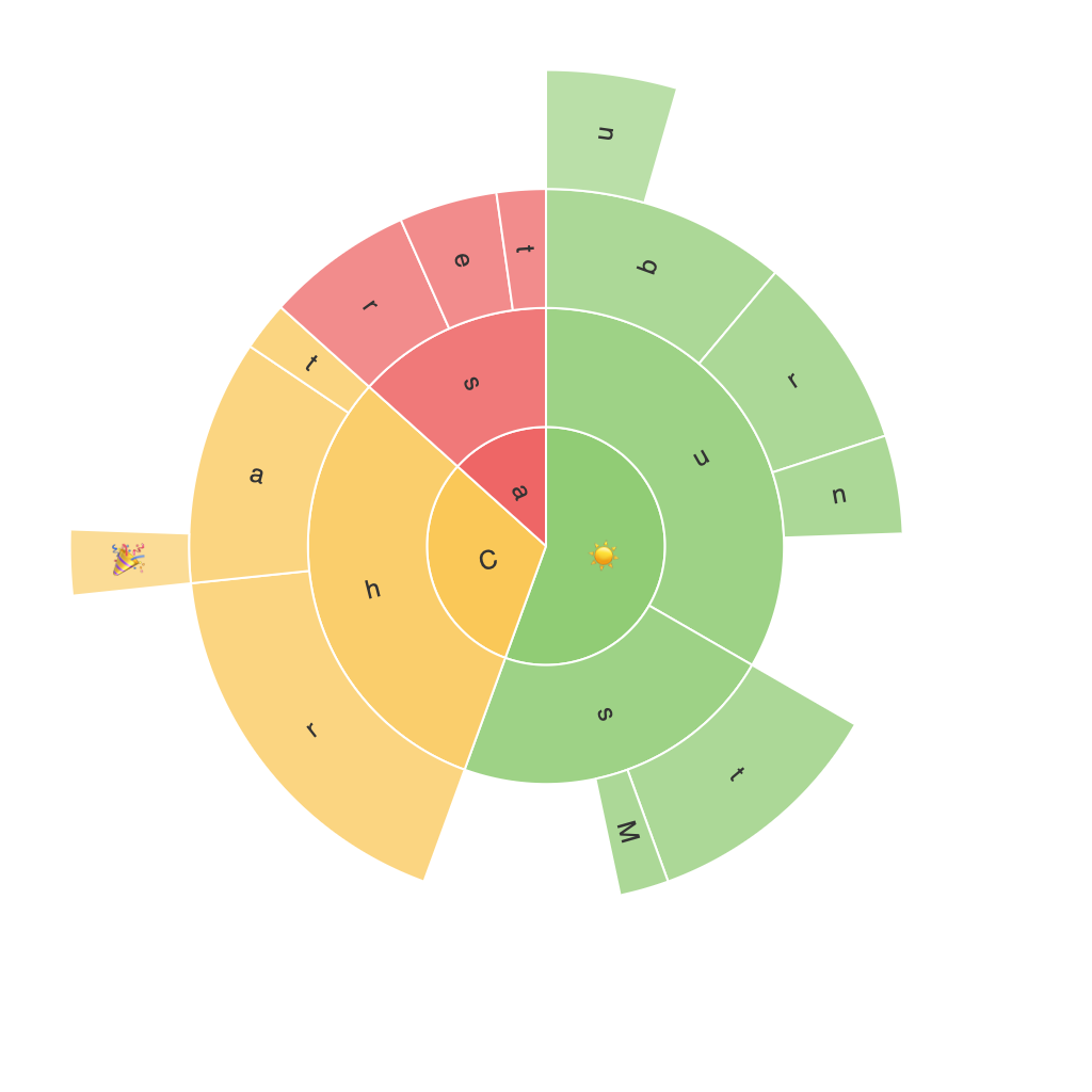
Sunburst charts represent hierarchical data with concentric circles, where the hierarchy is displayed in a radial layout, and each slice can contain child slices and potentially further levels. This nested structure is particularly advantageous for depicting categories at different levels of a hierarchy. A central circle usually represents the root of the hierarchy, and the subsequent rings represent the child categories within this root, expanding outward to encompass more detailed levels of subcategories.
Components of a Sunburst Chart
1. **Root Circle:** The primary circle at the center of the sunburst chart serves as the root node of the hierarchical data. It may be labeled with a top-level category or the highest-level identifier.
2. **Inner Rings:** As we move outward, concentric circles represent child entities. Each of these rings is labeled with a specific category, and its area is proportional to the metric value assigned to it, usually representing a measure of importance or quantity.
3. **Sectors & Area:** The segments within each ring correspond to the subcategories or children nodes of the parent category. The size of these sectors is proportional to the measure value associated with that subcategory, providing a visual comparison of the relative importance of each node within its parent category.
4. **Subslices:** These are sectors within an outer ring that are in turn assigned to a category that is a direct child of the outer ring’s parent.
Using Sunburst Charts
The application of sunburst charts spans numerous industries, from business analytics to education, where hierarchical data is common.
1. **Business Intelligence:** Sunburst charts excel in summarizing organizational structures, department budgets, or the sales distribution by type, region, and amount. This visualization allows for clear identification of major contributors and enables strategic decision-making.
2. **Project Management:** For projects with multiple tasks and stages, sunburst charts provide a structured view of the hierarchy, showing which tasks contribute significantly to the project’s completion.
3. **Education:** In educational settings, they can depict the hierarchical structure of subjects and sub-areas, or break down student performance across different categories, offering educators a clear perspective on subject strengths and weaknesses.
4. **E-commerce:** Analyzing product categories, subcategories, and sales breakdowns can be effectively represented through sunburst charts. This visualization aids businesses in optimizing inventory and marketing strategies.
Creating Sunburst Charts
Creating a sunburst chart typically involves the following steps:
1. **Data Preparation:** Gathere hierarchical data, organize it into a structured format like a tree structure. Ensure that the data is in a suitable format for your chosen visualization tool.
2. **Select Visualization Tool:** Utilize tools such as Tableau, PowerBI, or native programming libraries (e.g., Plotly, Matplotlib) for automated chart creation. Some tools may offer drag-and-drop interfaces for simpler setup, while others might require more complex custom coding.
3. **Mapping Data to Visual Elements:** In a visualization tool or through code, connect the dataset to the chart. Assign dimensions to different aspects of the chart, such as dimensions to labels, metrics to the radius, and aggregations to the size for subcategories.
4. **Customization:** Personalize the chart to enhance readability and aesthetics with different color schemes, labels, tooltips, and interactive features. Custom legends, gridlines, and other elements can be added to provide more clarity and precision.
Conclusion
The sunburst chart is a versatile and intuitive option for visualizing hierarchical data, offering a comprehensive understanding of complex structures through its clear radial layout and area-based comparisons. By integrating sunburst charts into data analysis and reporting, users are better equipped to identify trends, opportunities, and insights within large datasets with a visual narrative. With this guide, you should be ready to apply sunburst charting techniques and unlock valuable insights from hierarchical data.
