Unlocking Insights with Sunburst Charts: A Comprehensive Guide to Data Visualization and Interpretation
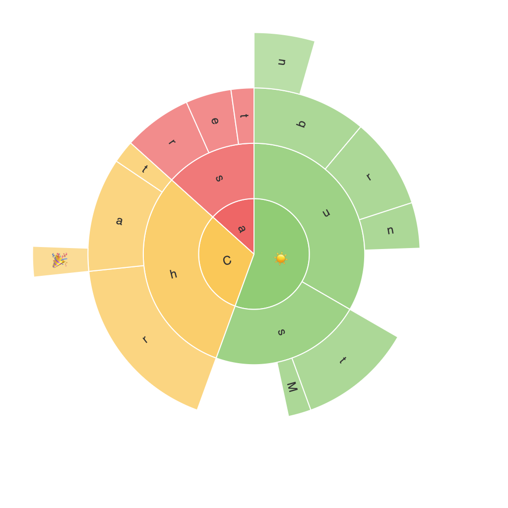
Sunburst charts are a lesser-known, yet extraordinarily powerful method of visualizing hierarchical data. These sophisticated yet straightforward graphical representations offer a unique perspective that can significantly enhance the understanding and interpretation of complex information, be it internal organizational structures, product categories, sales revenue, or any other multi-layered data set. In this guide, we will explore the workings, benefits, best practices, and advanced techniques of sunburst charts, showcasing its potential in data visualization and interpretation.
### Understanding Sunburst Charts
Sunburst charts are a type of multilevel radial tree diagram. They display hierarchical data through concentric rings, with each ring representing a different level of the hierarchy. The segments within each ring represent the children within each parent category, visualized in proportional sizes to their relative values. This unique layout allows for the representation of large hierarchical data sets in a comprehensible manner, distinguishing and emphasizing the relationships between categories and subcategories.
### Key Components of Sunburst Charts
1. **Rings**: The hierarchical structure is represented through rings, where each successive ring represents a level deeper into the data. The outermost ring typically depicts the top-level categories, leading into more detailed subcategories within the inner rings.
2. **Segments**: The sections within rings correspond to categories at different levels of the hierarchy. Each segment’s size indicates the proportion of the total quantity in its parent category, facilitating an intuitive understanding of the composition.
3. **Labels and Legends**: Essential for clarity, labels identify the specific elements of the hierarchy, while legends may offer additional context or explanations for the data’s categorization.
4. **Color Coding**: Colors are used to differentiate between various categories within the hierarchy, enhancing readability and aiding in data comparison. Consistent and meaningful color schemes are crucial for effective communication throughout the chart.
### Benefits of Using Sunburst Charts
“`bullets
– **Hierarchical Visibility**: Sunburst charts allow for easy visualization of nested categories, providing a clear structure of the whole and its components.
– **Comparison Ease**: The segment sizes make it simple to compare quantities within each level, highlighting disparities and similarities without numerical values.
– **Space Efficiency**: They use space efficiently, offering a compact way to represent large amounts of data in a single view, making complex data more accessible.
– **Enhanced Detail Discovery**: The interactive nature of these charts when available, enables users to drill down into details, uncovering insights that might be missed in less dynamic visualizations.
“`
### Best Practices and Advanced Techniques
1. **Simplification**: Avoid clutter by limiting the hierarchy to no more than three to four levels. This prevents the chart from becoming too complex and overwhelming to interpret.
2. **Color Stratification**: Use a consistent color scheme to prevent visual confusion. Introduce a gradient across each level to distinguish between broad categories and their subcategories.
3. **Interactive Elements**: Utilize tooltips, touch interactions, or zooming features to enhance user experience. This allows viewers to explore deeper levels of the hierarchy at their own pace.
4. **Dynamic Data**: Enable data sorting and filtering for dynamic navigation through the hierarchy. This can significantly improve the usability and relevance of the chart for decision-making processes.
### Conclusion
Sunburst charts are an invaluable tool in the arsenal of data visualization, offering a unique perspective on hierarchical data that enhances both the presentation and the interpretative exploration of complex information. Through strategic design and careful consideration of implementation, these charts can effectively guide insights from large data sets, making them an indispensable choice for analysts, business managers, and decision-makers alike.
