Unlocking Insights with Sunburst Charts: A Comprehensive Guide to Data Visualization and Analysis
Sunburst charts, also known as sun charts, are powerful tools for data visualization and analysis, offering a distinctive way to present hierarchical data in a visually appealing, easy to interpret format. This comprehensive guide aims to reveal the intricacies of sunburst charts, their benefits, and best practices for their effective use in deepening insights into complex data structures.
## Introduction to Sunburst Charts
### Characteristics and Structure
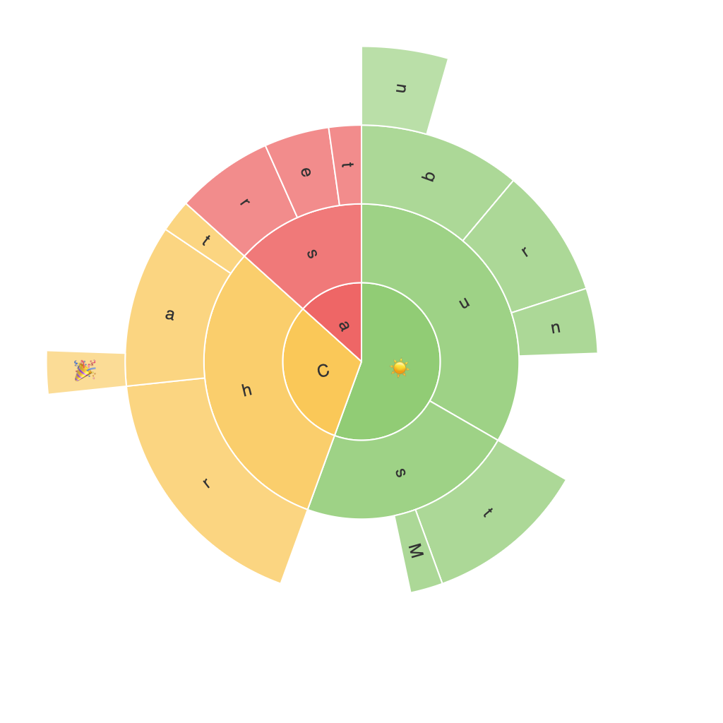
Sunburst charts consist of a circle with nested rings arranged radially, each ring representing a hierarchical level in the data set. The data at each level is further divided into segments, each segment representing an entity or subset within that hierarchical tier. This layered structure allows for a clear visual differentiation and comparison across different levels of data granularity.
### Key Benefits
1. **Hierarchical Information Clarity**: Sunburst charts effectively display the hierarchical relationships within data, making it easy to identify and understand the structure at a glance.
2. **Easy Comparison**: By visualizing data across multiple levels, comparisons between categories and sub-categories become straightforward, providing insights on which branches are dominant or underrepresented.
3. **Data Density**: Sunburst charts can pack a lot of data into a small space, making them suitable for datasets with multiple levels of hierarchy without sacrificing readability.
### When to Use Sunburst Charts
Sunburst charts are particularly useful in scenarios where data is structured hierarchically, aiming to explore the distribution and relationships between different entities. They are ideal for visualizing data that follows a categorization into smaller categories, each having its own subcategories, thus providing an excellent framework for understanding aspects like taxonomies, information structuring, or user navigation pathways on websites.
## Data Preparation and Visualization
### Data Structuring
To effectively represent your data with a sunburst chart, it must first be structured hierarchically. This means having your information in a format that includes a parent-child relationship, ensuring each data point knows to which higher-level category it belongs.
### Designing and Customizing
Once your data is in the correct format, you can now design your sunburst chart. This involves:
– **Choosing Axes and Layers**: Typically, the outermost ring represents the top-level categories, with each subsequent ring detailing the next level of data decomposition. Colors can be used to represent different attributes or categories.
– **Utilizing Interactivity**: Interactive features, such as hover labels or deep drill-downs, can greatly enhance user experience by allowing them to explore detailed information without cluttering the chart itself.
– **Labeling and Legends**: Clear labels and legends are critical to avoiding confusion and ensuring the chart’s interpretability. Hierarchical labels can be customized to include meaningful descriptions at each level.
### Tools for Creation
### Popular software and platforms like Tableau, Power BI, and Python libraries (such as Plotly and Matplotlib) offer tools to build and customize sunburst charts.
## Analyzing and Interpreting Sunburst Charts
### Trend Identification
Sunburst charts excel at showing trends through the size and color variations of segments. Larger segments indicate higher values, while colors can indicate different attributes, making it easy to spot dominant components and key patterns.
### Comparative Analysis
Comparative analysis becomes a straightforward task when dealing with hierarchies. By visually observing the relationships and sizes of segments across various levels, one can identify which segments contribute more significantly to the total, allowing for a nuanced understanding of data relationships.
### Storytelling
Embedded within the data structure of a sunburst chart, there lies a narrative to be told. Connecting the dots across different levels can reveal stories about data, helping to uncover insightful narratives that might not be as apparent in tabulated data.
### Example
**Application in Marketing**: For a business, a sunburst chart might illustrate customer segments and their spending behavior across different product categories. It could show that while a significant portion of total revenue comes from young, tech-savvy customers, those in the luxury goods category might attract a smaller, but more lucrative segment.
## Best Practices
### Use with Caution
While sunburst charts are visually engaging and insightful, they should be used judiciously. Ensure that charts are not overly complex, which might confuse the viewer. Also, for very large datasets, other types of charts, such as treemaps, might be more suitable.
### Accessibility Considerations
Always design charts with accessibility in mind. Include sufficient contrast, meaningful tooltip texts, and a logical label hierarchy. Provide alternative text descriptions that convey the same information but are text-based.
### Aesthetics Matter
Color plays a critical role in the readability and impact of sunburst charts. It should be used wisely to reflect different attributes (e.g., categories, values, trends), while maintaining visual coherence. Consider using a color palette that avoids too much color variation at the same level to maintain clarity.
### Conclusion
Sunburst charts provide a unique way to visualize and analyze hierarchical data. They are particularly advantageous when dealing with complex, structured data sets, offering a dynamic and engaging method for data representation that can significantly enhance the understanding and communication of hierarchical relationships. By following best practices in data preparation, visualization design, and analysis, you can harness the power of sunburst charts to unlock valuable insights and craft compelling narratives from your data.
In conclusion, as with every tool in data visualization and analysis, the effectiveness of a sunburst chart depends on how well it is tailored to the specific task, the audience it’s intended for, and the insights one wishes to communicate or uncover.
