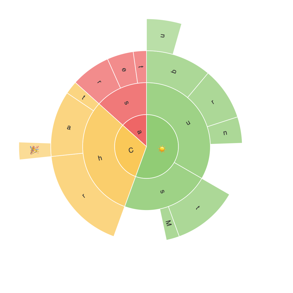
**Unlocking Insights with a Sunburst Chart: A Comprehensive Guide to Visualization and Data Analysis**
Sunburst charts are an advanced visualization tool that can unlock significant insights from complex hierarchical data sets. By providing a layered, visually intuitive representation of your data, these charts make it easier to grasp relationships, patterns, and trends that might be obscured in tabular formats. In this guide, we will explore how to effectively use and analyze data with sunburst charts, step-by-step.
### **Introduction to Sunburst Charts**
Sunburst charts, also known as sun charts, are radial tree diagrams that visualize hierarchical data with concentric circles. Each level of the hierarchy is represented by a ring, with the central ring showing the highest level of categories, and outer rings representing subsequent levels.
### **Benefits of Using Sunburst Charts**
1. **Hierarchical Clarity**: Sunburst charts excel in visualizing multi-level data, making it easy to understand complex relationships at each level of the hierarchy.
2. **Visual Intuition**: Categorization and breakdowns are presented in an easily digestible format, reducing the need for textual descriptions.
3. **Space Efficiency**: By laying out data radially, these charts make optimal use of space, displaying a large amount of data without overcrowding the graph.
4. **Distinctive Visualization**: The color and size of segments help in distinguishing between different categories and subcategories, enhancing data analysis.
### **Key Components of a Sunburst Chart**
Understanding the components of a sunburst chart is crucial for interpreting the data effectively:
– **Edges (Roots and Branches)**: Each edge connects nodes and segments them to parents, forming the hierarchical structure.
– **Nodes (Categories)**: Represents the categories at each level of the hierarchy, with nodes serving as the building blocks.
– **Segments (Slices)**: Indicate subcategories within each node, showing their contribution to the total.
### **Creating a Sunburst Chart**
**Step 1: Prepare Your Data**
Gather or import your hierarchical data into a compatible data analysis tool such as Tableau, PowerBI, or any data visualization software. Ensure your data is structured correctly; the most common format for a sunburst chart includes a nested data structure with fields for root categories, categories, and values.
**Step 2: Select the Sunburst Feature**
Navigate to the visualization options in your tool and select the sunburst chart. This action typically involves dragging the root categories to the appropriate dimensions.
**Step 3: Configure Levels**
Customize your chart by adding, removing, or reordering levels of the hierarchy. This step helps in visualizing the structure at different depths, depending on what insights you wish to explore.
**Step 4: Display Values and Aggregation**
Decide how you want to display values for each segment, whether by percentage, count, or other aggregation methods, and ensure the chosen representation accurately reflects the data’s characteristics.
**Step 5: Apply Colors and Patterns**
Utilize color to differentiate between nodes, segments, or to highlight specific data points. Patterns or textures can also add visual interest and further distinguish elements.
**Step 6: Analyze and Customize**
Once your chart is built, zoom into individual segments, compare different levels of the hierarchy, and explore how changes in data affect the chart’s visualization. Fine-tune the design to improve readability and aesthetic appeal.
### **Insight Extraction**
To effectively use a sunburst chart for data analysis, focus on the following aspects:
– **Parent-Child Relationships**: Understand how different categories are nested and influence each other. This dynamic can reveal hierarchical dependencies or outliers in your data.
– **Segment Contributions**: Pay attention to the size and color of segments within each node to identify key contributors or areas needing further investigation.
– **Trend Observation**: Analyze how patterns evolve across different levels. Tracking changes over time can uncover growth, decline, or cyclical behaviors within your data.
### **Conclusion**
Sunburst charts are a versatile tool for presenting and analyzing hierarchical data. By visualizing data in a way that enhances clarity and provides quick insights, they help in making complex information more accessible. With practice and strategic use, you can leverage these charts to gain deeper understanding and make informed decisions based on your data analysis.
