Unlocking Insight with Sunburst Charts: A Comprehensive Guide to Visualization and Data Interpretation
In the realm of data display, the quest for a concise, understandable representation of complex datasets is an eternal challenge. Among various data visualization techniques, sunburst charts have emerged as an innovative tool for illuminating the hierarchical structure of data. This article takes you through a comprehensive guide to understanding sunburst charts, their usage, benefits, and best practices to create insightful representations of complex datasets.
### What are Sunburst Charts?
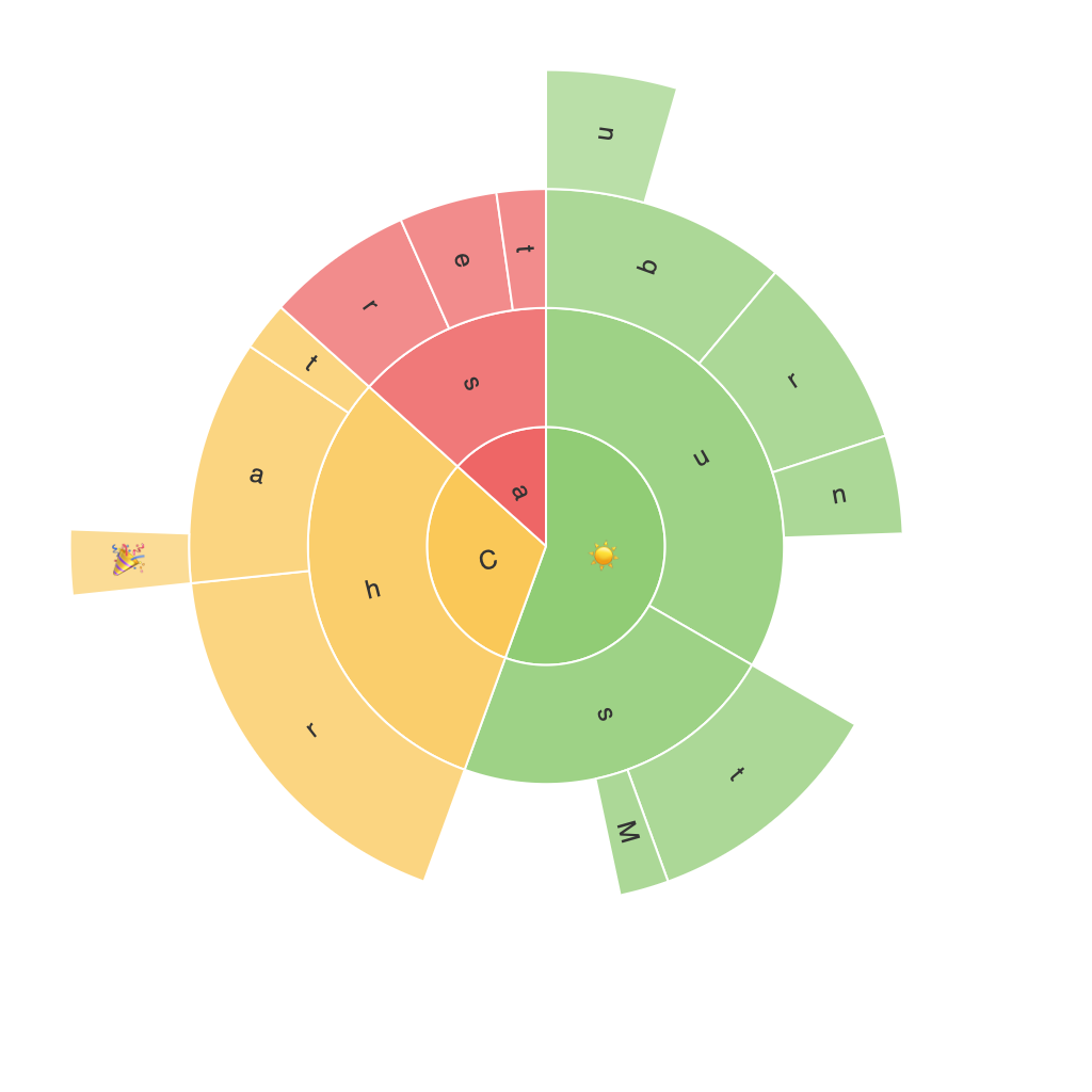
Sunburst charts, also known as ring charts, hierarchical pie charts, or multi-level pie charts, are radial visualizations that map multilevel data structures. They are excellent at representing hierarchical categories across multiple levels, with each category having a corresponding area radius, showing the importance based on data values. Every ring represents a level in the hierarchy, with categories nested within each other.
### Components of a Sunburst Chart
1. **Innermost Ring:** Typically represents the top level of the hierarchy.
2. **Middle Rings:** Depict the intermediate levels, nesting within the top.
3. **Outer Ring:** Often represents the deepest level in the hierarchy, where individual data points or leaf nodes can be found.
4. **Segments:** Each sector (or segment) in the rings represents a subcategory. Sizes of the segments are proportionate to the attribute’s value or quantity.
5. **Labels and Legends:** These provide clear identification of categories and their values, enhancing the readability and interpretability of the chart.
### Advantages of Sunburst Charts
1. **Hierarchical Organization:** They naturally handle hierarchical data, allowing users to visualize and understand relationships between categories on different levels.
2. **Data Depth**: With nested rings, these charts can represent data with many layers, providing depth and detail in analysis.
3. **Trend Visualization:** They make it easy to trace the flow of data from higher to lower levels, showcasing patterns and trends effectively.
4. **Comparative Analysis:** By displaying similar colors and values across rings, users can more easily compare categories between different levels.
### How to Create Sunburst Charts
– **Software Selection:** Many data visualization tools such as Tableau, Power BI, Qlik, and Python libraries like Plotly, and Matplotlib offer functionalities to create sunburst charts.
– **Data Preparation:** Ensure your dataset is in a hierarchical format, often structured as a JSON or CSV file with a clear indication of parent-child relationships.
– **Configuration:** Set up the chart by specifying which column(s) represent the hierarchy, which to denote categories, and potentially colors to visualize different attributes.
– **Customization:** Tailor the aesthetics to ensure clarity and readability; consider using contrasting colors for different levels, adjusting font size, and enhancing readability through animations.
### Best Practices and Tips
– **Prioritize Information:** Keep the chart simple by avoiding too many levels. Start with the most significant hierarchical relationships to ensure key insights are not overlooked.
– **Use Color Wisely:** Employ distinct colors for each level or specific categories to enhance visual contrast and facilitate the differentiation of data points.
– **Label Carefully:** Avoid overcrowding the chart by placing labels carefully. Use meaningful, concise labels and consider an alphabetical sort for categories in each level to improve navigation.
– **Interactive Features:** Utilize tooltips, zoom features, and drill-down capabilities to allow users to explore the data in-depth without compromising the overall chart’s simplicity.
### Conclusion
Sunburst charts offer a visually engaging and insightful way to visualize hierarchical data, making complex datasets more comprehensible. They provide not only a clear depiction of the distribution of items across different categories but also their relationships, strengths, and importance within a structure. By following the guidelines, tips, and best practices, you can create effective, informative, and aesthetically pleasing sunburst charts that effectively communicate your data’s story.
