Unlocking Data Insights with Sunburst Charts: A Guide to Enhanced Visualization and Analysis
In an era of immense data production and increasing pressure to make decisions based on data, the visual representation of that data plays a crucial role in understanding trends, patterns, and relationships. One such visualization tool that has gained popularity in recent years for its ability to handle hierarchical data is the sunburst chart. In this article, we’ll explore the principles behind sunburst charts, their benefits, implementation, and how you can leverage them to enhance your data analysis capacity.
**Understanding Sunburst Charts**
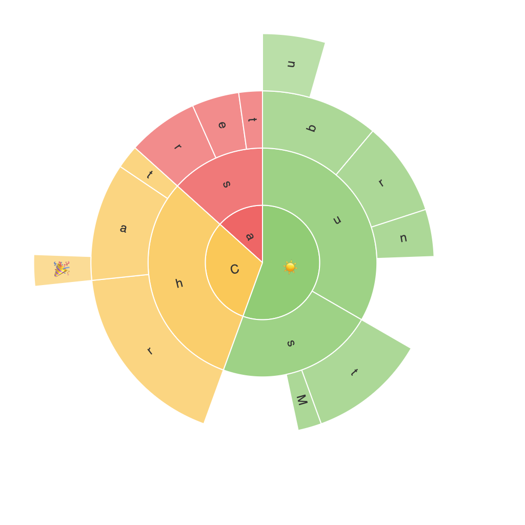
A sunburst chart is a type of radial tree diagram used for multilevel data visualization. It starts with a circle where each radial spoke represents a higher level category, and segments within these spokes represent subcategories within the parent category. This structure continues down the hierarchy, forming a sun-like radiation pattern.
**Key Components of a Sunburst Chart**
1. **Rings**: The rings in the center of the sunburst chart represent different hierarchical levels of the data. The outermost ring is usually the first hierarchical level, and as you move inward, you encounter deeper levels of categorization.
2. **Segments**: Each segment on the spokes of the rings represents a category and its percentage of the total or specific value. Segments can be color-coded to distinguish between different categories or to highlight specific segments based on their size or their relationship to other segments.
3. **Labels**: Both circular labels and spoke labels provide information about the segments, making the chart easier to interpret. This labeling helps in explaining the context of each segment within its hierarchical level.
**Benefits of Using Sunburst Charts**
1. **Hierarchical Data Visualization**: Sunburst charts excel at visualizing data in hierarchical structures, making it easier to understand the relationships between parent and child categories.
2. **Comparison and Contrast**: With its layered structure, sunburst charts help in easily comparing the size of different categories and their relationships with each other, which is particularly useful when comparing multiple data sets.
3. **Space Efficiency**: Compared to traditional area charts or tree maps, sunburst charts use minimal space and clutter the visual space efficiently, making them a great choice for compact dashboards or when presenting data in a limited amount of screen real estate.
4. **Color Coding and Highlighting**: The use of color to differentiate segments and highlight important data allows for quick identification and comparison. This feature is especially beneficial when highlighting key metrics or categories within the data hierarchy.
**Implementing Sunburst Charts**
Implementing a sunburst chart involves several steps, often requiring data preparation and the use of visualization libraries or tools. Here’s a general approach:
– **Data Preparation**: Start by structuring your data in a hierarchical format. This involves creating a parent-child relationship that defines the categories and their subcategories.
– **Choosing a Visualization Tool**: Depending on the tools you are comfortable with, you might opt for a library like D3.js, Plotly, or even use data visualization tools built into BI platforms such as Tableau or Power BI.
– **Coding or Configuring**: If using a code library, you would write a script that loads your data, constructs the sunburst chart, and adjusts the settings such as colors, labels, and layout. For visualization tools, you would typically follow a series of steps within the software interface to input your data and design your chart.
– **Customization and Enhancements**: Tailor the chart to your needs by adding tooltips, interactivity, or adjusting colors and layout based on your specific requirements.
– **Review and Feedback**: Before finalizing the chart, review it for clarity and coherence. Consider user feedback on both the aesthetics and legibility of the chart, and make adjustments accordingly.
**Conclusion**
In summary, sunburst charts offer a unique and effective way to visualize and analyze hierarchical data. By enhancing your ability to compare and contextualize categories, they optimize space efficiency and offer powerful insights at various levels of the data hierarchy. Regardless of the specific tool or language you use, the principles of structure, color, and scale in a sunburst chart can significantly improve the way you understand, communicate, and interact with hierarchical data. So, whether you’re visualizing operational data, organizational structures, or complex business strategies, consider incorporating sunburst charts to unlock new insights and enhance your data storytelling.
