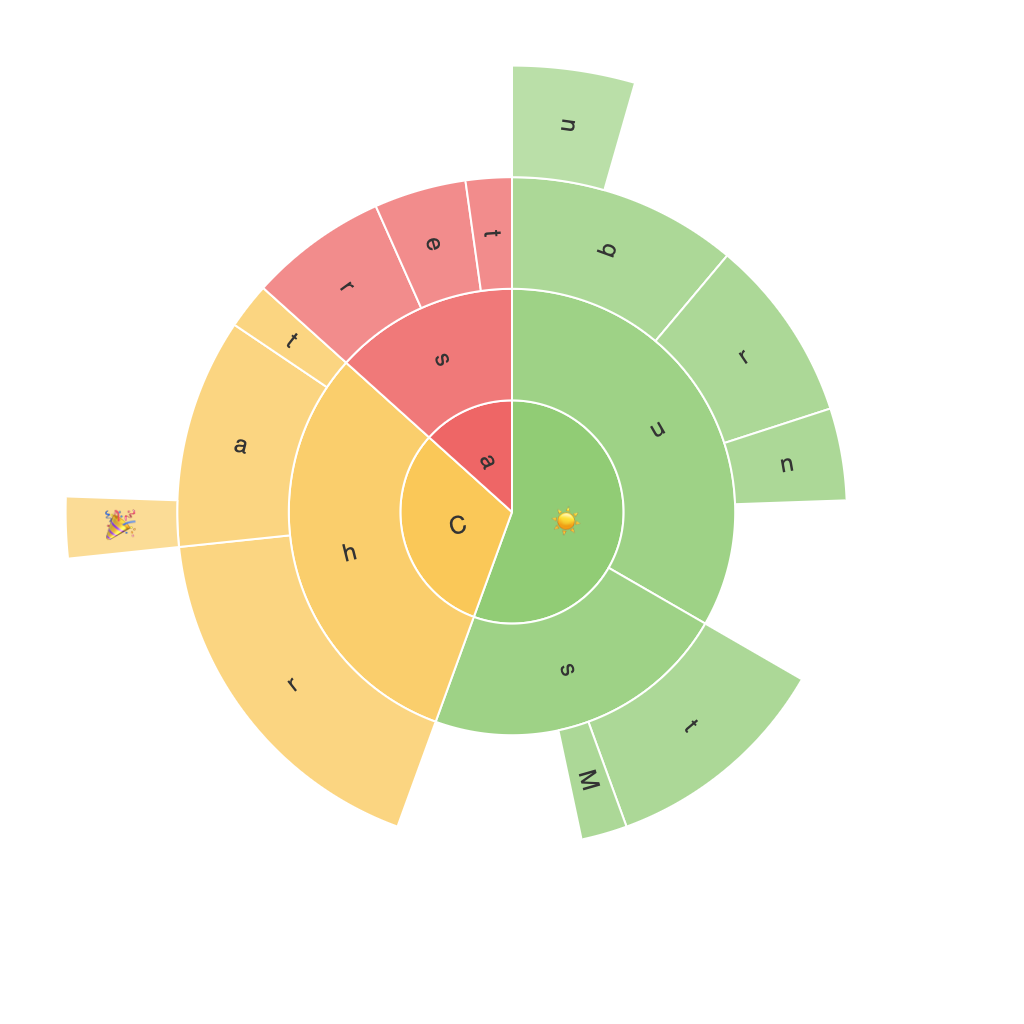
Unleashing Visual Insights: A Comprehensive Guide to Mastering Sunburst Charts
In the wide world of data visualization, finding the right tools to articulate complex data efficiently can make all the difference. Among these, the sunburst chart holds a special charm, offering a clear, hierarchical breakdown of data in an engaging, space-saving format. It’s perfect for representing data with multiple levels of organization, from the macro to the micro, making it incredibly useful in fields that deal with large datasets, such as finance, business analytics, information systems, and more. This guide aims to provide you with a comprehensive overview of sunburst charts, including their key features, their uses, their benefits, and practical tips on how to implement them effectively.
### What Are Sunburst Charts?
Sunburst charts, also known as sun charts, sun charts, or ring charts, are pie chart variants used for displaying hierarchical data. Essentially, they’re a radial diagram that allows the representation of data in several dimensions. Typically, a sunburst chart is constructed by stacking concentric circles (rings) in a radial form, with each ring representing a node in the hierarchy. It’s a visual tool that encourages deeper investigation into your data’s structure, making the information more digestible and engaging than many other static visualization methods.
### Key Components of Sunburst Charts
– **Root Node**: The largest circle, representing the top-level category or root of the hierarchy.
– **Child Nodes**: Circles within the root node, each representing a subcategory or category directly under the root.
– **Leaf Nodes**: The smallest circles, which represent the leaves or the final categories or individual items in the hierarchy.
– **Segments (Slices)**: These are the rays extending from the circle’s circumference, denoting the proportion of each category in comparison to the whole.
– **Color Coding**: Typically used to differentiate between categories, enhance data differentiation, and even reflect data values.
### Benefits of Sunburst Charts
### Visualization of Hierarchical Data:
Sunburst charts effectively illustrate hierarchical relationships between categories, such as the categories belonging to different categories, making them ideal for displaying data with significant depth and complexity.
### Space Efficiency:
They are a compact way to visualize multiple levels, utilizing the same radial space to represent diverse categories, making it perfect for desktop and mobile layouts.
### Data Insights:
By layering the data rings, detailed insights can be easily identified, aiding in the understanding of category compositions and the performance of each layer within the hierarchy.
### Customization and Aesthetics:
Their aesthetic appeal varies from plain and functional to highly customized, which can enhance data presentation and improve user engagement.
### Implementation Tips
#### Choose the Right Tool:
To begin, select the appropriate software or tool. Popular platforms such as Tableau, Power BI, and Python libraries like Matplotlib or Plotly offer powerful features for designing and implementing sunburst charts, catering to a range of technical proficiency levels.
#### Simplify and Organize Your Data:
Ensure your data is structured hierarchically – each node should distinctly represent a category, and its position should reflect its relationship to other categories, making data arrangement key to clear visualization.
#### Use Appropriate Colors:
Choose a color scheme that enhances readability and differentiates between categories effectively. However, avoid overusing colors that might make the chart overwhelming.
#### Highlight Key Data Points:
If necessary, highlight specific data points on the chart to draw attention, perhaps by using dynamic elements like tooltips, highlighting segments, or using animated transitions.
#### Optimize for Accessibility:
Ensure your chart is accessible to visually impaired users by providing detailed descriptions in the form of tooltips, alt texts, or legends.
### Conclusion
Sunburst charts are a sophisticated yet accessible way to present hierarchical data, offering a unique blend of clear, detailed visualization and space-saving design. As you navigate through the complexities of your data, these versatile charts can illuminate insights you might not uncover otherwise, making them an indispensable tool in the modern data analysis toolkit. Whether in business analytics, information management, or research, sunburst charts have become indispensable for their ability to simplify complex hierarchical structures and reveal insightful patterns, supporting informed decisions and better understanding of data in a visually intuitive way.
