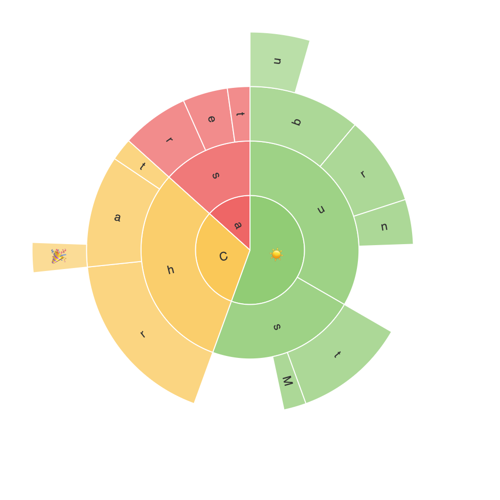
Title: Unleashing the Power of Visualization: Exploring the Detailed World of Sunburst Charts
Introduction
Visualization is the art and science of presenting complex data in a format that enhances understanding through the use of graphical representations. One such impactful method that utilizes this principle to provide a clear overview while highlighting critical data points is the Sunburst chart. This article aims to explore the power and versatility of Sunburst charts as a tool to delve into the intricate aspects of data, elucidating different configurations and their practical applications.
Understanding the Basics
A Sunburst chart, also known as a radial tree chart, is a circular data visualization that radiates out from a central point, representing hierarchical data. Each level of the hierarchy is depicted as a ring, with sectors at each level representing category members. This structure allows for the depiction of multiple dimensions within the data, making it a versatile tool for complex datasets.
Advantages of Sunburst Charts
Sunburst charts present a plethora of benefits for data analysts:
1. **Hierarchical Insight**: With its circular structure, it easily visualizes the hierarchical structure of data, making it simple to navigate through different levels of categories.
2. **Comparative Analysis**: By assigning color, size, and angle to sectors and sub-sectors, Sunburst charts offer a visually intuitive way to compare different categories or data segments.
3. **Versatility**: Sunburst charts can effectively handle large numbers of categories without becoming cluttered or confused, making them suitable for numerous applications in various fields.
4. **Space Utilization**: Due to its circular shape, these charts save space, making them an efficient option for layout considerations when presenting charts within limited space, such as dashboards or reports.
5. **Data Complexity Management**: The layered structure allows for the representation of multiple attributes in a compact layout, helping manage the visualization of multi-dimensional data.
Practical Applications and Examples
Sunburst charts find widespread application across different industries, enhancing the comprehension of complex datasets:
1. **E-commerce Analytics**: Retailers often use Sunburst charts to visualize the breakdown of sales at different levels of classification, such as customer segments, product categories, and geography. This helps identify which product categories are most profitable in each region.
2. **Healthcare**: In analyzing patient data, health professionals can use Sunburst charts to categorize patients based on demographics, diagnosis, treatments, and outcomes to identify trends and make informed decisions.
3. **Financial Analysis**: Financial institutions apply Sunburst charts to illustrate the hierarchy of debt, equity, revenue, and expense categories within a portfolio, allowing for a clear understanding of financial health across various dimensions.
4. **Marketing Strategy**: For market segmentation and understanding the impact of various marketing strategies, Sunburst charts help visualize how sales or customer engagement are distributed across different product or service categories, helping strategize and optimize investment.
5. **Project Management**: During project portfolio analysis, Sunburst charts can represent the hierarchy of projects, their budgets, time frames, and risks, aiding in resource allocation and prioritization.
Challenges and Limitations
Despite their effectiveness, there are challenges and limitations associated with Sunburst charts:
1. **Data Clutter**: When too many categories are represented, especially at deeper levels, the chart can become cluttered and hard to read. It’s crucial to have a clear hierarchy and use filtering or zoom functions effectively.
2. **Understanding Complexity**: The circular layout can provide a steep learning curve for users unfamiliar with this or similar visual representations. It may require additional explanation or interactive elements to enhance comprehension.
3. **Limited Tool Support**: Not all visualization tools offer comprehensive support for Sunburst charts, which could limit their implementation, especially during the initial data exploration phase.
Concluding Thoughts
The Sunburst chart stands as a powerful visualization tool for uncovering insights within hierarchical data. By enabling the clear representation of multiple dimensions and offering an intuitive and space-efficient layout, it significantly enhances data comprehension for both analysts and consumers. Whether tackling complex datasets in finance, healthcare, or any other domain, the Sunburst chart remains a beacon for effective data storytelling.
Despite the challenges it poses to users, the benefits far outweigh the difficulties, making it a valuable asset in the ever-growing landscape of data visualization techniques.
