Unleashing the Power of Visual Insights: A Comprehensive Guide to Understanding and Mastering Sunburst Charts
Sunburst charts are a visually captivating way to present hierarchical data on a disk. This type of visualization is like a radial treemap or a pie chart but offers more detailed insights into the structure and composition of your data points. Whether you are a seasoned data analyst or new to data visualization, understanding the ins and outs of sunburst charts can elevate your ability to communicate complex information effectively. In this comprehensive guide, you will learn how to master and utilize sunburst charts to unlock valuable insights from your data.
### 1. **Understanding the Structure**
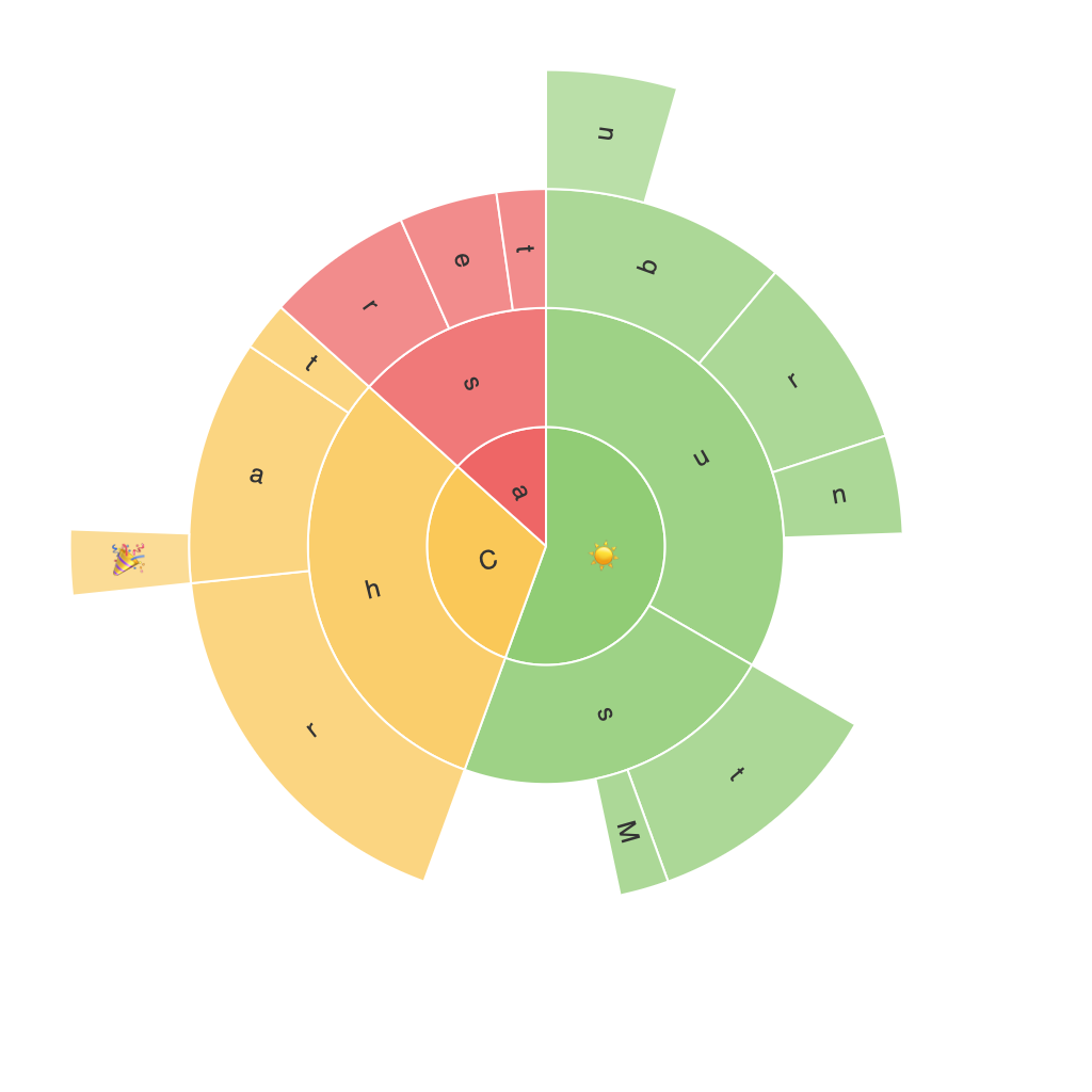
A sunburst chart displays a hierarchy in a layered format, with the primary category at the center and successive subcategories radiating outward like petals. Each segment’s size represents the proportion of that category, and colors are often used categorically to distinguish between different levels. This structure makes it easy to see the breakdown of each category within its parent category.
### 2. **Benefits of Sunburst Charts**
### 3. **Benefits of Sunburst Charts**
**Versatility in Data Presentation:** Sunburst charts can handle multi-level data, making them suitable for organizations with a hierarchy of responsibilities or a complex data structure.
**Enhanced Visualization:** The radial layout allows viewers to easily see the proportion of each subcategory relative to its parent, providing insights that linear treemaps or pie charts can’t easily convey.
**Comparison and Contrast:** With their hierarchical design, sunburst charts facilitate comparisons among different levels and categories, highlighting similarities and differences.
### 4. **Best Practices for Crafting Effective Sunburst Charts**
– **Prioritize Clarity:** Ensure that the chart’s structure is clear and logical. Avoid too many levels that might obscure meaningful patterns.
– **Use Descriptive Labels:** Label each segment carefully. For long hierarchies, consider using more descriptive labels to avoid overcrowding the chart and make it harder to read.
– **Color Coding:** Use color to differentiate between categories (e.g., by department, location, or product line). Consistent color schemes can help viewers easily track the hierarchy and make quick comparisons.
– **Interactive Enhancements:** In digital formats, interactive links to each segment can help viewers explore the hierarchy in more detail, enhancing engagement and usability.
– **Limit the Depth:** It’s often recommended to keep the depth of the hierarchy to a manageable level, usually three to four levels at most, to maintain readability and understandability.
– **Annotations and Tooltips:** Use annotations or tooltips to provide additional context for complex data points. This feature is particularly useful for long labels or when detailed breakdowns are necessary.
### 5. **Common Pitfalls and How to Avoid Them**
– **Overcrowding:** Ensure that the chart is not too complex. Excessive data can obscure the hierarchy and make the chart less effective at communicating the intended insights.
– **Lack of Context:** Always accompany the sunburst chart with a clear explanation of the categories and the hierarchy. This context helps viewers understand the data more thoroughly.
– **Consistency in Scale and Layout:** Make sure the sizes of the segments are proportional to their values and keep the chart’s layout consistent across different platforms or in different views of your application.
### 6. **Tools for Creating Sunburst Charts**
– **Software and Online Tools:** Popular tools include Tableau, Qlik Sense, Power BI, and online chart generators such as Plotly or Google Charts, which support various types of visualizations, including sunburst charts.
– **Data Preparation:** Before creating your chart, ensure your data is clean, well-organized, and formatted correctly. This step is crucial for effective visualization and ensures minimal data loss during conversion to a chart.
By following these guidelines and best practices, you can harness the power of sunburst charts to effectively communicate your hierarchical data, making complex structures accessible to stakeholders, and enhancing your ability to reveal insights that drive meaningful action. Whether you’re diving into a business’s sales structure, analyzing a website’s navigation patterns, or exploring a corporation’s organizational hierarchy, sunburst charts offer a transformative way to visualize data, empowering you to optimize strategies, improve decision-making processes, and enhance overall data literacy.
