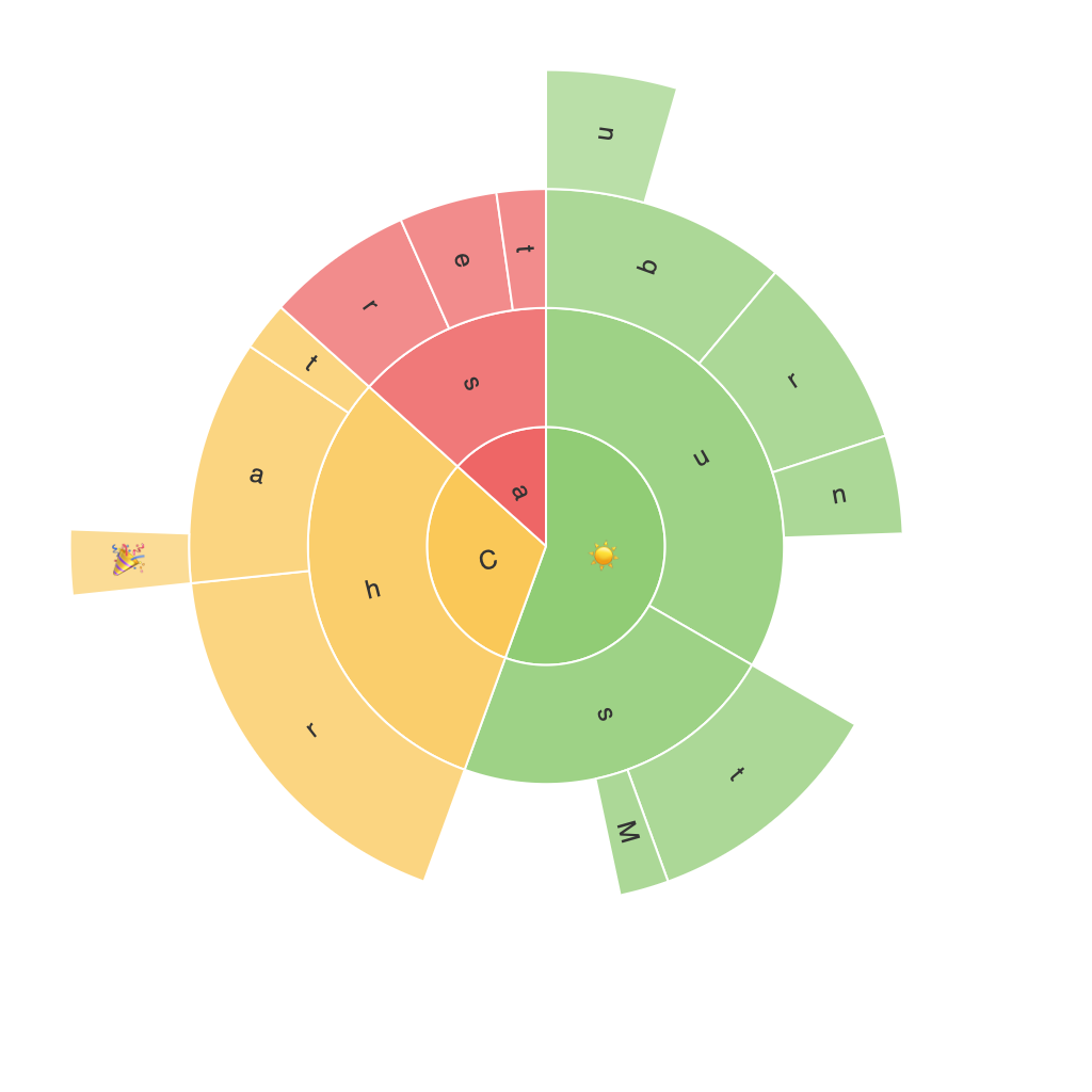
Unleashing the Power of Data Visualization: An In-depth Guide to Creating Effective Sunburst Charts
In the vast and ever-expanding universe of data visualization tools, the sunburst chart stands out as a powerful yet elegant solution for presenting hierarchical data in an intuitive, engaging manner. This guide delves into the intricacies and steps involved in creating effective sunburst charts, helping you make the most of this visualization type’s potential to convey complex information seamlessly.
### Understanding Sunburst Charts
Sunburst charts, also known as sun charts or multi-level treemaps, are circular diagrams that display hierarchical data. They consist of rings (or “sunbursts”) that represent categories, with child categories shown as segments within those rings. The radii of the rings are proportional to the level of hierarchy, with the largest circles representing the biggest categories, and smaller circles indicating subcategories or less significant divisions within the data.
### Benefits of Using Sunburst Charts
Sunburst charts offer several advantages over traditional tabular or tree-based data representations, making them an ideal choice in specific scenarios:
1. **Visual Clarity**: Sunburst charts provide immediate, visually intuitive insights into the structure of data and its hierarchical breakdown, making it easier to grasp relationships and proportions at a glance.
2. **Space Efficiency**: They utilize space efficiently, particularly in environments with limited display area, making it suitable for mobile devices or interactive dashboards.
3. **Comparison and Trends**: Users can easily compare values across different levels of the hierarchy, spotting trends and patterns that might be obscured in other visual formats.
4. **Engagement**: The circular and colorful nature of these charts can make them appealing and engaging, drawing more attention to the data and making it more memorable.
### Designing Effective Sunburst Charts
To create an effective sunburst chart, consider the following guidelines:
#### 1. **Simplicity is Key**
– Use a clear, clean layout to ensure that the data is easily understandable. Avoid cluttering the chart with excessive text or colors, focusing instead on highlighting key metrics or data points.
#### 2. **Labeling Wisely**
– Properly label segments and rings with concise but informative labels. Utilize tooltips or hover texts for extra details without overwhelming the viewer.
#### 3. **Proportional Scaling**
– Ensure the segments within each ring follow proportional scaling relative to their parent categories to maintain clarity and facilitate accurate comparisons.
#### 4. **Color Consistency and Contrast**
– Implement consistent colors for different levels and subcategories to maintain visual clarity. High contrast between colors can also enhance readability, especially in digital formats.
#### 5. **Interactive Elements**
– Integrate interactive features like clickable segments, tooltips, or animations to enrich the user’s experience. These features can guide users to explore the data further and discover insights that might not be immediately apparent.
### Applications of Sunburst Charts
Sunburst charts find their utility in various fields, including:
– **Business Intelligence**: For organizing and visualizing organizational structures, product hierarchies, or sales data across different categories.
– **Market Analysis**: To depict market segments, audience demographics, or product categories and their impact on total revenue.
– **Web Analytics**: Utilizing in dashboards to represent user navigation patterns, time spent on different sections of a website, or interaction frequencies.
### Conclusion
Sunburst charts, with their unique ability to visualize hierarchical data in a comprehensible and visually engaging manner, have proven indispensable in making complex data accessible to a wide audience. By adhering to the guiding principles of simplicity, effective labeling, proportional scaling, strategic color usage, and interactive design, you can harness the full potential of these charts to unlock valuable insights and foster a deeper understanding of your data. Incorporate these techniques into your data visualization toolkit and watch how the clarity of your data stories improves, ultimately enhancing decision-making and engagement with your audience.
