## Unleashing Insights with Sunburst Charts: A Comprehensive Guide to Visualization and Data Analysis
Sunburst charts, also known as radial treemaps, burst charts, segment treemaps, ring charts, or bullseye charts, are a unique and versatile tool to visualize hierarchical data in a circular format. These charts are particularly advantageous when dealing with datasets that have multiple layers of related categories, as they allow better understanding and comparison of data relationships and proportions.
### What are Sunburst Charts?
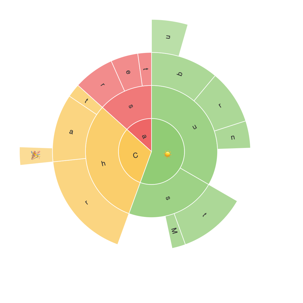
Sunburst charts present data as a hierarchical structure, arranged in concentric rings or disks. Each category in the hierarchy is represented by a ring, with its segments split to reflect the proportion of subcategories. This representation makes it easier to identify patterns, clusters, and outliers, especially in large datasets.
### Advantages of Sunburst Charts
#### Improved Visual Representation of Hierarchical Structure
Sunburst charts are highly intuitive in conveying the nested structure of the data through its concentric rings. This visualization makes it simple to discern the parent-child relationships among categories, thus presenting a more accessible and compelling way to display complex data.
#### Comparison of Totals and Sub-Totals
By visualizing data in rings of varying sizes that correspond to the total values at each level of the hierarchy, sunburst charts provide an effective platform for comparing the magnitude of categories and their subcategories. The proportional size and shape of segments quickly highlight which groups contribute significantly to the top-level category.
#### High Data Density in a Limited Space
Sunburst charts can accommodate large datasets effectively, managing multiple layers of categories with a compact, space-efficient design. This is especially beneficial when working with data where each category has numerous subcategories, as traditional charts or tables can become cluttered and difficult to interpret.
### Applying Sunburst Charts Across Industries
Sunburst charts find applications in various fields where hierarchical data visualization is crucial for decision-making. Below are a few example applications:
#### 1. E-commerce Analytics
In online retail, sunburst charts can illustrate sales data with category segments representing different departments or subcategories. The visual hierarchy offers insights into top contributors to revenue, helping businesses make strategic decisions about promotions or product expansions.
#### 2. Financial Planning
For financial analysis, sunburst charts can depict investments or expenditures by sector, providing a visual representation of portfolio composition and risk allocation. This assists in understanding the contribution of different segments to overall financial health or performance.
#### 3. Marketing Campaign Performance
In marketing, these charts might be utilized to analyze the performance of various initiatives within overall marketing strategies. Segments can represent different campaigns or channels, revealing high-impact activities, low performers, and areas needing improvement.
#### 4. Healthcare Applications
Sunburst charts offer unique opportunities in healthcare, particularly in public health and epidemiology. They can illustrate the breakdown of cases by symptoms, treatment stages, or other categories relevant to disease tracking and policy-making.
### Drawing Conclusions
Sunburst charts are a valuable method for exploring and presenting hierarchical data. They provide a unique approach to visualizing large datasets, offering better insight into the structure and relationships involved. Whether you’re an analyst diving into online sales performance metrics or a healthcare professional tracking disease outcomes, sunburst charts can become an indispensable tool in your data visualization arsenal. With their straightforward yet powerful representation, these charts offer a fresh perspective on complex datasets, enabling more insightful and impactful decision-making.
