Title: Enhancing Data Visualization with Sunburst Charts: A Comprehensive Guide for Design and Interpretation
Sunburst charts are a type of complex multi-level visualization technique that provides a compelling way to present hierarchical data. This unique and unconventional approach to data presentation can help unlock deeper insights and offer a broader understanding of complex data sets that would otherwise be challenging to discern through traditional two-dimensional charts. In this guide, we delve into the intricacies of sunburst chart design and interpretation, laying out detailed steps and concepts for effectively incorporating this powerful visualization tool into your data analysis arsenal.
### Designing Your Sunburst Chart: A Step-by-Step Guide
#### 1. **Understanding the Basics**
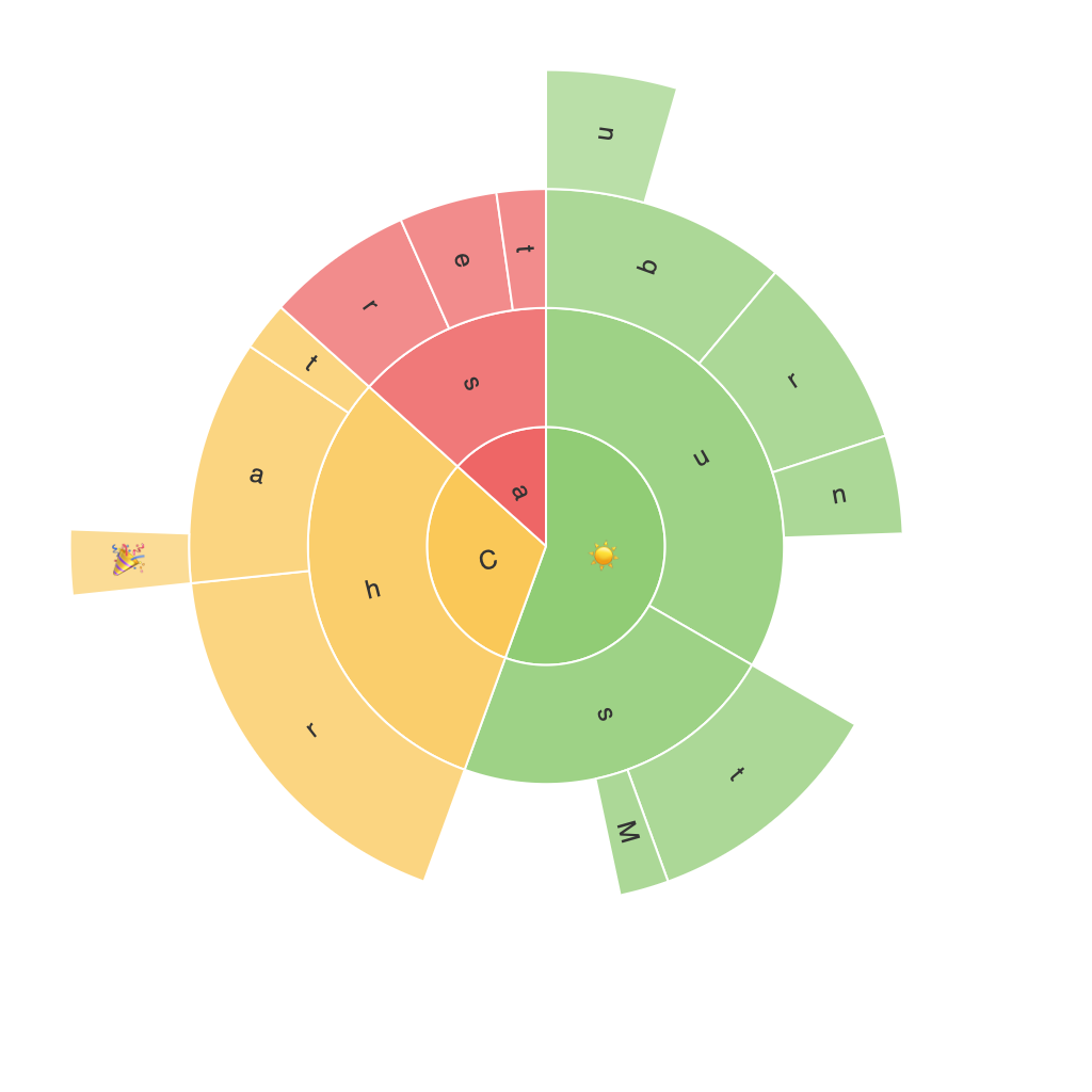
– A sunburst chart typically begins with a circle (the ‘sun’) at the center, representing the root node of a hierarchy. The chart radiates outwards with concentric rings, each representing the nodes below the root, and edges connecting these rings to demonstrate hierarchical relationships.
#### 2. **Choosing the Right Data**
– Sunburst charts are particularly well-suited for datasets that represent multi-tiered categories or hierarchies. The primary data structure should feature a clear hierarchy with subcategories, suitable for representation along the concentric circles.
#### 3. **Deciding on Dimensions and Measures**
– **Dimensions**: These represent the different levels of the hierarchy. Typically, the root node is in the center, followed by branches, sub-branches, and so on.
– **Measures**: Values that you want to display, such as counts, percentages, or any other quantitative values, will be allocated to sectors within the chart.
#### 4. **Creating the Chart**
– Select a visualization tool that supports sunburst charts. Many data visualization programs and software, including software like Tableau, Power BI, and Python libraries such as Plotly or Seaborn, offer this feature.
#### 5. **Customization**
– **Colours**: Use distinct colors to represent different categories or levels in the hierarchy, enhancing readability and visual appeal.
– **Labels**: Include labels on the inner levels of the chart to help interpret the data more easily. This is crucial for understanding what percentage or value each segment represents.
#### 6. **Interactivity**
– Enhance user engagement by making the chart interactive. Features like hover-over tooltips, clickable segments to drill down into more details, and animations can significantly improve the interpretative power of your visualization.
### Interpreting Sunburst Charts: Key Insights and Tips
#### 1. **Spotting Hierarchical Relationships**
– Sunburst charts visually highlight the hierarchical structure, making it easy to see which categories fall under others. This is particularly useful in organizational, business, or any context where data is structured in a tree-like hierarchy.
#### 2. **Analyzing Value Distribution**
– By allocating measures (such as revenue, sales, or any other quantifiable metrics) to different segments, the chart elegantly displays how total value is distributed across the hierarchy, allowing for a quick comparison and analysis.
#### 3. **Identifying Central and Peripheral Trends**
– Explore how the central nodes relate to the peripheral nodes. This can help uncover patterns, such as the impact of top-level decisions or strategies on sub-level outcomes.
#### 4. **Effective Storytelling**
– Use the structure and data displayed in the sunburst chart to narrate a compelling story about your findings. A well-designed and interpreted sunburst chart can convey insights that are much more difficult to communicate through tabular data or traditional charts.
### Conclusion
Sunburst charts are more than just a visualization tool; they are a method to explore and understand complex hierarchical data in a more intuitive manner. By carefully selecting your data, designing your chart with precision, and interpreting it to uncover underlying trends and relationships, you can harness the full potential of this tool in enhancing analytical insights and enhancing communication of data-driven messages. Whether you are a data analyst, a business intelligence specialist, or a data enthusiast, mastering the art of the sunburst chart will significantly enhance your ability to visualize and interpret the world of hierarchical data effectively.
