Title: Mastering the Sunburst Chart: A Comprehensive Guide to Visualizing Hierarchical Data Effectively
Introduction
In the world of data visualization, discovering the right tool for the job can mean the difference between a clear, comprehensible message and a jumbled, misunderstood presentation. For those dealing with hierarchical datasets, the sunburst chart emerges as an invaluable asset. This unique chart type, with its radial treemap design, allows for the representation of complex data structures in an accessible and visually compelling way. This article aims to equip you with a comprehensive understanding of the sunburst chart, its creation, benefits, and its various applications across industries.
Understanding Sunburst Charts
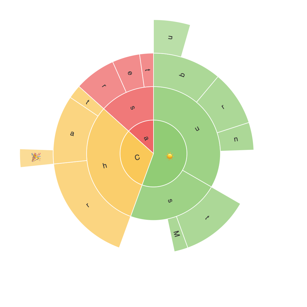
A sunburst chart is a circular graph that displays hierarchical data in a series of concentric rings, emanating from the center outward. Each ring in this layout signifies an ascending level of data, starting with the root node at the innermost circle and gradually expanding into progressively detailed subcategories as you approach the outer edges. This diagrammatic form transforms intricate structures into easily digestible information, offering a multi-dimensional perspective on dataset composition.
Features of Sunburst Charts
– **Multilevel Deconstruction:** One of the hallmark features of sunburst charts is their ability to visually articulate data across multiple hierarchical levels. This layout gives you both a bird’s-eye view of the whole and a granular breakdown of the constituent parts, thereby facilitating an interconnected view of the dataset.
– **Compact Space Utilization:** Sunburst charts are adept at making efficient use of the available space, particularly in instances of dense datasets. By arranging the data in concentric circles, they can represent extensive data relationships in a compact, visually cohesive format.
– **Enhanced Visual Clarity:** Through its radial structure, sunburst charts offer a distinct advantage in visual clarity, allowing observers to easily perceive the proportionality and interrelationships between segments. This feature is particularly useful in comparative analysis.
Advantages and Use Cases
Sunburst charts offer multiple benefits that make them a more versatile tool than their peers:
– **Hierarchical Data Mastery:** They are adept at representing hierarchical data, providing clarity on how various components are interconnected within a larger framework.
– **Layered Decision-Making:** With the ability to encode different levels of data within color-coded segments, sunburst charts empower decision makers with more nuanced and in-depth analysis insights.
Examples of Use Cases
Sunburst charts can be applied across a diverse range of industries, enhancing data-driven insights:
– **Business Intelligence:** In the realm of business analytics, sunburst charts can be utilized to analyze sales data across geographical regions, product types, and chronological periods. This visualization aids in identifying trends, making strategic decisions for resource allocation, and addressing specific areas needing improvement.
– **Market Research**: They provide an exceptional platform for representing consumer behavior studies across categories, subcategories, and segments. This helps researchers and marketers to better understand the dynamics of the market and tailor strategies more effectively.
– **Website Analytics**: Tracking navigation paths on websites or the breakdown of various features within an application, sunburst charts can illuminate user engagement patterns, reveal pain points, and inform the development of more user-friendly interfaces.
Conclusion
In the vast universe of data visualization tools, sunburst charts stand out as a powerful method for interpreting hierarchical data. Their capacity to illustrate complex relationships, their compact design, and superior visual clarity make them a preferred choice in fields such as business intelligence, market research, and website analytics. With the right understanding and application, you can harness the full potential of the sunburst chart to enrich your data-driven insights and strategic decision-making processes.
