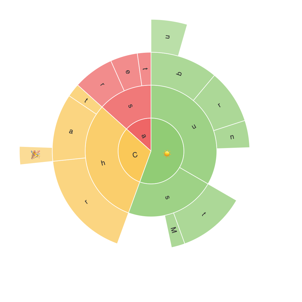
Title: Exploring the Sunburst Chart: A Comprehensive Guide to Visualization, Applications, and Best Practices
Sunburst charts, also known as sun charts, wheel charts, or multi-level ring charts, have gradually gained recognition as a visually appealing yet straightforward data visualization method. These diagrams provide an interactive means of representing hierarchical data, where each slice of the sunburst chart represents a part of the whole. This article delves into the fundamentals of sunburst charts, their various applications, and best practices for their implementation.
**1. Visualization Principles**
Sunburst charts are effective in illustrating complex hierarchical datasets. They are unique in their ability to depict the relation between different levels of a hierarchy by expanding sectors into smaller sectors or slices. Each level in the hierarchy is represented by a new ring, with the most comprehensive data occupying the outermost ring.
**Types of Sunburst Charts**
– **Multilevel Ring Charts:** The outermost circle represents the first level of the hierarchy, with subsequent levels represented by nested sectors.
– **Tree Maps:** A type of sunburst chart where the inner rings represent subcategories of the outer ring, with space typically representing quantity.
– **Area Charts:** Displaying multiple time series, these charts use the radius to represent the quantity of each data point over time.
**Advantages of Sunburst Charts**
– **Hierarchical Clarity:** Makes it easier to visualize the structure of data, showing clearly how components relate to the whole and each other.
– **Interactive Elements:** Enhances user engagement by enabling drill-down features, allowing users to explore data at a finer level.
– **Comparison Tool:** Facilitates the comparison of quantities by sector width and color intensity.
**2. Applications of Sunburst Charts**
Sunburst charts find utility across numerous sectors:
– **Business Intelligence:** To categorize sales data, market segments, or expense categorization.
– **E-commerce:** To understand sales per product category or per brand.
– **Financial Analysis:** For visualizing investments, debt structures, or portfolio compositions.
– **Web Analytics:** To analyze user flow or traffic distribution across website sections.
**3. Best Practices for Implementing Sunburst Charts**
**Data Suitability:**
Ensure that the hierarchy and data structure align well with the sunburst representation. Charts may become cluttered if the hierarchy is overly complex.
**Simplicity:**
Limit the number of levels to ensure clarity. Too many levels and subcategories can make the visualization confusing.
**Color Scheme:**
Use a distinct color palette that aligns with your brand or enhances legibility, especially in emphasizing certain categories over others.
**Labeling:**
Clearly label each sector with relevant information such as category names or values, and consider using tooltips for more detailed information on hover.
**Interactivity:**
Implement user-friendly features like drill-downs and hover effects to encourage exploration. This can assist users in deciphering complex data hierarchies.
**Space Utilization:**
Optimize the radial layout for each ring, ensuring that the visual effect accurately represents the data being displayed.
**4. Conclusion:**
Sunburst charts offer a dynamic and elegant solution to represent hierarchical data, providing a clear visual hierarchy that can be interactively explored. Their application is broad, fitting sectors from business intelligence to web analytics, and their implementation requires careful consideration of structure, color, and user interaction to ensure effective communication of data insights. By adhering to best practices, data analysts and designers can leverage the full potential of sunburst charts in their visual reporting toolkit.
Acknowledging limitations, such as the potential for visual clutter with deep hierarchies or large datasets, it’s essential to continually refine the use of these charts to meet the needs of all audiences effectively.
