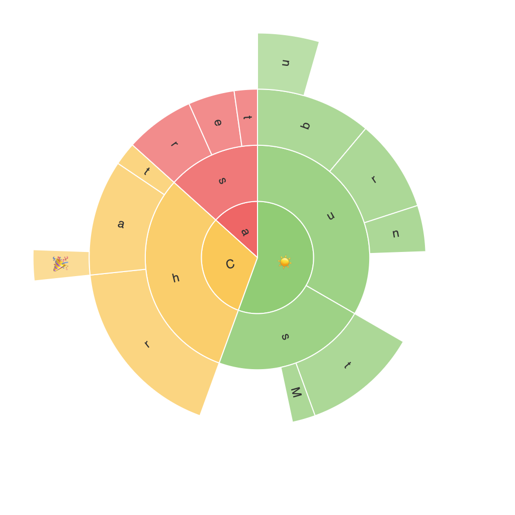
Sunburst Charts: Enriching Data Visualization and Insights in a Comprehensive Guide
In the realm of data visualization, Sunburst Charts have emerged as innovative tools that offer a dynamic, layered representation of hierarchical data. Unlike traditional pie charts, which display only single-level relationships, Sunburst Charts depict multiple levels, making complex hierarchical concepts easily understandable. This article will delve into the creation, functionality, and uses of Sunburst Charts, as well as explore their advantages over conventional representational techniques.
Understanding the Structure and Features of Sunburst Charts
Firstly, Sunburst Charts offer an interactive, visually appealing display of hierarchical data. They divide the total data set into concentric rings, each ring representing a level in the hierarchy. The center of the chart is divided into segments representing major categories, which expands outwards into subtler categories linked to them. This multi-ring structure provides clear distinctions for each level in the hierarchy, simplifying identification and comprehension.
Benefits of Using Sunburst Charts
1. Multi-Level Analysis: One of the key features of Sunburst Charts is their ability to represent information across multiple levels. This is especially advantageous when dealing with datasets that have several layers of complexity, as different segments in the rings can represent specific hierarchical elements.
2. Comparative Insights: By grouping related segments around the same level, Sunburst Charts facilitate easy comparison between different categories. This makes it easier for the viewer to understand the contribution of each category relative to others and find areas of growth or decline.
3. Color-Coded Identification: Users can assign colors to the segments, which not only adds aesthetic value but also aids in immediate identification and differentiation of categories. This color-coding system makes it straightforward to perceive trends and patterns when analyzing hierarchical data.
4. Interactive Visualization: Modern Sunburst Charts offer interactive features that enhance user engagement. With hover effects highlighting segments, users can obtain specific information about individual categories simply by hovering their mouse pointer over them. Zooming functionalities also allow for a closer look at specific areas of focus, enabling detailed exploration of complex figures.
Practical Applications of Sunburst Charts
Sunburst Charts find their applications in a variety of domains, especially where hierarchical structures are essential to understanding and analyzing data effectively. Here are a few examples:
1. Business Analytics: Companies often use Sunburst Charts to visualize sales data within their organization. It helps in understanding the contribution of different product lines, sales regions, and other aspects of marketing or sales funnel stages.
2. Information Systems: Systems administrators can use these charts to represent the breakdown of system components, enabling effective monitoring and troubleshooting of complex network structures.
3. Finance: Financial data from multiple levels of investment firms or portfolio management can be easily visualized and analyzed using Sunburst Charts. This promotes understanding industry structure, asset allocation, and risk management strategies.
4. Marketing: Marketers often use Sunburst Charts to visualize the allocation of marketing budgets across various channels and their performance, providing insights into strategic planning and reallocation.
5. Social Network Analysis: In the study of social connections, Sunburst Charts can represent the levels of relationships between individuals in different groups, highlighting influential points or pathways within networks.
Harnessing the Potential of Sunburst Charts
To effectively utilize Sunburst Charts, it’s essential to consider their integration into data visualization tools and platforms that support such advanced features. Platforms like Tableau, Power BI, and Google Charts allow for easy creation and customization of Sunburst Charts, catering to both business and technical audiences. By incorporating interactive elements and adjusting visual aesthetics, these tools enable users to create visually appealing, engaging, and informative Sunburst Charts that enhance business intelligence, marketing strategies, and data-based decision-making environments.
In conclusion, Sunburst Charts are powerful, versatile tools that offer unique insights into complex hierarchical data. Through their structure, features, and applications, these charts serve as a comprehensive guide for data visualization, making them an indispensable asset in today’s data-driven world. By embracing the capabilities of Sunburst Charts, organizations, analysts, and researchers can develop a deeper understanding of their data, leading to better-informed decisions and improved strategic outcomes.
If you would like to include a title for the article based on the content provided, you may consider:
1. “Empowering Data Visualization: A Comprehensive Guide to Sunburst Charts and Their Applications”
2. “Leveraging Sunburst Charts: Enhancing Insights, Analysis, and Presentations with Multi-Level Data Visualization”
3. “Navigating Hierarchical Data with Sunburst Charts: A Visual Guide for Enhanced Business Intelligence”
4. “Unlocking the Power of Sunburst Charts: A Guide for Streamlining Complex Data Visualizations”
5. “Visualizing Hierarchies: An Exploration of Sunburst Charts for Improved Data Interpretation and Analysis”
Choose the title that best aligns with the content of your choice, or use your own suggestion based on these titles or the article itself.
