Title: Mastering the Sunburst Chart: A Comprehensive Guide to Visualizing Hierarchical Data
Introduction
In the complex and data-driven world of today’s analytics, a versatile and visually intuitive way of presenting hierarchical data is paramount. Among the various graphical representations of information, the sunburst chart emerges as a particularly effective tool for displaying hierarchical data structures. This article serves as a comprehensive guide aimed at helping readers understand the nuances and applications of the sunburst chart, making it easier to extract insights and communicate complex data relationships.
Understanding Sunburst Charts
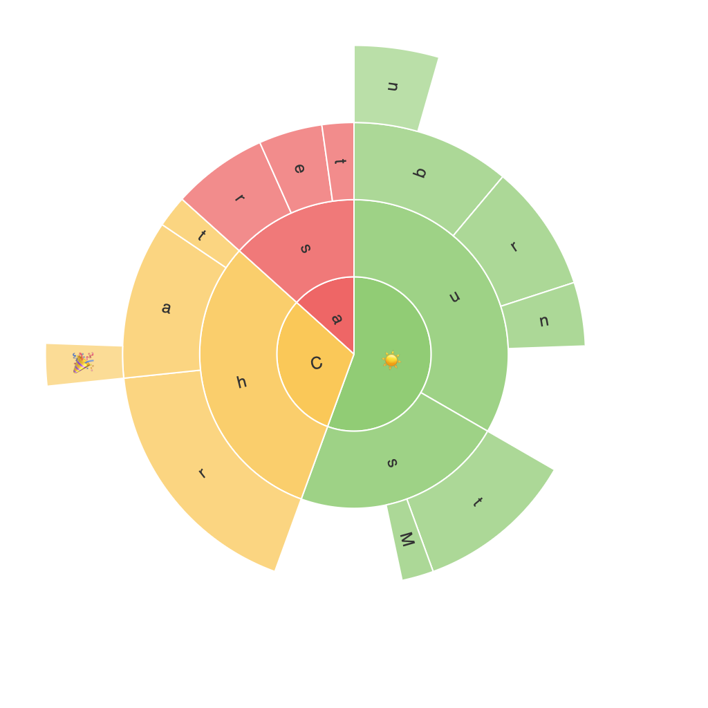
A sunburst chart, also known as a multilevel pie chart, radially segments a whole into multiple concentric rings representing various levels of hierarchy. This layout aids in visualizing the breakdown of a total, where each ring corresponds to a specific subcategory, with segments representing individual data points, and the area size proportional to the magnitude of each segment.
Key Features and Benefits
1. **Visual Clarity**: Sunburst charts provide a clear, hierarchical view of data clusters, making it easier to perceive the relationships and proportions between different categories.
2. **Multilevel Representation**: This chart type can visually depict multiple levels deep in a hierarchy, allowing users to analyze and understand complex data structures at various granularity levels.
3. **Space Efficiency**: Due to its circular layout, sunburst charts can convey large amounts of hierarchical data within a compact space, which is beneficial for on-screen presentations and printed designs.
4. **Easy Comparison**: The visual overlap of segments within rings facilitates quick comparisons of values across different categories and levels, highlighting significant variations easily.
Key Components and Customization Options
– **Root Rings**: The most outer rings in a sunburst chart represent the highest level of the hierarchy, with each ring usually corresponding to a category.
– **Sub-rings**: These are rings within the root rings, representing subcategories under the root categories.
– **Segments**: These segments represent individual data points, with their size relative to the parent ring indicating the proportion of the total.
– **Color Coding**: Effective use of color can emphasize important categories, highlight trends, and differentiate data sets, enhancing the chart’s readability and impact.
Customization Options:
– **Color Scheme**: Choose distinct, contrasting colors for different levels and segments to optimize readability and visualization effectiveness.
– **Interactive Features**: Incorporating features such as tooltips and clickable segments for detailed information can greatly enhance the user’s engagement and understanding of the data.
Common Uses and Applications
1. **Website Analytics**: Sunburst charts can effectively represent the breakdown of traffic sources, user flows, and interaction details, allowing for better insights into user behavior.
2. **Financial Analysis**: They are useful for visualizing revenue streams, market share, cost distribution, and other hierarchical data within financial models, aiding in strategic decision-making.
3. **Project Management**: This type of chart can display dependencies between tasks or resources within a project, revealing critical paths and resource allocation at a glance.
4. **Demographic Data Analysis**: Sunburst charts can be employed to analyze complex hierarchical demographic data such as age groups, income brackets, educational levels, and employment sectors, simplifying large datasets for better analysis.
Conclusion
Mastering the art of utilizing sunburst charts effectively is key to transforming complex hierarchical data into easily digestible insights. Whether you’re looking to explore website analytics, dissect financial structures, manage project resources, or analyze demographic compositions, the sunburst chart offers a compelling and visually-rich method to present data in all its layered glory. By understanding the chart’s structure, key features, benefits, and customization possibilities, you’re equipped to harness this powerful tool for your data visualization needs.
By following the guidelines and examples provided, you can confidently employ sunburst charts to unveil patterns, trends, and insights that traditional methods might overlook, thereby empowering you to make informed decisions based on a solid, data-driven understanding of your subject matter.
