Exploring Visual Analytics: Mastering the Art of Sunburst Charts in Data Visualization
In the realm of data visualization, where data speaks louder than words, the process often involves conveying complex information in a comprehensible and impactful manner. Enter the sunburst chart, an exquisite tool for those wanting to present hierarchical data in an insightful, visually appealing way. Sunburst charts not only simplify data structures but also highlight proportions and variations, making them an advantageous choice over traditional tree diagrams or pie charts. This guide is tailored for those eager to grasp the intricacies of sunburst charts and master their application in various data visualization scenarios.
The Essence of a Sunburst Chart
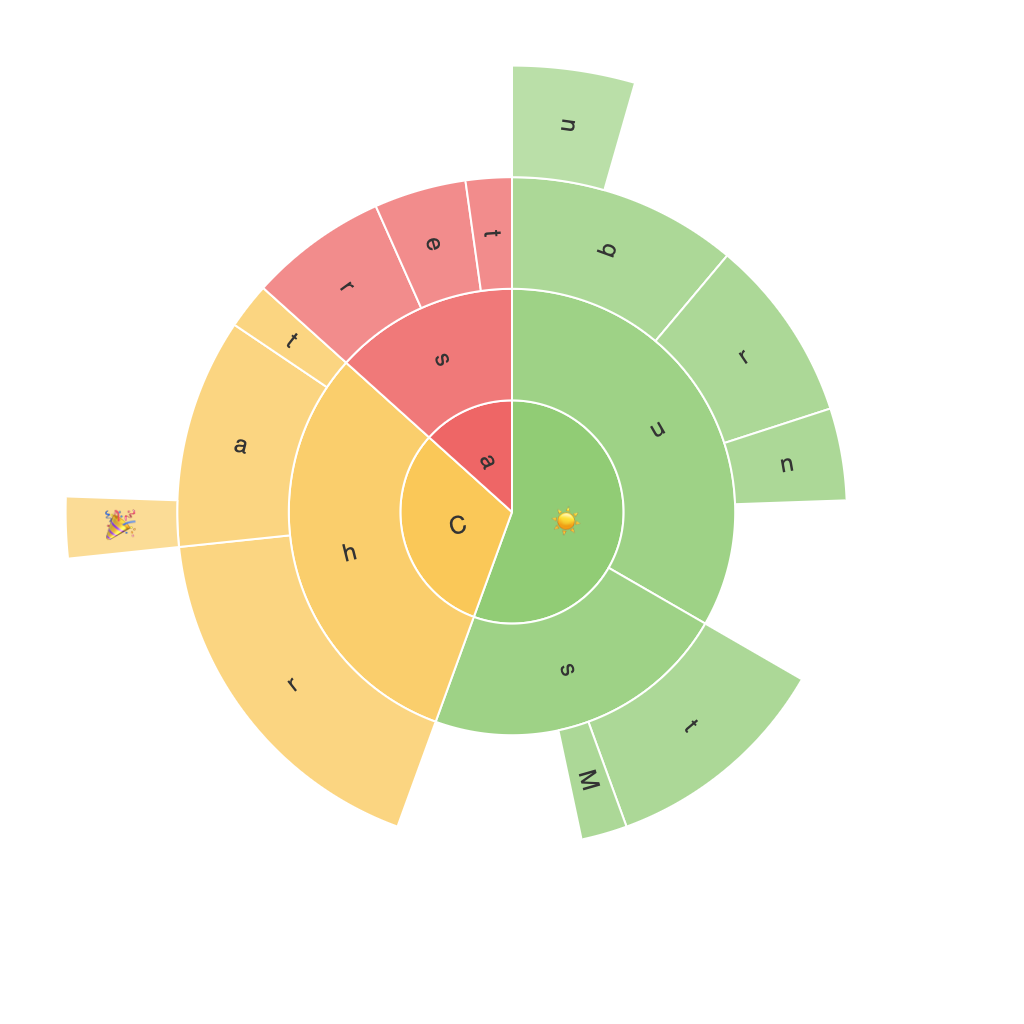
To start off, let’s delve into the basic structure of a sunburst chart. It is essentially a multilevel pie chart, where segments are divided into rings, each representing a hierarchy level. The outer circle typically denotes the top level, while deeper levels are nested within this structure. The primary focus when designing these charts is to preserve a user-friendly layout and maintain clear visual distinctions between hierarchy levels, ensuring that the data is easily understandable.
Choosing the Right Data
Before embarking on creating a sunburst chart, it is essential to consider the nature and scale of your data. Sunburst charts excel in visualizing hierarchical data where there is a necessity to exhibit relationships across multiple levels and the need to compare proportions. For instance, business analytics teams often utilize sunburst charts to depict sales analytics across various categories, subcategories, and individual products or services. Similarly, in project management, they are useful for illustrating milestones, tasks, and their completion status within a project hierarchy. The key is to have data that aligns neatly into one or more nested categories, making the structure of a sunburst evident and accessible.
Designing Effective Sunburst Charts
To ensure the effectiveness of your sunburst charts, pay attention to layout, color schemes, and labeling. A well-designed chart should place the most important data at the forefront, typically represented in the outer rings, making it stand out.
Utilize a consistent color palette to distinguish different levels and categories. For example, you might assign a different color to each level of the hierarchy, followed by smaller variations within each level. This creates a visually coherent chart, enhancing its readability.
Adding labels to your data segments can be especially helpful in making critical information easily accessible to your audience, thus preventing any ambiguity in interpretation. However, it’s critical to maintain balance; overlabeling can clutter the chart and potentially detract from its readability.
Interactivity is a key factor in enriching user engagement with sunburst charts. Tools and features that enable users to zoom in or out, select segments to view detailed descriptions, or even animate the chart to reveal or hide layers can transform a static chart into a dynamic exploration tool. Consider implementing mouseover tooltips that provide more detailed information about specific segments, further enhancing the user experience.
Conclusion
Sunburst charts offer a visually compelling and intuitive way to explore, understand, and present hierarchical data. By carefully selecting your data, employing strategic design choices, and incorporating interactive features, you can harness their full potential to make your data more accessible and digestible. As a data visualization tool, the sunburst chart is a testament to the marriage of aesthetics and insight, offering a unique palette of exploration and analysis possibilities for data-driven storytelling.
