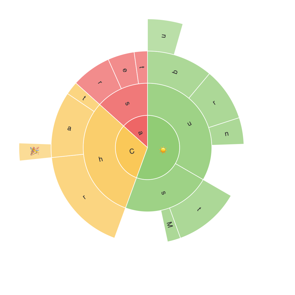
Exploring the Visual Power of Sunburst Charts: Maximizing Data Insights and Presentation
Sunburst charts, often heralded for their innovative approach to visualizing hierarchical data, have emerged as a powerful tool for data analysis and presentation. With their layered, radial design, these sophisticated visualizations can turn complex, nested data structures into easily digestible insights. From business intelligence to educational purposes, the sunburst chart’s visual prowess enables users to quickly grasp the intricacies of expansive datasets through the visual representation of categories, subcategories, and child elements.
Structure and Design
Sunburst charts feature a hub at their center, which acts as the root node. This central node is then expanded into sectors or slices, whose size corresponds to the magnitude of the data they represent. These sectors are further divided into smaller segments corresponding to subcategories or children. The outer layer of the chart displays the top-level categories, whereas the inner layers denote deeper levels within the hierarchy, revealing a depth and structure that traditional charts often fail to convey.
Hierarchical Insights
One of the key advantages of sunburst charts lies in their capability to represent complex hierarchies visually. For businesses analyzing revenue structures, product lineups, or customer segments, sunburst charts offer a clear view of how revenue is distributed across different levels. This visualization allows users to quickly spot which segments contribute the most to revenue, understand dependencies between different categories, and identify potential areas for optimization.
Moreover, in the educational sector, sunburst charts can serve as an interactive tool for teaching organizational structures, such as company hierarchies, product categorizations, or even geographical regions. This graphical approach not only aids in the comprehension of organizational complexity but also engages learners by offering a clear, visual narrative of the data.
Comparison and Contextual Insights
When comparing data across different levels of categories, the sunburst chart’s radial layout provides a unique perspective. For instance, in analyzing market share among competitors, the chart could display the market share as a whole, with deeper layers showing the contribution of individual products or regions. This not only highlights the major players but also reveals insights on product diversification, regional preference, and market dominance.
Data Density and Clarity
One of the challenges of utilizing sunburst charts is managing data density. While the chart’s design allows for the representation of numerous categories and subcategories, it can become cluttered when dealing with very large datasets. To tackle this issue, techniques like filtering options, hierarchical grouping, and interactive zoom feature can be implemented, enabling viewers to focus on specific segments or subcategories of interest. These enhancements ensure that even the most complex datasets remain visually comprehensible and informative.
Conclusion
Incorporating sunburst charts into the data presentation toolkit offers an innovative approach to conveying hierarchical data through visual means. With their ability to clearly represent complex data structures, facilitate in-depth comparisons, and provide contextual insights, these charts have become indispensable tools for leveraging data in decision-making processes across various sectors. Whether analyzing market strategies for business intelligence or teaching organizational structures in education, the power to visualize and understand hierarchical data cannot be overstated, illustrating the continued relevance and utility of this sophisticated charting method.
