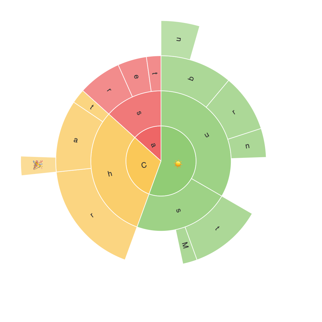
Exploring the Visual POWER of Sunburst Charts: Enhancing Data Interpretation with Stunning Visualization
Sunburst charts, a visually captivating form of data representation, offer a unique way to explore and interpret complex hierarchical data relationships. These radial layout charts utilize color and concentric circles to display information at multiple levels, where each circle slice represents a category, allowing for a rapid identification and comparison of relationships and proportions. This article aims to highlight the power of sunburst charts in revealing insights in a visually stunning manner.
**Understanding the Structure of Sunburst Charts**
A sunburst chart breaks down the data into a hierarchical structure, where the central circle represents the root node, and the sub-circles and segments represent the child nodes. In a typical two-level chart, the initial circle might represent the top-level categories, with child categories as segments. In a multilevel chart (a.k.a treemaps or zoomable sunburst charts), sub-categories continue to be represented as nested circles, further expanding the hierarchical depth of the data.
Sunburst charts are visually appealing and intuitive, making them particularly effective for showcasing data in sectors such as business, social sciences, and information visualization. They are adept at representing vast amounts of hierarchically structured data, making complex information understandable and digestible.
**Enhancing Interpretation with Stunning Visualization**
One of the primary strengths of sunburst charts is their ability to highlight patterns and connections that are not as clear in traditional tabular or linear visualizations. By using color, size, and shape (including exploding segments for emphasis), these charts allow for a quick and dramatic portrayal of relationships and data hierarchies. This visual power enables stakeholders to:
– **Spot trends and relationships easily**: The radial and proportional representation of data in concentric circles makes it simple to analyze relationships between different categories.
– **Understand complex hierarchies**: Through multi-level nesting, hierarchical data is deconstructed in an understandable format, providing clarity in nuanced data structures.
– **Distinguish between categories**: Bright and contrasting colors help in defining the relationships and distinctions between categories, making it easy to differentiate and compare.
– **Engage the audience**: Their visually appealing and interactive nature can captivate and engage audiences, leading to enhanced comprehension and interest.
**Common Applications and Considerations**
Sunburst charts find applications across various fields, including:
– **Business intelligence**: Representing sales data, market segments, or organizational structures.
– **Web analytics**: Showing categories of website traffic, user navigation paths, or product hierarchies.
– **Social sciences**: Illustrating relationships in social structures, demographic breakdowns, or academic citations.
– **Information visualization**: Organizing and visualizing large datasets with multiple levels of detail for easier analysis.
When utilizing sunburst charts, it’s crucial to consider:
– **Scale**: The number of categories should be manageable to ensure clarity.
– **Clarity of relationships**: Ensure that labels and legends are clear and relevant to avoid confusion.
– **Interactive elements**: While static charts can be effective, adding interactive elements can enhance user engagement and data exploration, allowing users to dive deeper into specific categories or levels.
In conclusion, sunburst charts represent a powerful tool in data visualization, offering a visually striking and intuitive manner to interpret hierarchical data. Their ability to enhance comprehension and engagement make them a valuable asset in the toolkit of any data analyst or designer, particularly when dealing with complex and hierarchical datasets.
