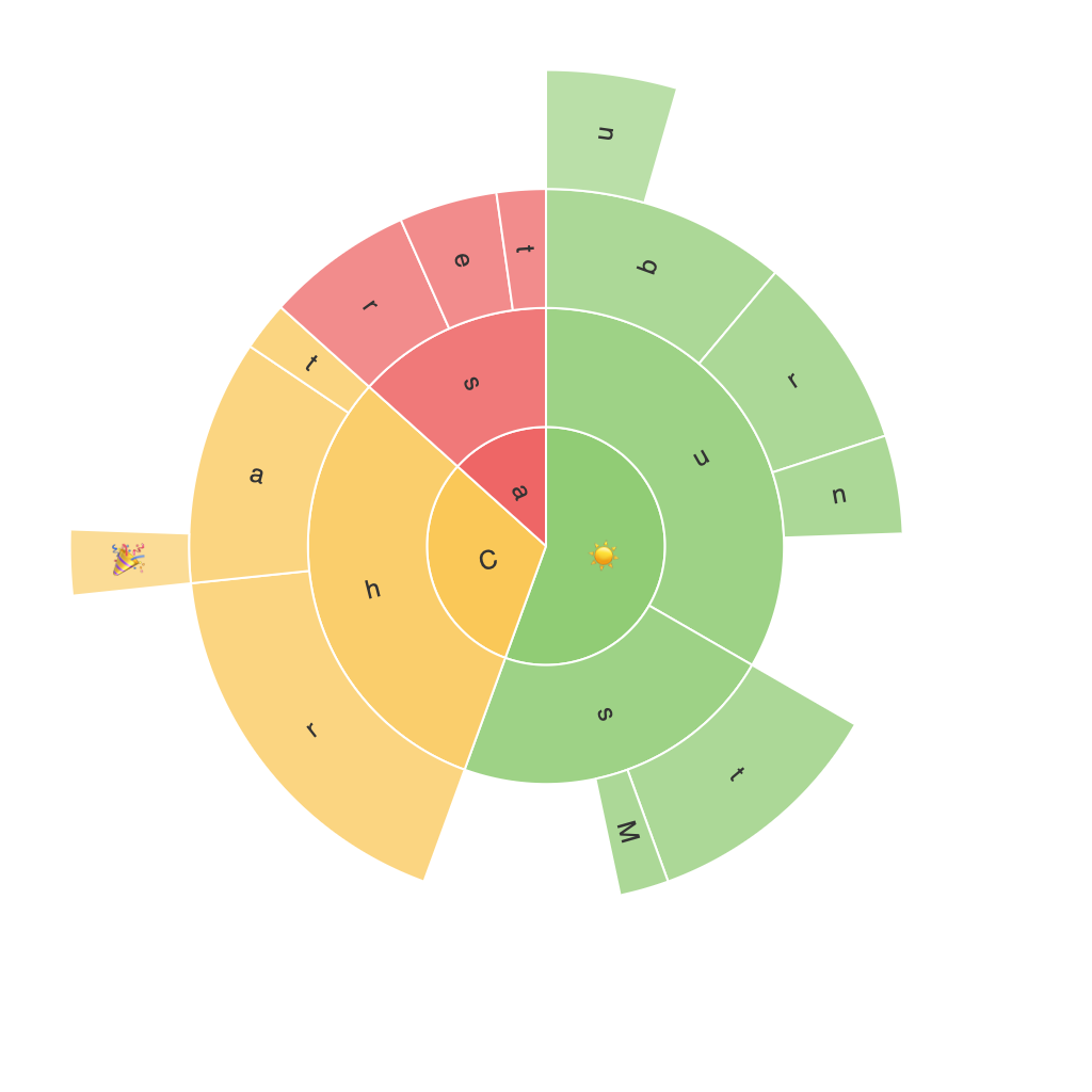
Exploring the Visual Power of Sunburst Charts: Enhancing Data Interpretation through Comprehensive Segmentation
Sunburst charts, also known as radial treemaps, are a type of data visualization that have been gaining popularity in recent years. These charts offer a unique way for data analysts and enthusiasts to break down hierarchical data sets on a visual scale, allowing for comprehensive segmentation and layered insights without cluttering the visualization. By utilizing concentric rings and arcs, sunburst charts present a unique take on the breakdown of multidimensional data, effectively making complex information more accessible, understandable, and aesthetically appealing.
### Key Elements of Sunburst Charts
**1. Hierarchical Structure**
The fundamental building block of a sunburst chart is its hierarchical structure, which utilizes nested rings to represent different levels of data. In this structure, the largest or central ring typically represents the top-level category. Each subsequent ring then branches out to represent subcategories, presenting a visual journey from the general to the specific.
**2. Segments**
Segments within each ring represent specific data values or categories, allowing for a clear visualization of both the part-to-whole relationship and the part-to-part relationships. The size of these segments may be proportional to the metric of interest, such as value, frequency, or distribution, helping to highlight the importance and significance of each data point.
**3. Colours and Legends**
To further enhance the understanding and readability of the chart, colors are often used to differentiate between various segments and categories. Legends are provided to interpret these colors, ensuring that viewers can easily comprehend the division of data and make meaningful connections between the segments.
### Advantages of Sunburst Charts
#### **Complex Hierarchical Data Simplification**
Sunburst charts excel in presenting complex, hierarchical data in a visually appealing manner. By transforming the data, these charts simplify understanding of relationships and comparisons, enabling insights that might be difficult to extract from traditional tables or bar charts.
#### **Efficient Space Utilization**
These charts use a radial format, which offers a unique visual advantage. The circular shape maximizes space utilization, making them ideal for displaying data with numerous categories without overcrowding the visualization space.
#### **High Level of Detail**
Comprehensive segmentation through several rings and arcs allows for the inclusion of detailed data levels within a single chart. This feature is particularly useful when displaying datasets with many hierarchical layers, enabling the depiction of finer, nested details without the need for separate visualization tools.
#### **Comparative Analysis**
Sunburst charts provide an excellent platform for comparative analysis, allowing viewers to easily compare proportions at different levels of the hierarchy. The visual representation makes it easier to grasp relationships between various levels and understand changes or fluctuations in data segments.
### Effective Use of Sunburst Charts
To maximize the effectiveness of sunburst charts, it is crucial to consider several factors:
– **Select the Right Data**: Use sunburst charts for hierarchical data sets with a moderate number of levels for optimal readibility.
– **Maintain Clarity**: Ensure that only meaningful data segments are used, avoiding clutter, especially for lower ring segments, which can become too numerous to interpret clearly.
– **Utilize Color and Design Wisely**: Use color and labels to effectively highlight the most important segments and maintain a clean design.
– **Interactive Elements**: Incorporate interactive features such as tooltips or clickable segments to provide additional details without compromising the simplicity of the primary message.
In conclusion, sunburst charts offer an exceptional tool for visual data interpretation, providing a unique and efficient way to explore, comprehend, and make decisions based on hierarchical data. Through their ability to simplify complex structures, utilize space effectively, and enable detailed comparative analysis, sunburst charts stand as a powerful asset in the realm of data visualization and analytics.
