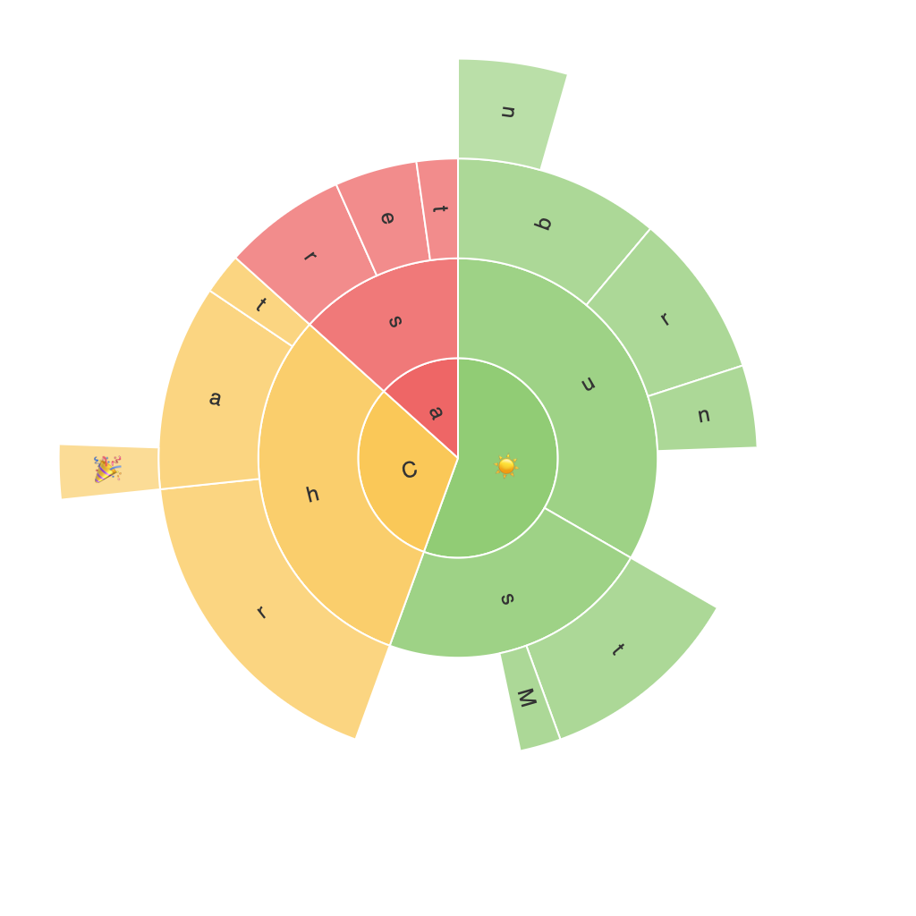
Exploring the Visual Power of Sunburst Charts: Enhancing Data Interpretation and Presentation
Sunburst charts are an innovative and visually appealing way to represent hierarchical data sets. These types of diagrams present information in concentric rings, making it easier for audiences to grasp complex data relationships and structures at a glance. As opposed to traditional pie charts, sunburst charts offer a more detailed exploration of categories and subcategories, thereby enhancing the interpretation and presentation of data. This article delves into the benefits of utilizing sunburst charts, their unique characteristics, and strategies for effectively integrating them into data visualization for better communication.
### Key Elements of Sunburst Charts
Sunburst charts are composed of several essential components:
1. **Central Node**: This represents a root node or the highest level of the hierarchical data.
2. **Layers**: Each layer surrounding the central node represents a level of the hierarchy, starting with the highest level at the outer edge, descending closer to the center.
3. **Segments**: These are the sections within each layer, representing parent nodes. The segments can further be subdivided into smaller segments to represent child nodes.
4. **Branches and Arcs**: These connect the segments, facilitating the visualization of hierarchical structure.
### Advantages of Sunburst Charts
#### 1. **Hierarchical Clarity**
Sunburst charts make hierarchical data easily understandable due to their concentric rings structure, which correlates visually with the hierarchical nature of the data. Each level in the chart represents a deeper dive into the data, allowing subtle distinctions in hierarchy to be readily apparent.
#### 2. **Efficient Data Representation**
For datasets with multiple subcategories and levels of organization, sunburst charts are superior to traditional charts in displaying complex data. A single view can encompass multiple dimensions of data, leading to improved data density and overall comprehension.
#### 3. **Cohesive Storytelling**
When combined effectively with labels and tooltips, sunburst charts can tell a coherent story through the visual presentation of data. This approach enhances understanding, making it easier for the audience to grasp relationships and nuances within the data.
#### 4. **Engagement and Aesthetics**
Sunburst charts are visually engaging due to their intricate design and color usage. Their aesthetic appeal can capture attention and maintain interest, contributing to a more engaging data presentation.
### Creating Effective Sunburst Charts
#### 1. **Target Audience Understanding**
Start by determining the audience for your data analysis and visualization. Understanding the level of expertise can guide you in choosing a chart that will be both comprehensible and meaningful to the viewers.
#### 2. **Data Mapping**
Map your hierarchy with care, ensuring that each node is accurately placed in a layer that corresponds with its level in the chart. This accurate mapping is crucial for conveying the correct contextual relationships within the data.
#### 3. **Visualization Design**
Design your chart to use distinct colors and labels for each section and layer. Employing varying colors can help in quickly identifying different levels and categories. Incorporate tooltips to provide additional details when needed, enhancing the user’s ability to interpret the chart thoroughly.
#### 4. **Interactivity**
For digital presentations, consider adding interactivity to your sunburst chart. Clickable segments, zoom functionality, and dynamic layers can significantly enhance user engagement and data exploration.
### Conclusion
Sunburst charts offer a compelling way to visualize hierarchical data, providing both a clear and visually engaging presentation of complex structures. Their design simplicity and ability to represent multiple layers of data make them an excellent choice for a variety of applications, from business intelligence to academic research. By mastering the unique aspects and strategies for creating effective sunburst charts, we can significantly enhance the way data is interpreted and shared, leading to more informed decision-making and communication.
