Exploring the Visual Power of Sunburst Charts: Enhancing Data Interpretation and Presentation
Sunburst charts, a lesser-known yet powerful visualization tool, stand as an efficient and visually impactful representation for layered data analysis. Their ability to simplify complex data structures for easier understanding is unparalleled. This article delves into the intricacies of sunburst charts, dissecting their anatomy, practical applications, and benefits in enhancing data interpretation and presentation.
### What is a Sunburst Chart?
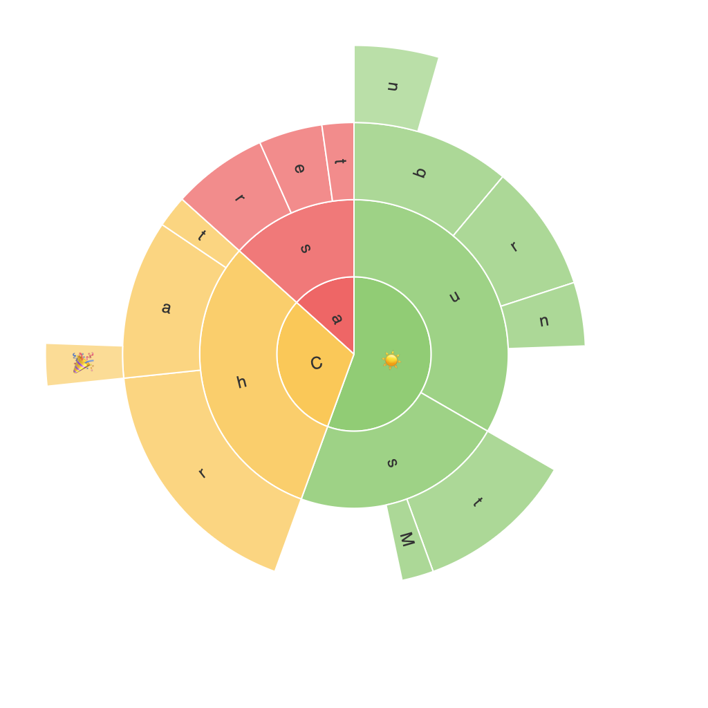
A sunburst chart, also known as a hierarchical ring chart, is a radial tree-like visualization. It displays hierarchical data as a series of concentric rings where each level represents a dimension of the dataset. The chart’s center is the root node, and each subsequent layer is a child node. This radial layout allows for an easy and intuitive understanding of the nested relationships and proportions within the data.
### Key Components of a Sunburst Chart
1. **Root Node (Central Circle)**: This represents the highest level of the hierarchy and can often be considered the overarching topic or main category.
2. **Child Nodes (Rings)**: These circles represent the first level of subcategories or secondary dimensions.
3. **Leaf Nodes (Segments)**: The individual slices or segments within each ring represent the primary data points, their values, and proportions within their respective parent segments and the overall hierarchy.
### Enhancing Data Interpretation
Sunburst charts offer several advantages when interpreting complex hierarchical data. The radial structure naturally supports the understanding of nested data, making it easier to discern relationships and group similarities. The visual representation of proportions through the segments’ sizes immediately highlights the relative importance of each category. It allows for quick identification of the most significant contributors at each level of the hierarchy.
### Improving Data Presentation
– **Simplicity and Clarity**: Sunburst charts are highly visual, making them ideal for presentations where clarity and simplicity are paramount. The radial structure minimizes clutter and makes the data stand out.
– **Comparison of Hierarchies**: They facilitate the comparison of sizes and proportions across different categories or time periods, which is crucial in spotting trends, outliers, and significant shifts in data.
– **Customization for Impact**: With features like color coding and highlighting, sunburst charts can be customized to emphasize specific aspects of the data, making it easier to digest and more engaging for the audience.
### Practical Applications
Sunburst charts find applications across various fields such as business analytics, where they are used to analyze company structures, sales funnel progress, or product categories. They are also integral in software architecture visualizations, biological classifications (such as the classification of species in taxonomy), and even in social sciences to illustrate connections within complex social structures.
### Limitations and Best Practices
While sunburst charts are powerful tools, they come with limitations. Their effectiveness drops when dealing with very large datasets that necessitate many layers, as it becomes difficult to maintain clarity. It is important to ensure that the chart is not overly complex to avoid confusion. Additionally, using labels and legends effectively is crucial for guiding the user through the chart’s structure and enhancing its interpretability.
### Conclusion
Sunburst charts provide a unique and efficient method to explore and present hierarchical data, offering a visual approach to understand complex relationships. They are particularly valuable when there’s a need to convey nuanced information in a more digestible and engaging format. Understanding and mastering the use of sunburst charts can dramatically impact the effectiveness of data storytelling and analysis in various professional settings.
