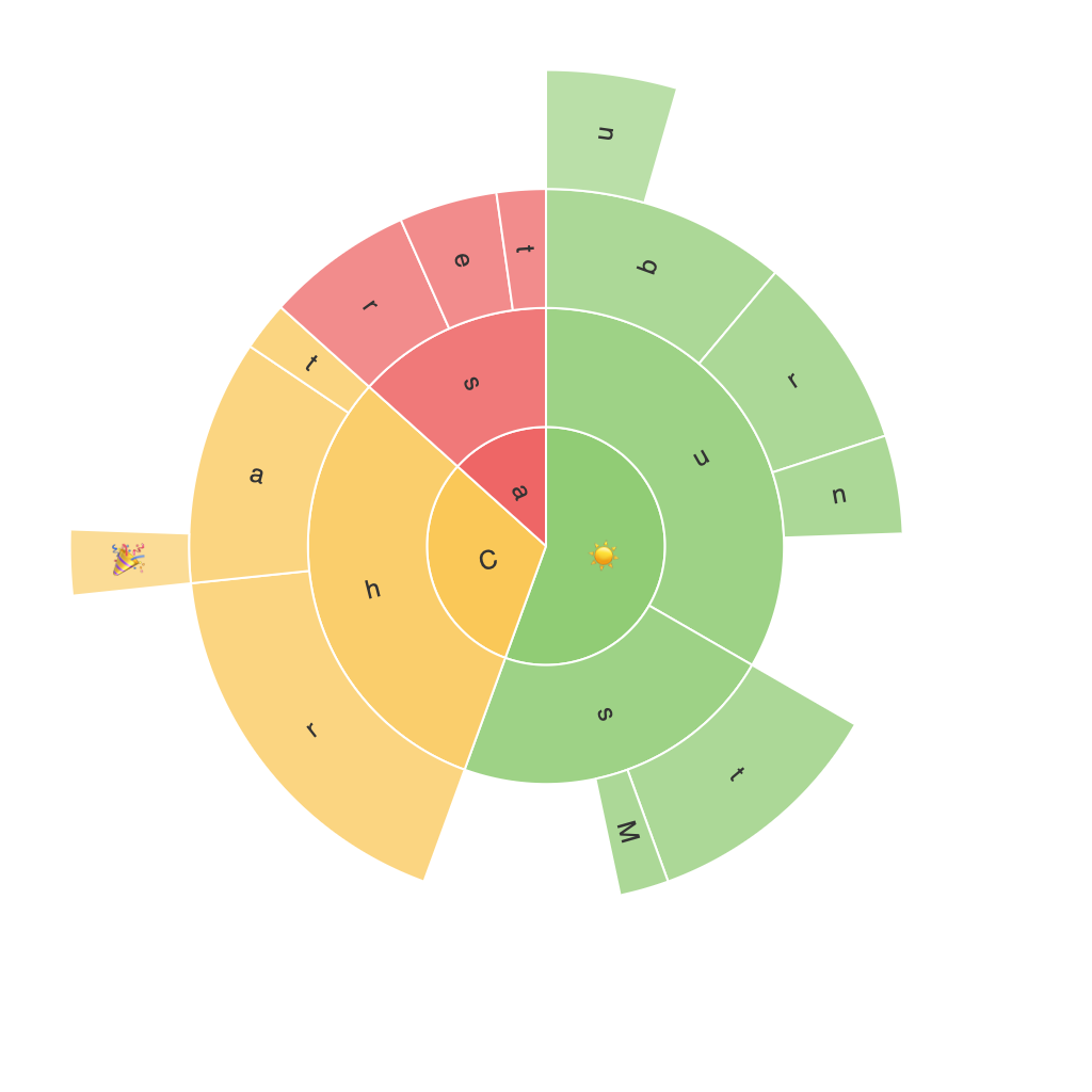
Exploring the Visual Power of Sunburst Charts: Enhancing Data Interpretation and Design
In a world saturated with data, the importance of efficient and meaningful data visualization cannot be overstated. Traditional methods have their strengths, but as datasets grow increasingly complex in size and variety, novel visualization techniques are needed to aid in the understanding and interpretation of this wealth of information. One such method, the sunburst chart, stands out for its unique features in presenting hierarchical data, thereby offering a more engaging and insightful visualization.
Sunburst charts are layered circular charts subdivided into rings or slices representing hierarchy levels, reminiscent of a tree structure. Every segment’s angle describes the relationship to the total and its position in the hierarchy, allowing viewers to grasp complex relationships at multiple levels simultaneously. This visual representation provides a vivid and intuitive understanding of the dataset’s structure, making it stand out compared to other common chart types.
### Enhancing Data Interpretation
1. **Complex Hierarchical Data Simplified:** Sunburst charts excel at visualizing hierarchical data by breaking it down into visually intuitive segments. Each sector or ring represents a level in the hierarchy, aiding in the clear delineation of relationships between different categories. This makes it notably easier to identify and compare the proportions of different levels, particularly in datasets with multiple categories nested within each other.
2. **Visibility of Relationships:** Unlike linear data charts (like bar or line graphs) which may struggle to represent hierarchical relationships adequately, sunburst charts are designed to highlight these connections. The radial structure enables the viewer to easily detect patterns, cross-level relationships, and deviations from expected ratios — all crucial for discerning insights in complex datasets.
### Design Considerations and Best Practices
1. **Color Usage:** While color is an essential tool for differentiation, it must be used judiciously to maintain clarity. Colors should be carefully chosen to represent different attributes in the data hierarchy, ensuring that the chart does not become unnecessarily complex. Consistency in color usage across similar categories across different levels also helps in maintaining the integrity of the visualization.
2. **Label Management:** Managing labels in a sunburst chart can be challenging due to space constraints at the center and outer layers. Tools like tooltips, which display detailed information on hover, can be effectively utilized to avoid overcrowding. Ensuring that labels are concise and informative without cluttering the chart ensures that data is accessible to both quick glance analysis and detailed study.
3. **Zoom Levels:** As datasets grow larger and more intricate, utilizing scalable visual zoom levels becomes necessary. This allows for quick identification of high-level summaries at a glance, while also enabling detailed exploration of innermost segments. The ability to zoom in and out through interactive means enhances the usability of sunburst charts.
### Applications
Sunburst charts find applications in various fields due to their versatile nature. In business intelligence, they help in exploring sales data, where products and categories can be hierarchically arranged. In information visualization, they provide insights into file system structures or network node relationships. In social network analysis, they can represent connections between users based on various layers like relationship strength or group affiliation.
### Conclusion
Sunburst charts, with their unique visual design and ability to articulate complex hierarchical data, offer an enriching addition to the data visualization toolkit. They facilitate quicker insights and more nuanced understanding compared to traditional methods. However, their effectiveness depends heavily on a balanced design approach that prioritizes clarity, simplicity, and user interaction. By leveraging these charts judiciously, data analysts and scientists can unlock the full potential of their datasets, making complex information not just more accessible but also more compelling to explore.
