Exploring the Visual Power of Sunburst Charts: A Guide to Effective Data Visualization
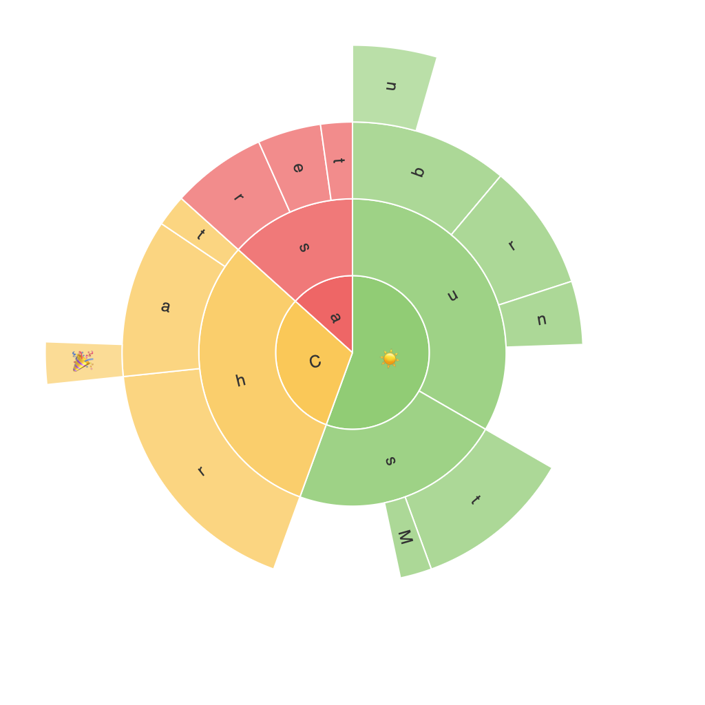
Sunburst charts have become a popular choice for presenters and data analysts because of their unique layout and the power they hold in conveying hierarchical data elements in a visually engaging way. These charts are characterized by their unique radial shape that radiates from the center, making them an excellent tool not only for data comparison but also for illustrating complex data relationships. This guide seeks to delve into the intricacies of sunburst charts, exploring how they can enhance your data visualization efforts.
### What Are Sunburst Charts?
Sunburst charts, also referred to as sun charts, are multilevel pie charts with concentric circles representing different levels of data categorization. The innermost circle typically represents the top-level categories (or segments); as the viewer moves outward, data for sub-categories are presented in descending circles. Each radiating arc can be thought of as a slice of data, with the size of each slice proportional to the size of the data segment.
### Key Components of Sunburst Charts
– **Center Circle:** This circle contains the top-level categories, which are usually the most significant factors in the data.
– **Concentric Circles:** These represent subcategories, nested within the main categories, to help in illustrating hierarchical data in depth.
– **Abridged Values:** For large data sets where the detail might be overwhelming, abbreviations or percentages can be used to label the data slices instead of full values.
– **Color Coding:** Each category or data slice is typically assigned a specific color, which aids in quick identification and differentiation.
### How to Use Sunburst Charts Effectively
– **Data Complexity:** Sunburst charts are particularly useful for visualizing hierarchical data with multiple layers. For instance, they are great for displaying organization charts, product categories, or geographical territories.
– **Comparative Analysis:** The chart facilitates easy comparison between different categories and subcategories. By using different colors and sizes, you can highlight significant differences or similarities in the data.
– **Data Depth:** They can effectively convey complex data relationships across various levels without becoming cluttered or confusing. This makes them ideal for presenting data with a large number of categories.
– **Accessibility:** Sunburst charts can be designed to be readable and understandable, even by those unfamiliar with data visualization. They effectively convey the magnitude of data values while keeping the layout clean and clutter-free.
### Tips for Creating Effective Sunburst Charts
– **Limit the Depth:** While sunburst charts are good at depicting multiple layers of data, too much depth can lead to confusion. Try to limit the chart’s complexity by focusing on the most significant categories.
– **Use Color Strategically:** Colors in sunburst charts can enhance readability and convey additional information. Distinguish between categories by color but maintain a consistent and distinguishable color scheme to prevent confusion.
– **Include Labels Wisely:** Avoid overcrowding the chart with information. Use clear, concise labels for top-level categories and consider abbreviations or labels for values where space is limited.
– **Utilize Hover Text:** For online visualizations, implement hover text or tooltips to provide additional information about the data points when users hover over them. This can be particularly helpful if too much information cannot be displayed directly on the chart.
### Conclusion
Sunburst charts provide a visually powerful way to analyze and present hierarchical data. Their unique layout makes it easy to compare large amounts of information and illustrate complex data relationships. By mastering the art of designing and effectively utilizing sunburst charts, data analysts and presenters can create engaging, informative, and memorable visual content that enhances understanding and interpretation of data.
