### Exploring the Visual Power of Sunburst Charts: A Guide to Effective Data Representation and Analysis
In the vast landscape of data visualization, several formats have emerged over the years, each catering to different dimensions and complexities in data. One such versatile chart format which has gained considerable popularity for its unique appearance and functional capabilities is the Sunburst Chart. This article seeks to delve into the intricacies of Sunburst Charts, explaining their core features, implementation, and effectiveness in data representation and analysis.
#### What are Sunburst Charts?
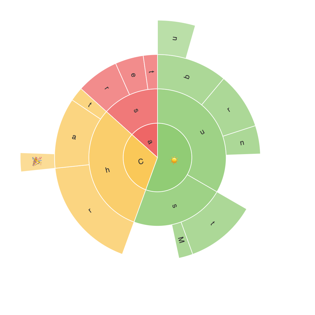
Sunburst Charts, also known as many-order treemaps, are hierarchical visualizations that display data with a concentric ring structure. Originating from the field of information visualization, they were developed to effectively illustrate hierarchical data by depicting various partitions or slices, and their further sub-divisions. The chart’s radiating rings and segments offer a unique aesthetic and efficiency in conveying multiple levels of data organization simultaneously.
#### Key Features
– **Hierarchical Structure**: Sunburst Charts excel in representing hierarchical data, making it easy to understand the parent-child relationships between categories and subcategories, down to the nth level of depth.
– **Compactness**: Despite their complexity of data representation, these charts are surprisingly compact, making them ideal for visualizing large datasets without sacrificing readability.
– **Aesthetic Appeal**: The visual hierarchy combined with color differentiation brings a rich visual appeal, enhancing comprehension and user engagement.
– **Comparison**: They facilitate comparative analysis between categories, as well as subcategories within each level, helping users discern trends and patterns without the clutter often found in traditional tree maps or pie charts.
#### Implementation Strategies
**Choosing the Right Data:**
– **Hierarchical Dataset**: Ensure your data has a clear hierarchy that can be categorized and subcategorized for effective visualization.
– **Appropriate Level of Depth**: Limit the depth of your hierarchy to avoid overloading the viewer’s attention. Typically, four to five levels are optimal for most use cases.
**Design Considerations:**
– **Color Scheme**: Use a color scheme that aids in readability and comparison. Alternating colors or a gradient can help distinguish between different levels and categories.
– **Interactive Elements**: Implementing hover effects, click actions, or animations can add an interactive layer, enhancing user interaction and engagement with the data.
**Technical Tools:**
– **Software Integration**: Popular tools like Tableau, PowerBI, and Python libraries such as plotly, matplotlib, and bokeh offer robust support for creating dynamic sunburst charts.
#### Case Studies
* **Corporate Sales Data:** In a scenario where a company wants to analyze its international sales performance, the Sunburst Chart can be utilized to break down sales across both products and regions, highlighting the most profitable segments and areas needing improvement.
* **Website User Journey:** For analyzing website navigation patterns, sunburst charts can be used to visualize the flow of users through different sections, easily identifying the most and least visited areas.
#### Conclusion
Sunburst Charts, with their combination of visual appeal, hierarchical data representation, and efficient space utilization, have become an indispensable tool for data analysts and visual creators. They provide a clear, engaging way to understand complex hierarchical data structures at multiple levels, offering insights that traditional charts might miss. By mastering the practical aspects of implementing these charts, from data selection and design considerations to tool integration, one can significantly enhance their ability to communicate and analyze data effectively.
