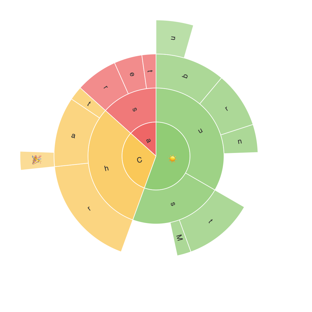
Exploring the Visual Power of Sunburst Charts: A Guide to Deep Data Visualization
Sunburst charts are visually rich representations of hierarchically organized data, making them an ideal tool for navigating and understanding complex structures that range from business analytics to cluster analysis. These charts offer a visually intuitive way to decode nested relationships within data, providing invaluable insights into multi-layered datasets.
### What are Sunburst Charts?
Sunburst charts are a type of radial tree diagram that display hierarchical information in a disc layout, with each level of the hierarchy represented by rings. The outermost ring represents the highest level of the hierarchy, with segments that branch out to represent child elements within that level. Each of these segments is further grouped into even smaller segments, which represent the next level of the hierarchy, and so on, inward toward the center of the chart. The center often acts as a hub, highlighting a common element.
### Key Benefits
1. **Visual Clarity**: Sunburst charts allow for the clear visual separation of categories at different levels, making it easier to decipher the hierarchy.
2. **Intuitive Nature**: The radial structure and color-coded segments make it simple for the viewer to grasp complex data at a glance.
3. **Efficient Space Utilization**: They use space efficiently to present multiple layers of data, making them suitable for displaying detailed structures without overcrowding the visual space.
4. **Enhanced Insight**: By visualizing nested data, sunburst charts can reveal patterns and insights that might not be apparent in tabular or linear data formats.
### How to Use Sunburst Charts
#### Step 1: Identify Your Data Structure
Decide on the levels of your hierarchy. Commonly, there are 2 to 4 levels, but the structure can go deeper or shallower depending on the complexity of the dataset.
#### Step 2: Data Preparation
Prepare your data in a format where fields are appropriately structured for hierarchical representation. Top level categories should be in one column, subcategories in separate columns or under, for each respective top category.
#### Step 3: Select a Visualization Tool
Choose a visualization tool like Tableau, Microsoft Power BI, or software like Python libraries (e.g., Plotly, Matplotlib) that support sunburst chart creation. Each tool has its unique features, so pick the one that aligns best with your project requirements.
#### Step 4: Creating the Chart
Enter your prepared data into the tool. Map your categories to the appropriate levels of the chart—typically, the outer ring represents the highest level of the hierarchy, with subsequent rings representing deeper levels. The tool often requires specifying dimensions for each level and a measure (like counts or values) to be represented by the size of the segments.
#### Step 5: Customize and Enhance
Customize your sunburst chart by adjusting colors, segment sizes, and labels to make your data more readable and visually appealing. This is where you can add meaningful insights through color coding, segment sizing, and annotations.
#### Step 6: Analyze and Present
Review the chart to ensure that the information is clear and effectively communicated. Test the chart with a few key users or stakeholders to gather feedback and iterate as necessary.
### Real-World Applications
Sunburst charts are widely used across industries to visualize hierarchical data. Here are some common applications:
– **Digital Marketing**: To analyze website traffic sources over various channels and sub-channels, helping marketing teams to optimize their strategies.
– **E-commerce**: To display product categories and subcategories efficiently, guiding users through a hierarchical navigation process to find products.
– **Biological Research**: For depicting phylogenetic relationships in biology, where the hierarchy represents evolutionary history.
– **Business Analytics**: In understanding customer segmentation at various touchpoints or sales funnel stages.
### Conclusion
Sunburst charts are a powerful tool in data visualization, capable of unraveling complex information into a visually digestible format. Whether you’re analyzing business data, optimizing website structures, or exploring biological phylogenies, these charts offer a compelling way to explore and present hierarchical data with clarity and elegance. By mastering the art of creating and interpreting sunburst charts, you can unlock deeper insights and better communicate data-driven stories.
