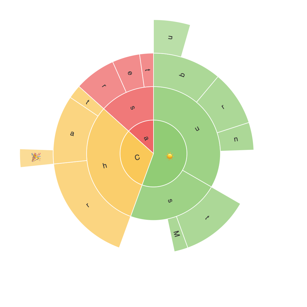
Sunburst Charts: Unleashing the Visual Power for Data Analysis and Presentation
Sunburst charts, also known as sun charts, ring charts, or multi-level pie charts, are a highly interactive and visually engaging form of data visualization commonly used to represent hierarchical data. This guide aims to delve into the intricacies of designing, interpreting, and leveraging sunburst charts to enhance data understanding and presentation skills.
### Origin and History
Sunburst charts have their roots in the broader family of tree diagrams. The earliest form of this type of chart can be traced back to the work of Francis Galton, a Victorian scientist, in the late 19th century, who used tree diagrams for statistical analysis. However, the representation seen today as a sunburst chart emerged more recently, evolving primarily in the fields of computer science and information visualization in the late 20th century.
### Components and Construction
A sunburst chart is composed of concentric rings, expanding radially from the center to display hierarchical data. Each ring represents a level of the hierarchy, with the central circle being the top level and subsequent rings branching out as levels deepen. Each segment in a ring is a sector that represents a category or node of the hierarchy. The size of each sector is proportional to the corresponding value it represents, allowing for the representation of both the quantity and hierarchical relationships in the data.
### Design Principles
1. **Clarity over Complexity**: Ensure that the chart is not overcrowded. Avoid too many levels or too much data, as it can become cluttered and less accessible. Focus on clarity and simplicity in your data’s representation.
2. **Color and Contrast**: Use color to distinguish between different categories but avoid overly vibrant or clashing colors. Contrast is crucial to enhance readability, especially when dealing with multiple levels.
3. **Focus on Major Insights**: Highlight the key segments of interest with more pronounced colors or sizes. This allows viewers to quickly grasp the main points without being overwhelmed by detail.
### Implementation Steps
1. **Data Preparation**: Prepare your hierarchical data in a format suitable for sunburst charts, typically a tree structure or a table. Ensure that each level of the hierarchy is clearly defined.
2. **Choosing a Tool**: Select a data visualization tool that supports sunburst charts. Popular choices include Tableau, Microsoft Power BI, Python’s plotly and matplotlib libraries, or D3.js for web-based applications.
3. **Designing the Chart**: Set up the outer rings with the main categories, and nest subsequent rings with more detailed categories. Assign colors carefully to each level to enhance readability and differentiation.
4. **Adding Interactivity**: Implementing hover effects, tooltips, or drill-down features can significantly enhance user interaction and engagement with the data. This allows users to explore the chart in more detail at their own pace.
5. **Customization and Layout**: Adjust settings to fine-tune the layout, such as the spacing between rings, the aspect ratio, and the transition animations, to ensure a clear and visually appealing representation.
### Interpretation Techniques
Interpreting a sunburst chart involves several key considerations:
– **Hierarchical Structure**: Identify the top-level categories and their subcategories to understand the overall structure of the data.
– **Comparison by Size**: Compare the sizes of segments within the same level to identify which categories are more significant in terms of value.
– **Drill-Down**: Use interactive drill-down features to explore the internal structure of a category, accessing deeper levels of the hierarchy.
– **Color-coded Insights**: Pay attention to color schemes and their consistent use across different levels to distinguish patterns or relationships within the data.
### Conclusion
Sunburst charts provide a compelling way to visualize hierarchical data, offering insights into complex information through their visually engaging and interactive nature. By following the guidelines outlined in this guide, individuals can effectively leverage this type of chart for data analysis, presentation, and decision-making. Whether you are a professional data analyst, a designer, or an educator, the ability to create and interpret sunburst charts will enhance your ability to communicate data effectively and efficiently.
