Exploring the Visual Power of Sunburst Charts: A Comprehensive Guide to Understanding Complexity in Data
Sunburst charts have emerged as a powerful visual tool in the realm of data visualization. Unlike their predecessors, such as pie charts, sunburst charts are adept at handling complex datasets, breaking down intricate correlations in visually engaging and accessible ways. This article provides a comprehensive guide into understanding how to effectively utilize sunburst charts to unlock the beauty and intricacies of complex data systems.
### Introduction to Sunburst Charts
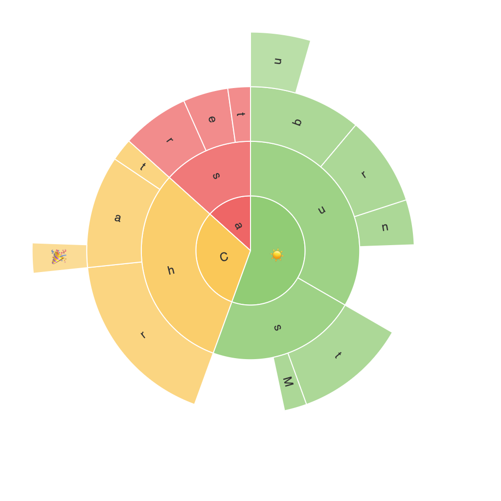
Sunburst charts are a hierarchical representation of data, where the central disk of the chart is divided into segments, each with a concentric ring representing different layer of the hierarchical structure. The segments, or leaves, of the outer rings represent individual data points. This unique configuration enables viewers to quickly identify the relationships between different levels of data, observe how data points are grouped, and spot trends or patterns that might be otherwise obscured in traditional charts.
### Construction of a Sunburst Chart
Creating a sunburst chart involves several steps:
1. **Define the Hierarchical Structure**: Determine the levels in the hierarchy and decide which level you will represent on each concentric circle of the chart.
2. **Assign Values and Categories**: Assign meaningful values to the data points, which will determine the size of the segments. Categorize data effectively to facilitate easy identification on the various levels of the chart.
3. **Utilize Colors and Labels**: Colors can be used for aesthetics and to differentiate between similar data points. Utilize labels to clearly define each segment and provide further context for the viewer.
### Key Features of Sunburst Charts
– **Hierarchical Data Visualization**: Sunburst charts excel at displaying multi-level data, providing insights into how parts contribute to a whole within various categories.
– **Space Efficiency**: They can display a significant amount of data (up to several hundred nodes, depending on the implementation) without the need for a lot of screen space.
– **Trend and Pattern Recognition**: Sunburst charts enable the quick identification of trends and patterns within hierarchical data, making it easier to understand complex relationships.
### Best Practices for Effective Use
#### 1. **Keep the Hierarchy Simple and Intuitive**
– Strive for a balanced structure with a manageable number of data levels and branches. Avoid overly complex hierarchies, as they may confuse the viewer.
#### 2. **Use Colors and Labels Sensibly**
– Choose distinct and easily distinguishable colors for different segments and levels.
– Implement effective use of labels. Too many labels can clutter the chart, creating visual noise.
#### 3. **Implement Interactive Elements**
– Incorporate interactive features such as tooltips, clickable segments, or even animations to provide additional context or deeper insights into complex data without overwhelming the viewer.
#### 4. **Consider the Audience**
– Tailor the information presented in the sunburst chart to the knowledge level and background of the audience. Avoid technical jargon or overly detailed breakdowns that might be confusing.
### Real-World Applications
Sunburst charts have found their utility across various fields:
– **Network Analysis**: Visualizing complex networks such as the internet or social networks.
– **Budgeting and Resource Allocation**: Displays can show how different resources are allocated within a budget.
– **Marketing and Sales**: Revealing the source of sales and product performance across different regions or channels.
– **Organizational Structure**: Providing a clear and comprehensive overview of an organization’s structure and how individual departments or sections contribute to the overall output.
### Conclusion
Sunburst charts provide a visually compelling and powerful means to explore complex datasets, offering insights that are beyond the reach of simpler visualization tools. With their ability to simplify hierarchical data, highlight correlations, and pinpoint trends, they are a valuable tool in the data analyst’s arsenal. Leveraging the best practices discussed here can enhance their effectiveness, making them an indispensable part of any data visualization strategy.
