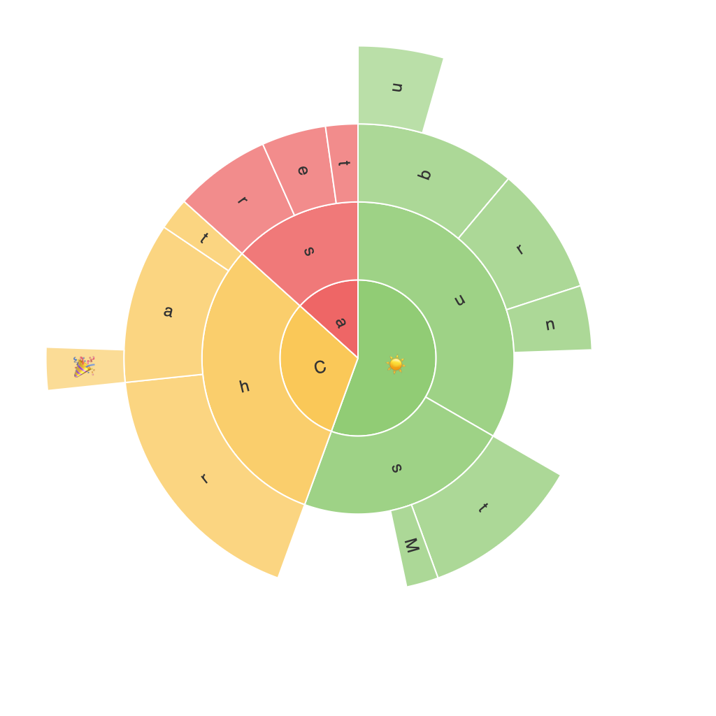
Exploring the Visual Power of Sunburst Charts: A Comprehensive Guide to Enhancing Data Interpretation and Presentation
Introduction:
In the vast ocean of data visualization techniques, sunburst charts stand out as an unconventional yet highly effective option for representing hierarchical data. This article delves into the intricacies of the sunburst chart, highlighting its unique visual appeal in storytelling and interpretation, while providing a comprehensive guide to enhance the presentation of data. By exploring the principles and application strategies, readers will gain a deeper understanding of how this visual tool can elevate data representation, making complex relationships more accessible and engaging.
Components and Structure:
A sunburst chart is a multilevel disk chart that displays hierarchical data through an array of nested rings or segments radiating from a central point. Each ring represents a level in the hierarchy, with segments within each ring symbolizing the different aspects or categories at that level. The arrangement of these rings and segments forms a visually striking pattern, allowing viewers to easily compare and contrast data across various hierarchical levels.
Benefits:
1. **Enhanced Data Interpretation:**
Sunburst charts offer a clear way to visualize hierarchical data in a compact space. The radial layout facilitates easy identification of parent-child relationships between categories, enabling quicker insights into data patterns and structures.
2. **Comparative Analysis:**
The nested structure of sunburst charts makes it simple to compare the magnitude of different data elements at the same and different levels. Proportions, frequencies, and value discrepancies can be vividly showcased with this layout, enhancing the analytical value of the data.
3. **Engaging Presentation:**
The visually rich nature of sunburst charts captures attention effortlessly, driving engagement and creating a memorable impact when presenting data-driven insights.
Techniques for Enhancing Presentation:
1. **Color Schemes:**
Employing a color scheme that enhances readability and emphasizes differences can significantly impact the overall presentation. Select colors that are visually engaging yet subtly different enough to distinguish between categories without overwhelming the viewer.
2. **Text Annotations:**
Adding text labels to segments provides clarity, especially for those who require more detailed information than a simple chart format might offer. These annotations can be placed strategically to maintain a clean layout while fulfilling the need for textual information.
3. **Customization and Automation:**
Utilizing sophisticated data visualization tools that allow for dynamic customization ensures that your sunburst chart can adapt to various data sets and scale seamlessly. Automation features can save time and effort by applying consistent styling and layout adjustments, ensuring a polished presentation regardless of the dataset’s complexity.
4. **Interactive Elements:**
Infusing interactivity into the chart can transform it into a powerful data exploration tool. Features such as zooming, hovering over segments to reveal additional details, and dynamically showing path connections can greatly enhance user engagement and the depth of analysis possible.
Conclusion:
Sunburst charts are not merely visual representations; they are powerful tools for data storytelling, enhancing the perception and interpretation of hierarchical data. By mastering the design and presentation strategies outlined in this article, one can leverage sunburst charts to make data-driven insights more accessible, engaging, and actionable. Whether used in a business report, educational presentation, or research context, the visual power of sunburst charts can significantly elevate the impact of your data presentation.
