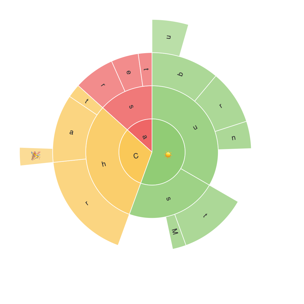
Exploring the Visual Power of Sunburst Charts: A Comprehensive Guide to Enhancing Data Interpretation
Sunburst charts offer a visually compelling method to represent hierarchical data in a way that highlights relationships and proportions. These intricate diagrams, with their concentric rings radiating outward, provide a unique way to visualize data that would be significantly more challenging to interpret with linear chart types. In this comprehensive guide, we will delve into the characteristics of sunburst charts, the reasons for their enhanced data interpretation capabilities, and practical tips for designing effective visualizations.
**Characteristics of Sunburst Charts**
Sunburst charts are built on a radial layout, with nested sectors symbolizing different hierarchical levels. The outermost ring shows the highest-level categories, and as you move closer to the center, the rings represent increasingly detailed subcategories. This structure is reminiscent of a pie chart’s sector arrangement but extends depth through additional levels.
**Advantages for Data Interpretation**
1. **Hierarchical Data Visualization**: Sunburst charts are fundamentally designed to handle hierarchical datasets, which enables users to explore data structure and proportions without cluttering the visualization.
2. **Trend Analysis**: As nodes branch out, visual cues associated with color, radius, and length become integral to recognizing patterns, trends, or anomalies in categories at different levels.
3. **Complex Relationship Insight**: The radial format allows for a clear depiction of the relationship between major categories and subcategories, revealing deeper insights that linear charts might obscure.
4. **Shared Values Emphasis**: In sunburst charts, each sector represents a quantifiable value. Shared values among parent and child nodes can be easily visualized, enhancing the interpretation of inter-relationships.
**Designing Effective Sunburst Charts**
1. **Choose the Right Data Structure**: Sunburst charts excels with clearly defined hierarchical data. Ensure your dataset includes clear, nested categories that can be effectively depicted in a radial structure.
2. **Color Usage**: Effective use of color can significantly enhance the interpretability of a sunburst chart. Assign contrasting or sequential colors to different levels or categories. Use color to highlight key areas or comparisons within your data.
3. **Simplicity and Clarity**: Keep your sunburst diagram sparse but effective. Avoid overloading the chart with too many categories or unnecessary data, which might obscure the key insights.
4. **Interactive Elements**: Consider incorporating interactive features such as tooltips, hover effects, or drill-down capabilities, which allow users to explore the data in more detail by clicking on specific elements.
5. **Proportional Area and Size Representation**: Each sector should accurately reflect the proportion of the data it represents. The area or size of each sector, depending on the chosen encoding method, should match the value it represents.
6. **Legibility and Accessibility**: Ensure that your chart is readable and accessible to all users, including those with visual impairments. Use high-contrast colors, adequate spacing between elements, and consider adding textual labels or legends where necessary.
By mastering the design and usage of sunburst charts, you can unlock powerful insights from hierarchical data, enabling more informed and impactful decision-making processes. Through careful consideration of data structure, effective use of visual elements, and strategic design choices, you can create sunburst charts that enhance, rather than detract from, the clarity and interpretability of your data.
