### Exploring the Visual Power of Sunburst Charts: A Comprehensive Guide to Data Visualization
In a world saturated with numbers, extracting meaningful insights from vast datasets often feels like a daunting task. This is where data visualization tools like sunburst charts step in, transforming complex information into accessible and visually engaging content. Sunburst charts, in particular, are powerful and versatile, making them indispensable in the arsenal of data visualization techniques. This guide aims to uncover the visual power of sunburst charts, unraveling their unique features, applications, and best practices to harness their potential effectively.
#### Understanding Sunburst Charts
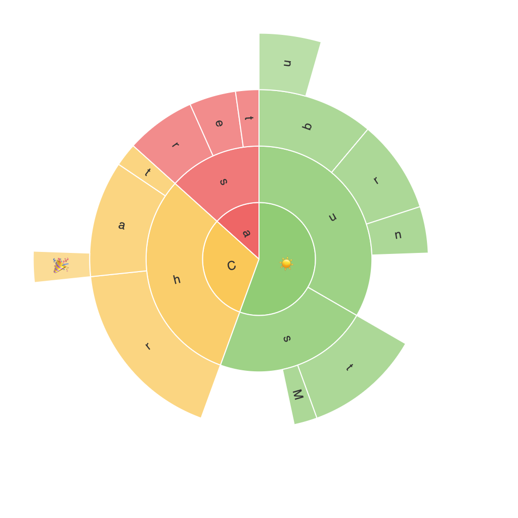
Sunburst charts are a hierarchical type of visualization that radiates outward from a central point, resembling a sun, hence the name. They are particularly effective in displaying multi-level categorical data or tree structures, where categories can be subdivided into smaller categories, and this process can continue through levels. The outer edges of the chart represent the leaf nodes, while the center represents the root node.
#### Key Features of Sunburst Charts
– **Hierarchical Clarity**: Sunburst charts excel in representing hierarchical data, making it easy to visualize the levels in a tree structure. The radial layout helps in distinguishing categories at different levels, providing clear insights into the hierarchical relationship.
– **Interactive Elements**: Many modern tools that support sunburst charts offer interactivity, such as hover-over features for detail display and the ability to drill down into subcategories, enhancing user engagement and the depth of analysis.
– **Color and Size**: The use of color and size can highlight important data points, making it easier to identify trends and patterns in the data. This can be particularly useful when comparing different levels or categories.
#### Applications of Sunburst Charts
Sunburst charts find applications in a plethora of domains, from business analytics where they can illustrate the breakdown of revenue by product categories and subcategories, to the health sector, where they might depict the distribution of patients across different diagnoses and sub-diagnoses. In web usage analytics, they can provide insights into user navigation through various pages of a site, showing entry points, paths taken, and exit points.
#### Best Practices for Effective Use
– **Data Set Limits**: Keep the data range manageable to maintain clarity. Too many categories can clutter the chart, making it difficult to interpret. Aim for around five to seven main categories to ensure readability.
– **Color Scheme**: Use distinct colors for different categories to enhance visual differentiation. Ensure the colors are accessible, meaning they are distinguishable enough for all users, including those with color vision deficiencies.
– **Interactive Design**: Implement interactive features that allow users to explore the data in detail, such as expanding sections to reveal more information. This not only makes the chart more engaging but also aids in deeper analysis.
– **Comparison and Prioritization**: Utilize sunburst charts to highlight the importance of different categories through size or color, making it easier to compare the relative sizes of categories at various levels.
#### Conclusion
Sunburst charts are a cutting-edge tool in the vast landscape of data visualization. Their ability to simplify complex hierarchical data into visually appealing and easily understandable formats makes them a powerful ally in decision-making processes across various industries. By mastering the nuances of these charts, analysts, data scientists, and business leaders can unlock the full potential of their data, leading to more informed strategies, enhanced user experiences, and smarter conclusions.
