Exploring the Visual Power of Sunburst Charts: A Comprehensive Guide to Data Representation and Interpretation
Introduction
Sunburst charts represent hierarchical data elegantly and efficiently. These visual tools offer a visually stunning way to represent complex data sets, making it simpler for audiences to not only understand the data but also grasp its intricacies. In this article, we will delve into the world of sunburst charts, discussing their design principles, utility, and how to create and interpret them effectively. Our objective is to provide an all-encompassing guide to equip you with the knowledge and skills to leverage the power of sunburst charts in your data storytelling endeavors.
Understanding Sunburst Charts
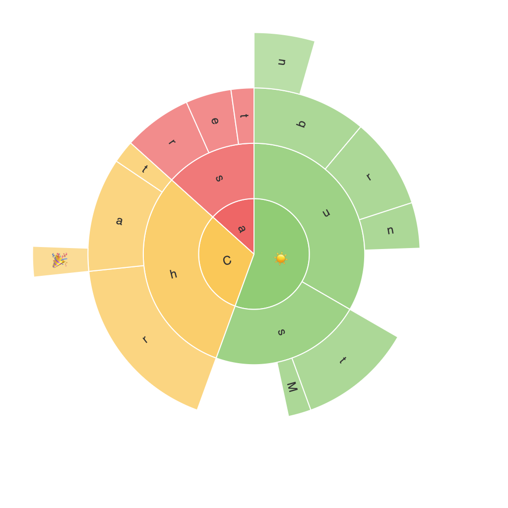
A sunburst chart presents data in a circular layout with concentric rings that represent hierarchical levels. The center of the circle often encompasses the top-level category, while subsequent rings denote subcategories. The visual appeal lies in the proportionality of each slice, making it easy to identify relationships and patterns within the data.
Principles of Design
To effectively convey information through sunburst charts, it’s crucial to adhere to certain design principles:
1. **Color Consistency**: Use a consistent color palette to differentiate levels, making the hierarchy visually apparent. The color scheme should also be accessible to colorblind viewers.
2. **Slice Proportions**: Arrange slices in a way that accurately reflects the data. The size of each slice should directly correspond to the quantity it represents, ensuring that the visual representation isn’t misleading.
3. **Clear Labels**: Include meaningful labels for each slice’s data, making the chart self-explanatory. This improves accessibility and ensures the correct interpretation of the data.
4. **Focus Clarity**: Ensure that the focus of your data can be clearly identified, such as by expanding collapsed sections to highlight important categories.
Applications across Industries
Sunburst charts find applications in various industries:
– **Marketing**: Analyzing customer segmentation, product categories, and sales channels
– **Finance**: Visualizing financial flows, corporate structures, and investments
– **Healthcare**: Charting disease prevalence across different demographics or states
– **E-commerce**: Representing product categories, consumer purchasing behavior, and supplier networks
Creating Sunburst Charts
To design an effective sunburst chart, follow these steps:
1. **Prepare the Data**: Organize your data in a hierarchical structure, using the top-level category as the primary ring, subcategories as subsequent rings, and so on.
2. **Choose a Tool**: Select a tool or software that supports sunburst charts, such as Tableau, Microsoft Power BI, or specialized data visualization libraries like D3.js.
3. **Map the Data**: Drag and drop your dataset onto the chart, mapping categories and values accordingly. Ensure that you configure the tool to recognize the hierarchical structure you’ve defined.
4. **Customize the Appearance**: Adjust colors, labels, and other visual elements to maintain clarity and enhance information presentation. Consider interactivity to allow audiences to drill down into specific areas.
5. **Review and Revise**: Ensure that the final chart is not overcrowded and that the hierarchy is intuitive. Test to ensure that the visual elements adequately represent the data and that it’s interpretable.
Interpreting Sunburst Charts
Reading a sunburst chart requires a systematic approach:
1. **Identify Top Categories**: Begin at the center, understanding the overall category that your sunburst represents.
2. **Follow the Rings**: Trace the rings outward to see the hierarchy and how one category is divided into subcategories.
3. **Assess Proportions**: Observe the size of each slice to gauge the significance of each category or subcategory within the total.
4. **Explore Intertwined Levels**: Sunburst charts with nested sections allow for detailed exploration, helping to uncover nuanced relationships within the data.
Conclusion
Sunburst charts are powerful tools for visualizing hierarchical data in a comprehensive and intuitive manner. By understanding the principles of design, appreciating the breadth of their applications, and mastering the art of creating and interpreting them, you can harness the full potential of these charts. Embracing the visual power of sunburst charts will enrich your data storytelling, making complex data sets accessible and engaging to diverse audiences.
