### Exploring the Visual Power of Sunburst Charts: A Comprehensive Guide to Data Presentation and Insight Discovery
In the competitive landscape of data visualization, choosing the right tool to present complex datasets effectively can often make or break the comprehension and interpretation of information. Among the various graph types available, sunburst charts stand out for their ability to effectively communicate hierarchical data structures whilst presenting key insights in an aesthetically pleasing and intuitive manner. This comprehensive guide will delve into the unique capabilities of sunburst charts, providing insights on their usage and potential within the realm of data presentation.
#### Understanding Sunburst Charts
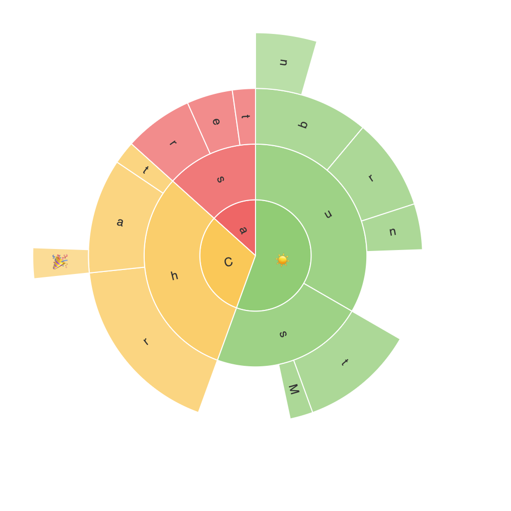
Sunburst charts, also known as radial treemaps, represent hierarchical data through concentric circles, where each ring (or level) represents a different level of the hierarchy. The chart’s sectors (or leaves) can be color-coded, allowing viewers to easily identify categories and trends. This type of chart visually exploits the human eye’s ability to distinguish between sectors and gradients, enhancing readability and facilitating quick comparison and recall.
#### Key Features and Benefits
**Hierarchical Data Visualization:** Sunburst charts are particularly adept at visualizing data with a clear hierarchy, such as product line sales, organizational structures, or tree classifications. Each level of the hierarchy is represented proportionally, making it easy for audiences to grasp the size of each category and its relationship to the whole.
**Comparison and Pattern Recognition:** The chart’s radial design allows for the easy comparison of quantities across different hierarchical levels. Sectors at one level can be directly compared to those in a higher level, enabling users to quickly identify significant changes and trends.
**Aesthetics and Engagement:** The use of color, size, and patterns in sunburst charts not only enhances the visual appeal but also engages viewers, encouraging deeper exploration of the underlying data. Customizable visual elements can help in drawing attention to key areas of interest without cluttering the chart.
**Efficient Data Density:** Compared to traditional tree maps, sunburst charts can often accommodate more layers of hierarchy in a single chart without overwhelming the viewer. This allows for nuanced data structures to be represented effectively, even at greater scales of depth.
#### Practical Applications and Use Cases
1. **Business Analysis:** Sunburst charts can be used in business intelligence to analyze customer segmentation across product categories, sales performance at different levels, or organizational structures and employee roles.
2. **Market Analysis:** Companies can use sunburst charts to show the breakdown of market segments, where each sector represents a category, and the segments within represent subcategories. This helps in identifying the most significant players in each category and understanding the dynamics between them.
3. **Project Management:** In project management, sunburst charts can illustrate the breakdown of project phases and tasks within each phase, providing a clear overview of the project’s structure and helping identify bottlenecks or areas requiring more resources.
4. **Information Visualization:** For complex datasets involving relationships between entities, sunburst charts offer a unique way to visualize connections, making it easier to discern patterns and dependencies not immediately obvious in tabular or linear formats.
#### Best Practices for Effective Sunburst Visualization
– **Simplicity:** Maintain a clear and simple chart layout to avoid overcrowding which can lead to misinterpretations. Limit the depth of the hierarchy to ensure that the chart remains readable and comprehensible.
– **Color Usage:** Employ a unique and consistent color scheme to represent data. Using color to differentiate levels and categories can aid in pattern recognition and make the chart more engaging. Ensure color contrasts are sufficient for accessibility and readability.
– **Interactivity:** For digital platforms, leveraging interactive elements such as tooltips, zoom, and drill-down features can greatly enhance user engagement and the depth of data exploration. These features allow users to delve into the details of specific segments without the clutter of too much information on a single view.
– **Customization:** Tailor the visual elements based on the context of the data and the audience’s characteristics. Personalization can include adjusting the color schemes, sizes, and patterns to align with the branding or design preferences of a specific project.
#### Conclusion
In conclusion, sunburst charts provide a visually compelling yet technically robust method of presenting hierarchical data. Their effectiveness lies in their ability to simplify complex information into an engaging and intuitive format. Appropriate for a wide range of applications, from business intelligence to project management and market analysis, sunburst charts offer a nuanced approach to data visualization that encourages deeper exploration and rapid comprehension. By following best practices in design and implementation, data analysts and professionals can leverage these charts to drive insights and inform strategic decisions with confidence.
