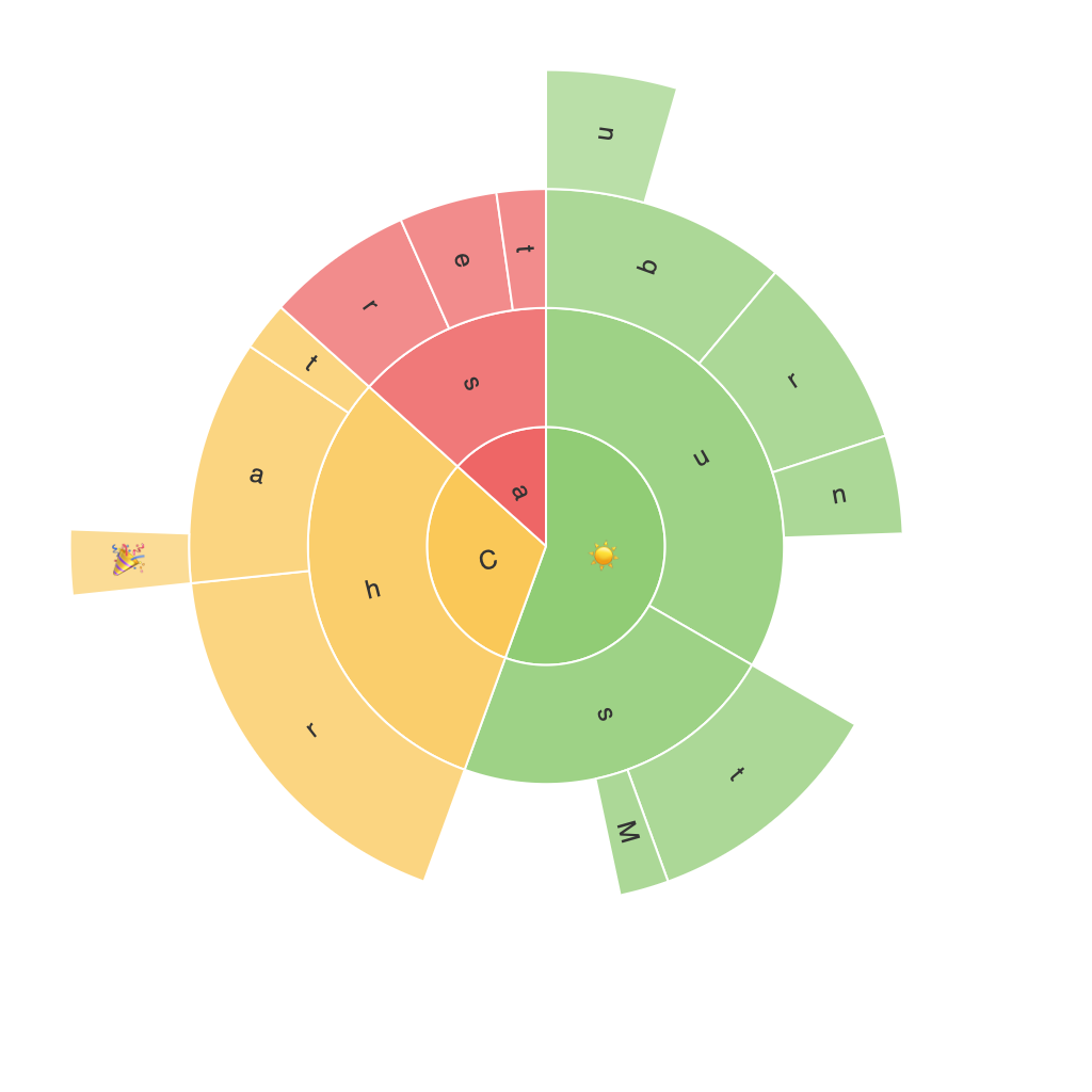
Exploring the Visual Power of Sunburst Charts: A Comprehensive Guide to Creating and Interpreting Detailed Hierarchical Data
Sunburst charts, also known as target diagrams or radials charts, are graphical representations that display hierarchical data in a visually captivating way, offering the user a clear understanding of the relationships and proportions across varying levels of classification. These charts are particularly valuable when dealing with complex data structures, as they facilitate insights that would become overwhelming or difficult to comprehend using traditional tabular or bar charts.
In this article, we will delve into the intricacies of designing and interpreting sunburst charts, aiming to equip you with the essential tools and techniques for mastering this powerful visualization method.
### Designing Sunburst Charts
#### 1. Understanding the Components
Sunburst charts contain three primary components:
– **Innermost Circle**: This represents the top level of the hierarchy.
– **Segmented Rings**: Each new ring represents a lower level in the hierarchy, with segments containing the respective data points.
– **Leaves**: These are the segments at the outermost ring, representing the lowest level in the hierarchy, which typically contain actual values or categories.
#### 2. Data Preparation
Before constructing a sunburst chart, ensure your data is properly structured with hierarchical relationships. Typically, this involves a parent-child relationship structure, which is essential for the chart to represent the data accurately.
#### 3. Choosing the Right Software Tools
Various software tools and programming libraries provide functionalities for creating sunburst charts, such as Tableau, PowerBI, and Python libraries (e.g., `plotly` and `matplotlib`).
#### 4. Creating the Layout
– **Start with the Top Level**: Place your top-level categories on the innermost circle.
– **Progress Outward**: Each child under the top level is assigned to a segment on the next ring, and this process continues outwards.
– **Adjust Sizes and Colors**: Size the segments according to the values they represent, and use distinct colors for clarity.
#### 5. Enhancing Readability
– **Labeling**: Add labels to the leaves, ensuring they are not overlapping and are readable.
– **Color Coding**: Use sequential or diverging color gradients to represent additional data attributes or categories.
– **Focus-Plus**: Implement a feature that allows users to drill down into specific branches or segments by clicking, enhancing the chart’s interactive capabilities.
### Interpreting Sunburst Charts
#### 1. Overall Structure
The first step in interpreting a sunburst chart is understanding its overall structure and organization. This involves recognizing how different categories relate to one another across various levels of hierarchy.
#### 2. Comparing Sectors
Sunburst charts naturally encourage comparisons across different levels, segments, and leaves. For example, one can quickly identify if there’s a dominant category at a higher level and how its parts contribute to the hierarchy.
#### 3. Using Colors and Sizes
Colors and sizes play a crucial role in distinguishing and emphasizing different aspects of the data. Color coding can highlight specific attributes or categories, while sizing helps in visualizing proportions.
#### 4. Drill-Down Interactivity
Interactive features like drill-down can provide deeper insights without cluttering the chart. This enables users to explore the data in more detail, enhancing comprehension and analysis.
### Conclusion
Sunburst charts are an excellent choice for visualizing complex hierarchical data due to their ability to convey information in a structured and visually appealing manner. By following the guidelines for designing, structuring data, selecting appropriate visualization tools, and implementing interactive features, you can create sunburst charts that not only showcase your data beautifully but also unlock valuable insights that would be lost in less engaging presentation formats.
Embarking on the journey to master sunburst charts will not only boost your data storytelling abilities but also help in making your reports and presentations more engaging and informative. With practice and creativity, you can unleash the full potential of these graphical representations, making them a powerful tool in the data analyst and data scientist’s arsenal.
