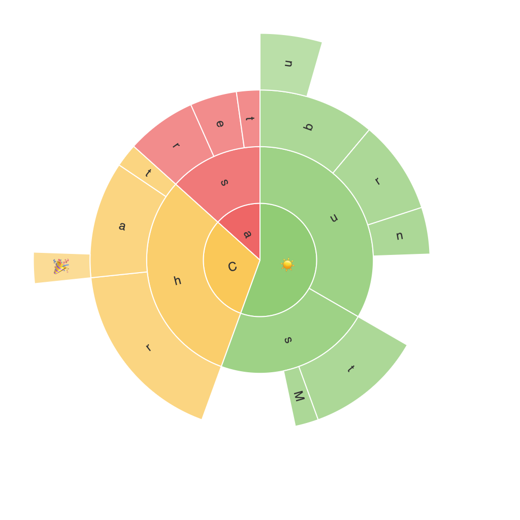
Sunburst Charts: An Innovative Approach to Visualizing Multilevel Data
Sunburst charts, a unique and captivating visual representation, stand as a beacon in the landscape of data visualization, particularly adept at showcasing hierarchical data structures with elegance and clarity. With their intricate and visually engaging appearance, these charts not only capture the essence of complex data, but also simplify it to a degree that facilitates quick comprehension and insight generation. In this guide, we’ll delve into the power of sunburst charts, their construction, exploration of intricate data sets, and application in various contexts, demonstrating how they serve as an invaluable tool in the data visualization arsenal.
### What Are Sunburst Charts?
Sunburst charts are a type of multilevel pie chart, with each level visually represented as a ring, expanding outwards like the petals of a flower. The central region, often called the “root” of the chart, represents the top-level category. As the radii expand outward, they display the second hierarchy, and so on, all the way down to the leaves, which are represented by the outermost rings and provide the finest level of detail.
### Constructing a Sunburst Chart
Constructing a sunburst chart involves several steps:
1. **Data Preparation**: Start with a hierarchical dataset. This could be anything from organizational structures, sales data broken down by region and product, or category data in a retail context.
2. **Creating the Hierarchy**: Organize your data into a tree-like structure within your chosen visualization tool. The top nodes become the central rings, and child nodes are placed outside, becoming children of their parent node or sibling nodes depending on their relationship.
3. **Color Coding**: Apply colors to each ring to signify different categories. The color scheme can help in quickly distinguishing between different data segments.
4. **Labels and Slicers**: Add appropriate labels to each segment to explain the data and slice by certain categories if needed. This feature is particularly useful in interactive charts for detailed exploration.
5. **Interactive Features**: Incorporate interactivity to enhance the user experience. Users should be able to hover over segments to obtain tooltips with detailed data, click to explore deeper levels of the hierarchy, or even perform dynamic filtering based on user inputs.
### Understanding Multilevel Data
The beauty of sunburst charts is their ability to handle detailed data hierarchically. Imagine visualizing a retail business like Amazon. The outermost ring could represent “All Categories,” the first level inwards could then be broken down into “Electronics,” “Books,” “Clothing,” and so on, with each level revealing further detail about subcategories, sales figures, or even individual products.
### Application Across Contexts
– **Web Analytics**: Display website or app navigation paths at different levels.
– **Organizational Structures**: Outline the company structure with employees, departments, and functions.
– **Sales Data**: Break down sales into products, regions, and time periods.
– **Content Management**: Show the hierarchy of articles, subcategories, and tags within a content management system.
### Conclusion
Sunburst charts harness the visual power of radiating geometry and color coding to transform complex, hierarchical data into a visually intuitive and understandable format. Whether used in academic research, business intelligence, or web analytics, these charts offer a powerful tool for data exploration and presentation. By leveraging the clear, interactive design of sunburst charts, users can uncover insights and patterns in multilevel data with a level of detail and depth that aids in decision-making and strategic planning. As data becomes increasingly complex and hierarchical, the capability to visualize this data effectively becomes even more crucial in aiding comprehension and action across various industry domains.
