### Exploring the Visual Potential: Unveiling the Sunburst Chart – A Comprehensive Guide for Data Visualization
In the vast universe of data visualization, there are countless tools and techniques that cater to different needs and data complexities. Among these, the sunburst chart emerges as a visually captivating method for representing hierarchical and multidimensional data. Its unique layout and functionality make it a compelling choice for data storytellers, offering a blend of aesthetics and functionality. This article serves as a comprehensive guide, exploring the potential of the sunburst chart and offering insights into its effective utilization for various data presentations.
#### Design and Layout
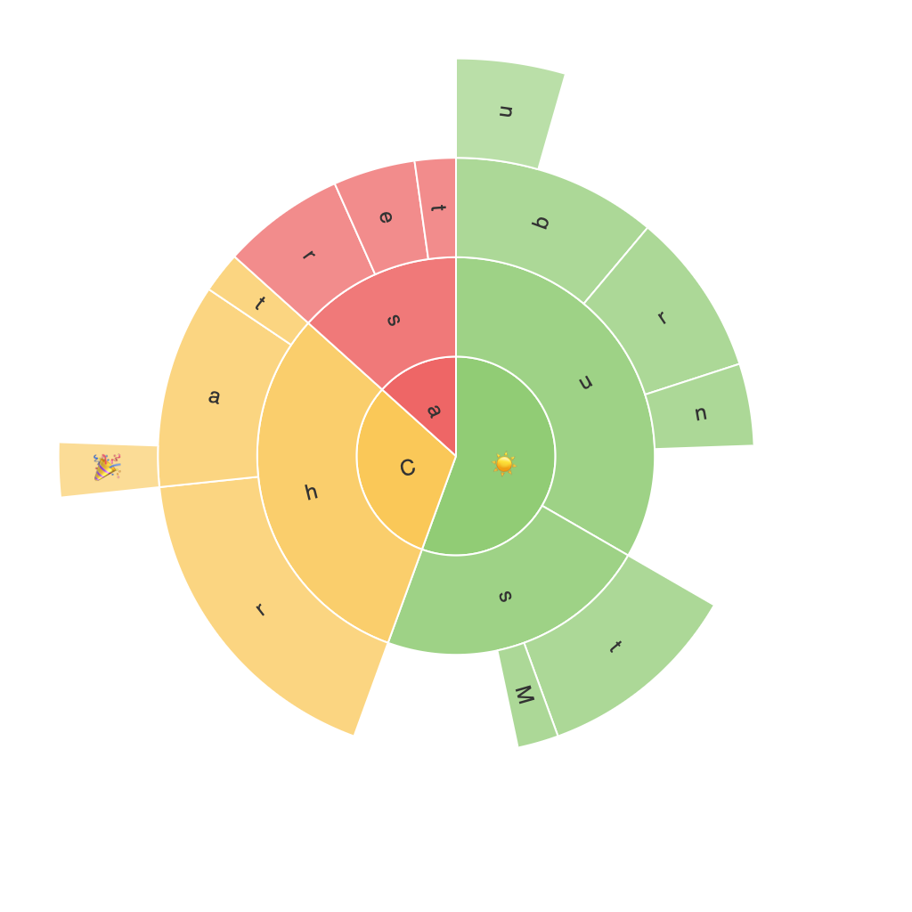
The sunburst chart, also known as a multilevel pie chart or hierarchical ring chart, is structured around concentric circles, where each circle level represents a higher level in the hierarchy. The innermost circle typically displays the root nodes, or the topmost categories, progressing outwards with subcategories, and so on. This radial design allows for a clear visualization of the relationship between different categories and subcategories, effectively communicating multilevel information in a compact form.
#### Key Elements and Variations
1. **Radii and Angles**: Each slice in the sunburst chart corresponds to a segment of a parent circle, the size and angle of which are proportional to the value or percentage of the data it represents.
2. **Labels and Colors**: Customizable labels are placed at the center of each arc, displaying the hierarchy and individual values. Colors are often used to differentiate between categories, enhancing readability and visual appeal while maintaining thematic coherence.
3. **Interactive Features**: Many digital implementations of sunburst charts offer interactive features, allowing users to drill down into specific subcategories for in-depth analysis, which is crucial for navigating complex hierarchies efficiently.
#### Use Cases
1. **Organization Structure Visualization**: Sunburst charts are ideal for representing organizational hierarchies, from corporate structures to academic departments, detailing the relationships and sizes of different departments and divisions.
2. **Genre or Category Breakdowns**: In the realm of media and content analysis, these charts are used to show the breakdown of genres, such as film categories (Action, Drama, Comedy) under the broader category of Entertainment.
3. **Website or E-commerce Navigation**: Sunburst charts can illustrate navigation paths through websites or online store categories, helping users understand how different sections contribute to website usage patterns.
4. **Product or Service Breakdowns**: Companies can use sunburst charts to show the proportion of various products or services within a portfolio, aiding in strategic planning and resource allocation decisions.
#### Implementation Tips
1. **Data Aggregation**: Before visualizing, ensure that your data is appropriately aggregated, with clear distinctions between top-level categories and their corresponding subcategories.
2. **Simplicity**: Keep the number of levels and data points manageable. Too much complexity can lead to confusion. Focus on the most relevant data for clarity.
3. **Color Scheme**: Choose a color scheme that enhances readability without overwhelming the viewer. Utilize color contrast to differentiate between categories, especially when dealing with numerous levels or data points.
4. **Interactivity**: Incorporate dynamic features such as hover effects, click-to-expand capabilities, or animations such as slow or fast transitions when drilling down into data. This enhances user engagement and facilitates a deeper understanding of the data structure.
5. **Accessibility**: Ensure that your sunburst chart is accessible to all users, including those with visual impairments. Provide text descriptions, color legends, and alternative text for images to cater to diverse user needs.
#### Conclusion
The sunburst chart, with its visually striking design and versatile functionality, offers a powerful tool for data visualization, especially when dealing with hierarchical and multilevel data. Its adaptability to various industries and its potential for interactive engagement make it a valuable addition to the data storytelling arsenal. As with any visualization method, the key lies in its effective implementation, tailored to the specific data and insights to be communicated. Whether analyzing organizational structures, content categorization, or navigational patterns, the sunburst chart stands as a testament to the visual potential in data presentation.
