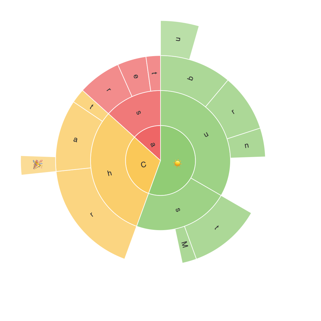
### Exploring the Visual Potential of Sunburst Charts: A Comprehensive Guide to Enhancing Data Presentation and Understanding
In the realm of data visualization, there exists a visually striking yet often underexplored technique known as the sunburst chart. This elegant graphical method offers a sophisticated approach to presenting hierarchical data, offering audiences a unique perspective into complex datasets. This article aims to delve deeply into the mechanisms and benefits of utilizing sunburst charts, providing a comprehensive guide for enhancing data presentation and understanding.
#### **Understanding Sunburst Charts**
Sunburst charts are a radial layout type where concentric circles represent different levels of the hierarchy. Each circle segment (or ‘slice’) represents a category, with the size often proportional to a specific value or metric associated with that category. This visual approach allows for a clear representation of both higher-level aggregates and detailed information within distinct branches of the hierarchy, making it an invaluable tool in elucidating otherwise convoluted datasets.
#### **Key Features and Enhancements**
**1. **Hierarchical Information Clarity:** Sunburst charts excel in illustrating multi-level relationships, making it easier for viewers to grasp complex, nested data structures. The radial format naturally guides viewers through a series of concentric circles, allowing for an intuitive exploration of nested categories.
**2. **Color and Label Utilization:** The primary visual cues—color, area (or radial length), and labels—each serve a significant role in enhancing the interpretability of the chart. Color can be used to distinguish between categories, while area and length can convey numeric values. Labels offer direct access to value representation for precise understanding.
**3. **Interactive Capabilities:** Modern tools often allow for interactive elements, such as hover effects that provide detailed data upon interaction, zoom functions to explore deeper levels, and navigation tools that help viewers traverse the hierarchy efficiently.
**4. **Comparative Analysis:** Through the use of color and area, users can easily compare between high-level categories and subcategories, making it straightforward to identify patterns, trends, and outliers in the data.
#### **Application of Sunburst Charts**
Sunburst charts are particularly useful in sectors ranging from finance and healthcare to education and web analytics. They are employed to:
– **Business Intelligence:** In showcasing revenue or profit distribution across various products, services, or channels within the organization.
– **Market Analysis:** To illustrate market share, customer segmentation, or product categories’ performance.
– **Web Analytics:** To represent click-through paths, user journeys, or referral sources.
– **Healthcare:** In visualizing hierarchical patient data, drug efficacy across different populations, or diagnostic pathways.
#### **Design Tips for Effective Sunburst Charts**
– **Focus on Clarity:** Ensure that the most important data is easily discernible, balancing between complexity and simplicity to avoid overwhelming the audience.
– **Consistent Color Usage:** Select colors that not only differentiate well but also enhance readability. Tools like palettes with high perceptual contrast can ensure better visual separation.
– **Simplify when Necessary:** Opt for a cleaner design by reducing unnecessary labels or segments in areas of the chart where less attention is needed.
– **Accessibility:** Consider the needs of those with visual impairments by ensuring sufficient contrast ratios between colors and a good text-to-background ratio for all text elements.
#### **Conclusion**
Sunburst charts offer a potent alternative for presenting hierarchical data, equipped with features that significantly enhance data visualization and understanding. Whether in the realms of business strategy, market analysis, or complex data exploration, leveraging the visual potential of sunburst charts can empower stakeholders to make more informed decisions based on clear, intuitive data insights. With an eye toward design and effective storytelling, these charts can truly transform data presentation, making complex information accessible to all.
