Exploring the Visual Potential of Sunburst Charts: A Comprehensive Guide to Enhancing Data Presentation
Sunburst charts offer a visually stunning and comprehensively insightful way of presenting multilevel data. Often used as alternatives to hierarchical treemaps, sunburst diagrams provide depth and a clear, intuitive understanding of the data structure. This article serves as a comprehensive guide to exploring the visual potential of sunburst charts, explaining their various applications, design considerations, and methods for enhancing their presentation to make complex data more accessible.
### Understanding Sunburst Charts
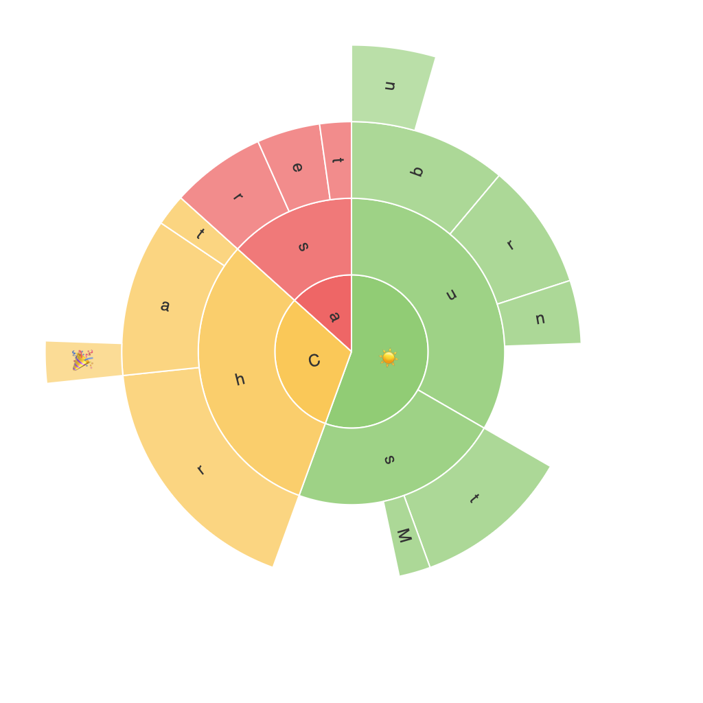
Sunburst charts, also known as radial treemaps, display hierarchical data by arranging segments in concentric circles. Each ring represents a level in the hierarchy, with segments within each ring corresponding to subcategories. The size of each segment is proportional to a value it represents, making it easy to discern the relative sizes of different segments at a glance. This visual layout provides an excellent mechanism for revealing patterns, comparing data, and simplifying complex data structures.
### Key Components of Sunburst Charts
1. **Radii**: These represent levels of the data hierarchy. Each radius corresponds to a level in the hierarchy, where the outermost ring represents the widest level, and the inner rings reflect the subcategories.
2. **Segments**: Each segment within a radius represents a subcategory. The size of the segment corresponds to the value it represents, making it easy to compare values at a glance.
3. **Labels and Colors**: Assigning unique colors to each segment and using descriptive labels enhances readability and helps in distinguishing between different data points.
4. **Interactivity**: In digital formats, interactivity is a key feature of sunburst charts, allowing users to drill down into the hierarchy, compare data, and explore relationships between categories.
### Use Cases and Applications
1. **Business Analysis**: Sunburst charts are highly effective in business analysis, such as displaying the breakdown of sales by regions, product categories, and subcategories. This makes it easier to identify which segments contribute most to overall sales and potential areas for improvement.
2. **Financial Modeling**: In finance, sunburst charts can illustrate the breakdown of investments across different sectors, regions, and investment types, helping analysts to understand the distribution and potential risks.
3. **Marketing Analysis**: Analyzing customer segments for targeting strategies or product categories for marketing strategies can be effectively visualized using sunburst charts, highlighting areas with the highest engagement or potential ROI.
4. **Ecosystem Analysis**: In biological sciences, sunburst charts can represent complex food webs by showing the flow of nutrients and energy through different trophic levels.
### Enhancing Sunburst Chart Presentation
1. **Color Schemes**: Utilizing color theory effectively can enhance the readability and visual appeal of the chart. Consistent, semantically meaningful colors can help distinguish between different segments and highlight key areas of interest.
2. **Label Placement**: Deciding on the best placement for labels can improve navigation and understanding. Clear labels can be placed with precision or with some overlap for aesthetic considerations, ensuring that every segment is identifiable and informative.
3. **Interactivity**: Incorporating interactive elements, such as tooltips, animation, and zoom capabilities, can greatly enhance user engagement and data exploration. This not only adds a modern and captivating aspect to the chart but also facilitates deeper insights and more dynamic data analysis.
4. **Data Scaling**: Adjust the scaling of concentric rings and segment sizes according to the importance or significance of the data. This can guide the viewer’s attention towards the more impactful segments and make the chart clearer to interpret.
### Conclusion
Sunburst charts are a powerful tool for visualizing hierarchical data, offering both aesthetic appeal and the potential for deep data insights. Their practical applications across various industries underscore their versatility and the extensive value they can add to data analysis, decision-making, and communication. Whether used in academic research, business intelligence, or everyday personal projects, investing time in designing and optimizing sunburst charts can lead to enhanced data presentation, clearer understanding, and informed, data-driven decisions.
