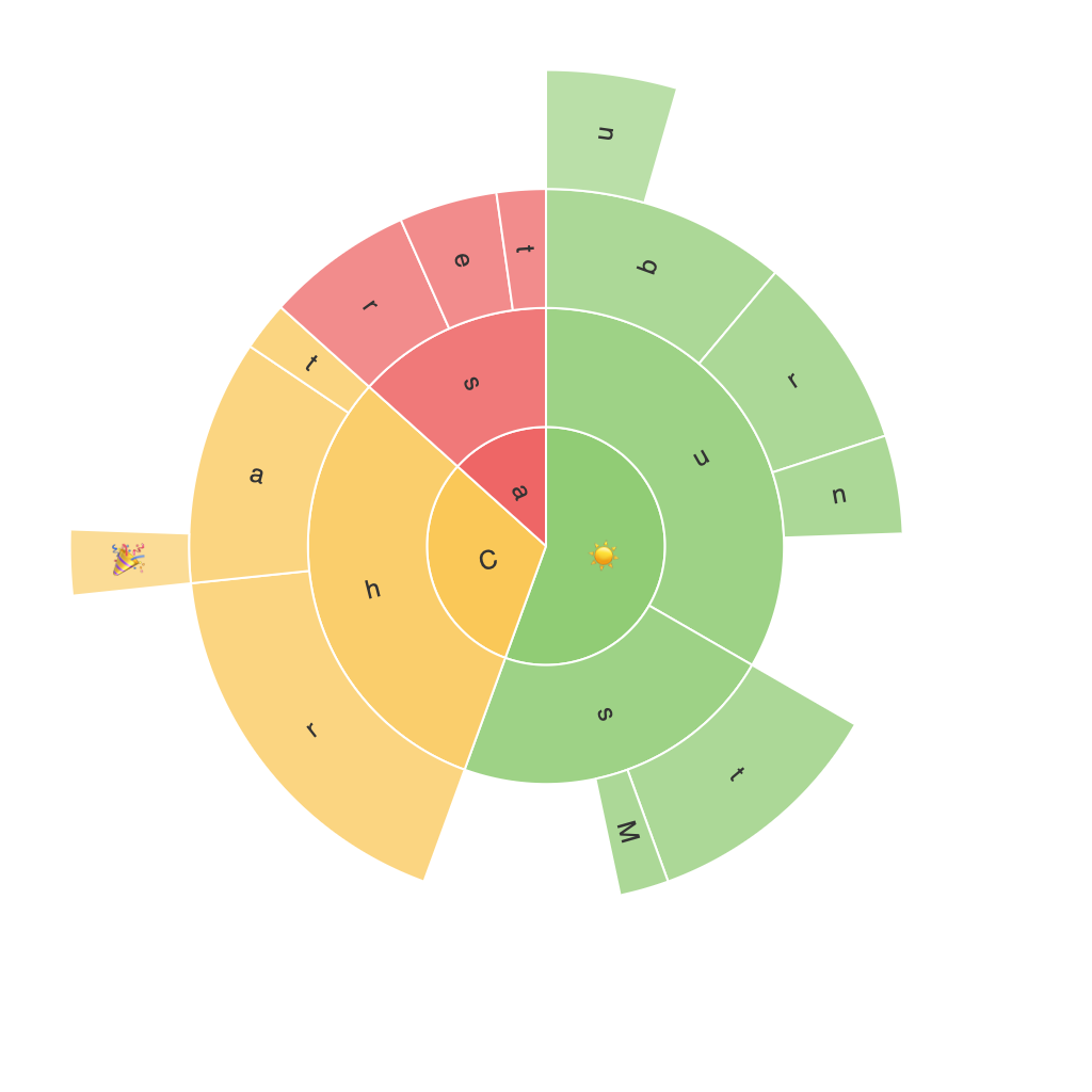
Exploring the Visual Potential of Sunburst Charts: A Comprehensive Guide to Enhancing Data Interpretation
Introduction to Sunburst Charts
Sunburst charts, often referred to as nested pie charts, offer a layered approach to visualizing hierarchical data. Unlike traditional pie charts, which depict only one level of information, sunburst charts can illustrate multiple levels of data, making them particularly valuable for depicting complex hierarchical structures. This article aims to provide a comprehensive guide on how to leverage sunburst charts’ visual potential for enhancing data interpretation.
Understanding the Structure
A sunburst chart visually represents the hierarchical relationships between data categories, where each level of data is indicated by a circle. At the outermost layer is the highest level of the hierarchy, while as you move towards the center, the chart depicts the nested subcategories. This structure allows viewers to easily discern the relationships and proportions within the data, facilitating deeper insights and quicker comprehension.
Applying Sunburst Charts in Data Analysis
Sunburst charts are particularly beneficial in scenarios where hierarchical classification of data is crucial. Here are some key areas where these charts can provide significant value:
1. **Business Analysis**: In business environments, sunburst charts are incredibly useful for analyzing the structure of organizations or product lines. For instance, demonstrating the different departments and their contributions to overall revenue. The chart’s layered nature helps in quickly identifying major contributors and understanding the breakdown of revenue across various segments.
2. **E-commerce**: Sunburst charts can highlight the product categories, subcategories, and the number of items within each category, aiding in understanding the sales structure or best-performing segments. This visualization is particularly helpful for product teams when making strategic decisions about stock management, marketing, and product development.
3. **Market Analysis**: In market research, these charts can illustrate the relationship between different product lines, their performance, and their market share. This visualization aids in comparing the growth rates and market positions of various subcategories within the same product family.
4. **Geographical Data**: Sunburst charts can effectively map geographical relationships and categorizations, providing insights into regional performance, market penetration, or distribution. By visualizing different levels of granularity, from global to specific regions, these charts facilitate a nuanced understanding of the data.
Best Practices for Effective Visual Communication
To maximize the effectiveness of sunburst charts in data communication, consider the following tips:
– **Simplicity**: Ensure that each level of the hierarchy is not too densely populated with too many categories. The key to a sunburst chart’s readability lies in its simplicity—aim for a medium number of categories at each level.
– **Color Scheme**: Employ a consistent and meaningful color scheme that enhances the visual clarity of the chart. Use color to distinguish between categories, subcategories, and hierarchy levels, making it easier for the audience to navigate the data.
– **Interactive Elements**: When possible, incorporate interactivity into the charts. This could include the ability to explore data by hovering over segments or clicking to zoom into specific categories. Interactivity can significantly enhance understanding of complex data structures.
– **Labeling**: Include labels and tooltips to provide a clear and succinct description of each segment. This ensures that the data is easily understood, especially when dealing with multiple levels of hierarchy or when there are not too many categories.
Conclusion
Sunburst charts offer a unique and powerful tool for data visualization, providing a rich, multi-layered view that aids in understanding hierarchical data and its relationships. By leveraging the right design principles outlined in this guide, you can enhance the visual potential of sunburst charts, making them an indispensable asset in your data analysis toolkit.
As organizations seek to make informed decisions based on complex data, the use of sunburst charts can significantly simplify this process. Whether navigating business classifications, market trends, product lines, or geographical relationships, this versatile chart type enables clearer, more concise, and insightful data interpretation.
Incorporating these recommendations into your data visualization strategy will not only improve the communicative effectiveness of your charts but also contribute to a more data-driven decision-making process within your organization.
